|
|
|
Showing 5761 - 5770 of ~6008 |
| Image |
Comment |
| 06/06/2003 01:51:41 PM | |  Photographer found comment helpful. Photographer found comment helpful. |
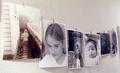
| 06/06/2003 01:49:53 PM | Escaping the Matrixby Girl from OZComment: FROM THE CRITIQUE CLUB
Hi, Danielle,
This was one of my 10s in the Matrix challenge (I voted even though I haven't seen the movies - I asked the kids what they were about). I must say I really like this photo, and I think it should have scored higher. I'm also wondering how it was done.
That said, here go the comments.
I think focus (on the typed stuff all over the picture) is very good. The out of focus background is great. Lighting is very good also. The colours are perfect. I'm finding little wrong here.
From what the kids have told me about the matrix, when I looked at it I thought, "Trapped in the Matrix", rather than "Escaping...". But then, I haven't seen the movies. From a photo point of view, the picture is nicely composed. I don't mind the slight slant in the text at all. I like the overall patterned appearance.
I don't think I'm being much help here. Sorry. You know, of the four pictures that you've entered, 3 have been favourites of mine in their respective challenges. Anyway. I think you'll take over the best photos for your camera page in no time. I'm looking forward to seeing more of your pictures. Take care,
Ursula (uabresch)
Complaints, comments, questions ... feel free to contact me. | | Photographer found comment helpful. |
| 06/06/2003 01:37:32 PM | | | Photographer found comment helpful. |
| 06/06/2003 01:34:40 PM | | | Photographer found comment helpful. |
| 06/06/2003 01:33:24 PM | Is It In You?by greenem2Comment: Cool idea! What comes out of my face is green though. One of favourites this week. |
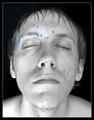
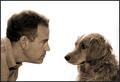
| 06/06/2003 11:31:15 AM | Comfortable Silenceby rll07Comment: FROM THE CRITIQUE CLUB
Hello Randy,
I am glad this picture ended up with a good score, because it is a very good shot. My main "complaint" is the title, "Comfortable Silence". Somehow, the silence does not look comfortable exactly, more "wary" (on the dog's side) or even just a bit confrontational. It looks to me like the man is winning the staredown.
The white background is striking (btw, how did you get it so white?). The edges (hairs) around the top of both heads look slightly "lost" (I think "blown out" is the term that's used for this). Focus is good, could be slightly sharper, but it's good. Sepia is a good choice IMO. Simple border is perfect.
The more I sit here and look at this picture, the more I think, "I like it, but there's something that's bothering me about it, and it's NOT the title." One thing that strikes me is that the shape of the dog comes from below (from the bottom up), whereas the man comes from the side (from the left). Makes the man look somewhat aggressive (IMHO) compared to the dog. Also, the large amount of white space attracts a lot of attention that possibly should be spent on the figures instead.
I don't think I have any good advise on how to make a good shot like this better, sorry. It's a good shot. It causes a pretty strong reaction in the viewer, which is very good. I guess I'll stop here.
Congratulations on an excellent finish! BTW, I love your shot of the mountains and the moon! It looks like a painting almost.
Take care,
Ursula (uabresch)
Complaints, comments, questions ... feel free to contact me. |
| 06/05/2003 03:01:14 PM | |
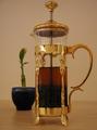
| 06/05/2003 03:00:19 PM | tea timeby apriceComment: Good idea, but, do you need the plant for tea time? It might have been better to include a cup or glass to drink the tea rather than the plant. | | Photographer found comment helpful. |
| 06/05/2003 02:59:24 PM | | | Photographer found comment helpful. |
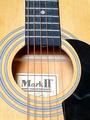
| 06/05/2003 02:42:21 PM | Guitarby EJComment: It would have been nice if you could have taken a picture of the guitar without showing the sticker inside. Also, I think the light is a bit harsh (is it flash?). Good try though - guitars are beautiful to photograph. |
|
Showing 5761 - 5770 of ~6008 |
Home -
Challenges -
Community -
League -
Photos -
Cameras -
Lenses -
Learn -
Help -
Terms of Use -
Privacy -
Top ^
DPChallenge, and website content and design, Copyright © 2001-2026 Challenging Technologies, LLC.
All digital photo copyrights belong to the photographers and may not be used without permission.
Current Server Time: 07/18/2026 03:22:00 AM EDT.
|