| Image |
Comment |
| 06/19/2003 03:47:38 PM |
Swimmingby draney4Comment: Good idea, but it needs to be in focus and a bit bigger. |
 Photographer found comment helpful. Photographer found comment helpful. |
| 06/19/2003 03:46:33 PM |
off center door of timeby jbruno1397Comment: The clock is off-center, and the picture is clear, but IMO it's not really a picture that will catch people's attention. The door (or window) reflected on the clock is distracting. Also IMO, the picture might be a bit better if the three small sides (bottom, right, and top) were the same size. ~4 |
| 06/19/2003 03:43:32 PM |
Jubal - Stage leftby QevinComment: Nice idea, but the snake does not look quite in focus. The colours of the background IMO take away from the snake. Also, the triangular shape to the right competes for attention with the snake. ~4 |
| 06/19/2003 03:43:15 PM |
Flooded Tunnelby RiderGalComment: I'm wondering if the movement is intentional? IMO, this image would work better if it were sharp rather than blurred. And, even though the man is off-center, the roundish hole is pretty much center, and the two compete for attention. ~4 |
| Photographer found comment helpful. |
| 06/19/2003 03:41:41 PM |
Kissed by a Roseby StevePaxComment: IMO, this picture would work better if the rose were somehow sharper even though it's in the fog. Nice fog by the way. |
| Photographer found comment helpful. |
| 06/19/2003 03:38:45 PM |
Finish Line by RuchartComment: Very nice - I don\'t see much of anything wrong with this picture. ~9 |
| Photographer found comment helpful. |
| 06/19/2003 03:37:47 PM |
MERGEby photogooComment: Wow, interesting! Great choice for off-center. The colours look almost a little overworked, but actually I like them. The yellow on the sign is great. I wish you'd included just a little bit more space on the left side of the sign. ~8 |
| Photographer found comment helpful. |
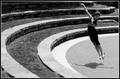
| 06/19/2003 03:33:27 PM |
Dreaming of Flightby MalokataComment: Nice picture, beautiful curves. You captured the jump just right, and I like the shadow. I wish the face of the girl were a bit clearer. ~8 |
| Photographer found comment helpful. |
| 06/19/2003 03:32:07 PM |
|
| Photographer found comment helpful. |
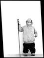
| 06/19/2003 03:31:11 PM |
Me and my Monopodby JPRComment: Very interesting! Excellent entry for the challenge. The border is beautiful. |
Home -
Challenges -
Community -
League -
Photos -
Cameras -
Lenses -
Learn -
Help -
Terms of Use -
Privacy -
Top ^
DPChallenge, and website content and design, Copyright © 2001-2026 Challenging Technologies, LLC.
All digital photo copyrights belong to the photographers and may not be used without permission.
Current Server Time: 07/18/2026 02:31:35 AM EDT.