|
|
|
Showing 5681 - 5690 of ~6008 |
| Image |
Comment |
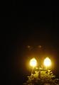
| 06/26/2003 03:44:42 PM | Retro Glowby eloiseComment: FROM THE CRITIQUE CLUB (the official critique :)
Hello, Eloise,
First of all, I agree with your commenters below that the two light spots are probably lens flare. It's a pity you couldn't edit them out for the challenge.
First impressions: The off-center nature of this shot is, IMO, off-center to satisfy the challenge, not because it adds to the picture. You are too far away from the subject.
Light / focus: It's difficult to take good night pictures, especially with a not so good camera. The yellowish cast is harsh. The focus seems off, nothing in the picture is crisp and clear, but the photo is not sufficiently "out of focus" to create a foggy or nightly/ghostly mood (something like that).
Composition: This is where IMO your picture suffers most. You need to get closer. Did you start with a larger image? IMO the shot could be cropped a long way and possibly be better. You also could straighten the lamp-post, parallel to the side of the pict. Also IMO, this particular pict would work better either in b/w or colourised. I played around with your pict a bit (hope you don't mind, and remember I'm starting from a small image) and am sending you result by email attachment (I don't know how to put it in here).
Overall: Not a bad idea, but the execution could be better. Keep going! If nothing else, you do have a lot of "spunk"! Take care,
Ursula (uabresch)
Complaints, comments, questions ... feel free to email me. |  Photographer found comment helpful. Photographer found comment helpful. |
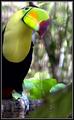
| 06/26/2003 03:15:17 PM | Hello from Belizeby RLSComment: FROM THE CRITIQUE CLUB
Hello, Bob,
I get to comment on another one of your beautiful pictures. And, be warned, I love colour!
First impression: good, clear, colourful shot, excellent entry for "Off-Center". Love the background.
Light: Excellent. I often find it difficult to work in bright light such as in this picture, but in this case I think the light is wonderful. I love the way it filters through the branches in the background. The only place where arguably it might be a bit harsh is on the branch and claw.
Focus: No problems. The bird is nicely in focus, the background is beautifully out of focus, and the leaves (bottom part of picture) connect the two.
Composition: I like it very much. I disagree with your commenters that would like to see the whole bird - IMO, showing part of the bird, kind of looking into the picture (tilt to the head), emphasizes the "off-center" aspect of the picture. I like the length of the image. The border complements the image and is very appropriate.
Overall: I don't see much wrong with the shot as it is, possibly a slightly softer sharpening wold be better? I'm not sure, as it is, it doesn't bother me, but it does look just a tad over-sharpened.
Congratulations on an excellent entry and a very good finish (although I think it should have finished higher ...). Take care,
Ursula (uabresch)
| | Photographer found comment helpful. |
| 06/25/2003 10:33:38 AM | Smiley Girlby MixiComment: Bunny, congratulations! You did a very good job.
~Mami | | Photographer found comment helpful. |
| 06/23/2003 12:32:23 PM | |
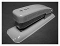
| 06/22/2003 03:33:09 PM | Old Stand Byby jerrftComment: FROM THE CRITIQUE CLUB
This is a nice, simple shot. Black and white seems like a good choice, although it might add interest to have the image in colour. The picture is nicely in focus. Light is OK, but not great - the glare on the front right corner of the stapler in particular is distracting. I think a bit more contrast would be nice. The simple white mat (border) is a good choice here.
It is hard to know what to say about this image. It is a fine shot, but it's not an exciting picture, and IMHO few people will spend much time looking at it or coming back to it. Anyway - keep shooting!
Ursula (uabresch) |
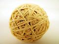
| 06/22/2003 03:23:59 PM | Ball of bandsby MajorChaosComment: FROM THE CRITIQUE CLUB
Like one of your commenters below, I am wondering if you made this just for the challenge.
Light: Seems OK, no problems that I can tell.
Focus: I'm assuming you wanted the edges of the ball to be blurry (out of focus)? On that assumption, I think you did a good job with focus, but, IMHO the contrast between the sharp middle and blurry edges of the ball is a bit much. I think I would have preferred the edges to be slighly more in focus (but that's opinion).
Composition: Again IMO, placing the ball right in the middle of the picture makes for a rather static picture, without much visual interest to hold the viewer's attention.
Overall: I think this was a good idea for office art, and a technically clean shot, but not an exciting picture.
Keep going!
Ursula (uabresch)
Comments, questions, complaints ... feel free to contact me. | | Photographer found comment helpful. |
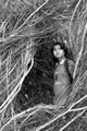
| 06/21/2003 06:59:22 PM | Peeking through lifeby asharisanComment: Very nice! I love your idea of using all the branches as a frame. To my eyes, you (the person) looks just a tad out of focus, but I'm not sure of that. B/W is a good choice here. ~8 | | Photographer found comment helpful. |
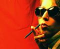
| 06/21/2003 06:56:05 PM | cigarettes will kill you...by aimster702Comment: I love the red background - it's very daring of you to use it! Very nice overall. My one comment, it might have been better to use a different colour pencil (for the cigarette). ~8 |
| 06/20/2003 09:38:56 PM | |
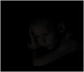
| 06/20/2003 09:29:18 PM | Timeless Youthby dodobirdComment: I can see the face of the child, but barely. I'm sure you're hearing a lot of "too dark" comments, so I'm not going to pitch in. The expression on the child's face is very nice, like a "little thinker". | | Photographer found comment helpful. |
|
Showing 5681 - 5690 of ~6008 |
Home -
Challenges -
Community -
League -
Photos -
Cameras -
Lenses -
Learn -
Help -
Terms of Use -
Privacy -
Top ^
DPChallenge, and website content and design, Copyright © 2001-2026 Challenging Technologies, LLC.
All digital photo copyrights belong to the photographers and may not be used without permission.
Current Server Time: 07/18/2026 09:08:05 AM EDT.
|