| Image |
Comment |
| 08/18/2003 03:29:42 PM |
Red Sunriseby cimarron98Comment: Beautiful sunset, great colours! It's a bit hard to tell which is negative space as the mountains/sun are not in focus. |
 Photographer found comment helpful. Photographer found comment helpful. |
| 08/18/2003 03:27:16 PM |
Cedar Sunriseby NitenComment: Very nice silhouette and sunset! IMO, and that's just my opinion, a less prominent border would enhance the picture; it's such a beautiful picture, it doesn't need such a heavy border. ~9 |
| Photographer found comment helpful. |
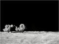
| 08/18/2003 03:25:59 PM |
Vertical Posture by GringoComment: Excellent entry, very good example of negative space making the "wow" of the picture! The tones are wonderful. One of my favourites. ~10 |
| Photographer found comment helpful. |
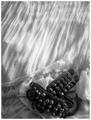
| 08/18/2003 03:22:23 PM |
After the danceby friscaComment: Frisca's entry? I really like this picture, it has a softness about it that's very attractive. It makes me want to touch that fabric, it looks like such soft cotton. The beadwork is nice. Actually, the negative space is wonderful and really makes this picture. One of my favourites this challenge. ~10 |
| Photographer found comment helpful. |
| 08/18/2003 03:20:38 PM |
illuminant shroudby grigrigirlComment: Good work! I didn't know if I liked the tones at first, but the more I look at it, the better they work. Very beautiful picture! ~10 |
| Photographer found comment helpful. |
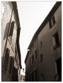
| 08/18/2003 03:19:03 PM |
Why negative?by jjbeguinComment: It took me a moment, but I got it! Very nice! I like the lamp at the foot of the "Y". The tones are nice. |
| Photographer found comment helpful. |
| 08/18/2003 03:16:35 PM |
|
| Photographer found comment helpful. |
| 08/18/2003 03:15:35 PM |
Invisible Lightby Chilly0999Comment: This photo looks so much like one entered to the prior challenge by the same name that I had to go check to make sure it wasn't the same shot. The negative space does make the photo here, nicely done! |
| Photographer found comment helpful. |
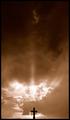
| 08/18/2003 03:13:06 PM |
Trinity by crabappl3Comment: Interesting shot. The sky is beautiful, and the small silhouette very good. The negative space does make the picture here, even though I think you could have cropped a bit off the top (to right below the small cloud in the centre) without loosing impact. The sepia tones are well done.
Two nitpicks and a question:
(1) there's a little branch peeking in at the bottom left corner;
(2) the cross looks slightly turned, like you weren't perfectly in back of it when taking the shot;
(3) I thought "trinity" meant three, Father, Son, and Holy Spirit. I see Christ's cross, possibly the Holy Spirit in the light of the sky, but where's the Father?
~8 from me |
| Photographer found comment helpful. |
| 08/18/2003 03:06:34 PM |
Casting Shadowsby cosmichaikuComment: Very nice! I like the colourful shadows. The lace tablecloth as negative space works well here. Good job. BTW - I have the same three bottles, plus a fourth one in the set, but in clear :) |
| Photographer found comment helpful. |
Home -
Challenges -
Community -
League -
Photos -
Cameras -
Lenses -
Learn -
Help -
Terms of Use -
Privacy -
Top ^
DPChallenge, and website content and design, Copyright © 2001-2026 Challenging Technologies, LLC.
All digital photo copyrights belong to the photographers and may not be used without permission.
Current Server Time: 07/19/2026 10:45:59 PM EDT.