|
|
|
Showing 2301 - 2310 of ~6015 |
| Image |
Comment |
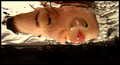
| 05/05/2007 01:35:59 PM | breatheby DoubledizzleComment: Greetings from the Critique Club
Very good finish in a difficult challenge. This is a beautiful, unique image, nicely done.
Positives: The sense of "unreal", of being in a different world of sorts. The detail on the face. The water at the top, in particular at the top right. The little droplet trails.
Negatives: The image speaks of breathing, and even though bubbles are there, and part of breathing underwater, it doesn't convey "bubbles" at first glance. The big bubble in front of her face, even though part of the story, is a bit distracting, mainly because it is so out of focus and it doesn't look to be part of the story at first glance.
A number of your commenters mention a possible rotation. I'm not sure. I think it looks quite good this way, although a portrait orientation might be quite intriguing.
I see no problems with the image from a technical point of view, except for the lack of sharpness on the big bubble in front of ther face. You certainly managed to get a clean image, even at ISO 800. The warm tones on the skin and water are beautiful. I like it how the water shines.
Overall, a really good entry, creative, well done. Congratulations on your high finish!
Take care,
~Ursula |
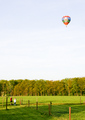
| 05/05/2007 01:26:13 PM | Anna, look!by ajschelComment: Greetings from the Critique Club
Positives: It tells a story, the two little girls looking at the balloon, one of them pointing at it, wonder and discovery. It's a peaceful image. Nice colours.
Things that work against the image: Both the balloon and the kids are too small, and there's too much other stuff around (the fence, the trees, the huge sky, the large grassy area, the stick and lone tree behind the girls) to look at. The subjects get lost in all of that. Also, the big blue sky is very plain, without much interest. Not a strict ROT image.
Technicals: It looks like you made the image in the evening (?), the light is quite beautiful. It shows up in particular on the tree trunks in back. Your exposure/shutter speed combination seem adequate for the image. You managed to keep colour and detail in the trees/grass/girls/balloon, without blowing out the sky. The post-processing again looks adequate for the image.
Overall impact: The story is beautiful, but it's weak in its presentation. It doesn't come through very well. From a plain compositional point of view, the thirds are thrown to the sides, and there's a big empty space in the middle. The large shadow at the bottom also distracts. In other words, it does comply to the ROT, but not really well, and it tells a story, but not nearly with enough strength.
I hope this helps. Let me know if I can be of further help.
~Ursula
|  Photographer found comment helpful. Photographer found comment helpful. |
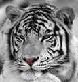
| 05/05/2007 12:39:22 PM | White Bengal Tigerby KaizerComment: Beautiful image, but, IMVHO, the selective colouring sort of kills it. ~7 (9 all b/w) | | Photographer found comment helpful. |
| 05/05/2007 12:13:04 PM | Breaktimeby LonzComment: Greetings from the Critique Club
Interesting image, fits the challenge description (it has bubbles) even though it doesn't scream "bubbles" because the bubbles themselves are largely out of focus.
The main positives for the image are the colour and the high contrast. The main distractions are the unclear subject and the focus on the skin (is it skin?) rather than the bubbles.
It is hard to tell what you were trying to show here. You say, "breaktime", but the image doesn't really give much of an indication of how it's supposed to be breaktime. Bubbles on a hand? The horizontal line towards the bottom and the bright glares are quite distracting.
From a technical point of view, F5.6 (lens wide open) is not enough DOF in this case in my opinion. I imagine you used a tripod, because of the slow shutter speed on a long lens. Are the bright reflections a flash? It is hard to tell.
Overall, I think this is an interesting concept to work with, but it needs better definition as to what you want to show here, and better execution, for the image to be successful.
I hope this helps.
~Ursula |
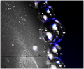
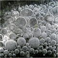
| 05/05/2007 11:54:36 AM | Frozen bubblesby korpenComment: Greetings from the Critique Club
Frozen bubbles, image seemingly made from above, at a slight angle. At first impression this is an intriguing image, I wonder where you made this, I'm thinking probably outside. I'm also thinking, it must be cold in Sweden to have ice like this in mid April. It's also intriguing because at first glance it looks like a black and white, but at closer inspection, it isn't.
Does it meet the challenge? Yes, no problem. It definitely is bubbles.
From a technical point of view, F4 was a lens too open for this image, in my opinion. I'm not sure if you can control aperture with the PowerShot A710, but for a macro such as this one, where you likely want all of it in focus, you need a higher F-stop number than 4. If you can set it, F8 to F11 at a slower shutter speed would likely have given you better clarity.
Your processing looks fine. If anything, I would have tried desaturating (or converting to B/W in some way), because that might have helped take away attention from the green leaf in the middle.
The composition is beautiful. The square crop suits the image, the feel of slight diagonal is charming. I very much like the little frozen airholes that look like little sticks and form the background. I love the shine in the bubbles at the top half. The bubbles seem to be trying to move, to break free from the ice. Your score of almost 6 is quite good, and it seems that people liked the image.
Negatives are the green leaf, it commands too much attention, especially because it is right in the middle of the frame, and the drop in sharpness and shine in the bubbles towards the bottom. For the challenge, the other negative is that even though it is a beautiful image, it doesn't have a huge visual impact.
Overall, a beautiful macro, very textural, and a good example of how squares and circles work well together.
I hope this helps. If you have questions, comments, complaints, please feel free to PM me.
~Ursula | | Photographer found comment helpful. |
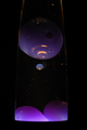
| 05/05/2007 12:54:02 AM | Bouncing Bluesby doc_gonzoComment: Greetings from the Critique Club
Interesting image. Lava lamps are so much fun to watch. I like the colours, the purple globs, the gold outline. I also like it that the background works both as a background and as a frame.
I think the exposure is right on for what you seeminly wanted to achieve. It was a wise decision to use a tripod, because at 1/5 of a second, handheld would not have worked. The colours are beautiful, quite rich, and the black is deep. I like the specks, they add life to the whole thing. I'm not sure how you processed this, but one thing that might help a bit is to sharpen the image a tad - the bubbles look a bit soft.
As for the challenge, it meets the challenge in that there are bubbles in the image. It might be that not everybody recognizes these as bubbles though, especially during voting, when images only get a few seconds viewing from each voter. The image doesn't really "sell" the idea of bubbles, in other words, it doesn't scream, "bubbles!"
Overall, a pleasing image, but it could be a bit sharper. A good entry to the challenge, but without selling the concept.
I hope this helps. If you have questions, complaints, comments, feel free to contact me.
~Ursula | | Photographer found comment helpful. |
| 05/05/2007 12:46:02 AM | Chemistryby cwalmyeComment: Greetings from the Critique Club
I am not sure what I can tell you about this image. I wish there were something in your notes about what you were thinking when you made the image, and why you decided to enter it to the challenge.
I also am not sure what I'm looking at.
From a technical point of view, the exposure seems adequate. The choice of shallow DOF works allright. The B/W conversion is also just fine.
It meets the challenge, in that it has bubbles in it. It doesn't sell the concept of bubbles.
Overall, this is a somewhat puzzling entry. It doesn't have a large amount of visual appeal. Like one of your commenters puts it, it's simple, not cluttered, but doesn't pop.
| | Photographer found comment helpful. |
| 05/04/2007 10:58:51 PM | Gemmaby alwaysREDComment: Greetings from the Critique Club
Your photographer's comments are spot on. This is a beautiful image, but not a high impact image. It is a good pet candid. You are right that the tail is distracting, as are the dirt specks on the face. The colours are quite beautiful, and the bokeh is soft and delicious. She really is cute!
So .... I am not sure what more I can add here :)
It meets the challenge, it follows the rule of thirds.
It likely would benefit from a bit higher contrast (sligh curves adjustment). It likely would also benefit from a slightly warmer tone overall, as Larus mentions in your comments. The focus is OK, but the eyes could be a little sharper.
FWIW, I would have voted it a 6 or a 7.
I hope this helps. If you have any questions, concerns, complaints, feel free to contact me.
~Ursula
|
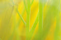
| 05/04/2007 10:52:24 PM | Stems and Bloomsby drbenjaminComment: Greetings from the Critique Club
First of all, reading through your comments made me laugh! "Ursular"? That's funny. Anyway. I am the real "ursula" here :)
Second, congratulations on making it through your first ever challenge!
About the image. Overall, I think it is a beautiful "abstract". The muted, yet bright, colour scheme is quite eye-catching. You say these are stems in water? It looks almost more like stems outside on a sunny day.
Your use of F2.8 with the macro lens certainly aided the overall dreamy feel of the image. It is always difficult to tell whether you intended to have the focus where it is, but it looks spot on for what it is - the stems that are clear are nicely defined without being oversharp, the rest is a pleasant out of focus hint of other stems and either a leaf or a flower.
The composition is quite good. I might consider leaving a bit less space to the right (move the stems a bit closer to the edge). I'd also try to not get any "intrusions" such as the little tiny bit of stem at the bottom left.
Processing, in my opinion it's beautiful as it is. You could have worked at creating greater contrast, but it's a matter of choice, how you want to present your image. I do like the colour combination, so similar throughout, yet the stems are quite distinct.
As for meeting the challenge, it does follow a thirds division; however, it doesn't yell rule of thirds, and that might have hurt your score. As for your score, this is not the kind of image that has a huge impact at first glance, and in the challenges that is what you need, immediate impact. That hurt your score also.
Overall this is a very pleasing image, a good study in colours and lines and shallow DOF. I hope this helps :)
If you have any questions, comments, complaints, please feel free to contact me.
~Ursula |
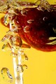
| 05/04/2007 02:25:56 PM | A Little Summerby BoldgraphyComment: Greetings from the Critique Club
First of all, welcome to DPChallenge, and congratulations on completing your first challenge.
What I like about the image:
I like the idea, bubbles, strawberries, warm colours, Summer. I like the shine of the bubbles, and the little bit of detail on the strawberry. I like the closeup view.
Challenge:
It meets the challenge topic, there are bubbles in your image. I would say that it maybe doesn't meet it head on, in the sense that, even though there are bubbles in the image, what you're "selling" is the idea of summer fun, not bubbles.
Technicals:
Your choice of F22 @ 1 second is a bit baffling to me. F22 will give you great depht of field, yet, you seem to have focused right in front of the glass, losing a lot of definition towards the straw and further back. 1 second is a bit slow I think for bubbles. I am not sure, but I would suggest going more something like F11 @ 4/10 of a second or so, and focus a bit further back. Something to try at least.
The light seems bright from the sides, maybe a smidgeon too bright. Maybe it would be worth it to try using the 2 flash units, one from the side, the other from a different place, maybe bouncing off a reflector for overall illumination.
Overall:
A good concept and a pretty good start for DPC, few of us start at 5.5. Keep going!
If you have any questions, complaints, comments, feel free to contact me. Take care,
~Ursula
| | Photographer found comment helpful. |
|
Showing 2301 - 2310 of ~6015 |
Home -
Challenges -
Community -
League -
Photos -
Cameras -
Lenses -
Learn -
Help -
Terms of Use -
Privacy -
Top ^
DPChallenge, and website content and design, Copyright © 2001-2026 Challenging Technologies, LLC.
All digital photo copyrights belong to the photographers and may not be used without permission.
Current Server Time: 05/04/2026 06:39:02 PM EDT.
|