| Image |
Comment |
| 07/27/2006 09:40:49 AM |
paint jobsby agenkinComment: I love this. Your crop has made an artist of this painter! If I was allowed to mark "favorite collection" I would pick your abstract/textures. I picked this picture because it didn't have a strong diagonal, but actually I love all the pictures in this collection. And you inspired me to re-categorize my own pictures. :) |
 Photographer found comment helpful. Photographer found comment helpful. |
| 07/27/2006 09:30:20 AM |
Texturesby posthumousComment: Originally posted by agenkin:
I'm getting too poetic here, to the point that I don't like it. :) |
Haha! Don't stop yourself! I'll collect poems for all my pictures. :) |
| 07/27/2006 09:27:53 AM |
Something Fishyby posthumousComment: Originally posted by agenkin:
Anyways, I like the square crop colour version better, I think. This is still a nice picture, though. The crop form factor is maybe a bit too weird, I am not sure what it does for me. Why did you crop it like that? |
I like the square crop better, too, but I thought this met the texture challenge better. That is why it's such a severe crop. I cropped out the surface details/highlights so that nothing would "pop". A surefire formula for a low score!
I think most dpc voters were interpreting texture differently than I was. They wanted a picture of something that they could imagine touching. I was trying to create a "visual texture." In other words, a consistent pattern across the entire field of the picture. No subject, just "surface." |
| 07/27/2006 09:22:51 AM |
You May Passby posthumousComment: Originally posted by agenkin:
blown red channel? |
If the red channel is blown I didn't do it! I swear, officer! ;) I've noticed that yellow has a tendency to destroy detail. |
| 07/27/2006 09:20:38 AM |
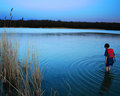
Watching My Own Existenceby posthumousComment: Originally posted by agenkin:
A very nice alegory, I'll need to remember it. Would not get it from the picture, though; |
No I wouldn't expect you to get it from the picture. The title is kind of its own poem meant to interact with the picture. Hopefully, the picture has its own merits. To be honest, I sincerely doubt the boy IS looking at his own reflection.
Oh, and another obscure point: you could say he is looking at his ripples, not his reflection! |
| 07/26/2006 02:56:55 PM |
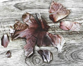
Onion on Woodby posthumousComment: Originally posted by raish:
This should not have succeeded here |
my thought exactly! perhaps it being an abstract challenge made voters more tolerant of the lack of a subject, the flatness, etc. Then again, I've been known to bomb in abstract challenges as well. I have no clue why this made top 20. That's why I can still suck! |
| 07/26/2006 11:48:54 AM |
|
| Photographer found comment helpful. |
| 07/26/2006 11:47:51 AM |
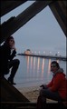
BBQby mkramarcComment: you're on the right track here. Interesting composition. I gave it a 7. |
| 07/26/2006 10:57:02 AM |
untitledby latidaComment: great composition, good expressions and positions of the models, nice muted colors. |
| 07/26/2006 10:55:52 AM |
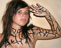
Veinsby photochild405Comment: Great vulnerability to this portrait. Not only is the skin exposed, but even the veins! It is a pretense of vulnerability, of course (drawn in), but it mirrors the real deal. |
| Photographer found comment helpful. |
Home -
Challenges -
Community -
League -
Photos -
Cameras -
Lenses -
Learn -
Help -
Terms of Use -
Privacy -
Top ^
DPChallenge, and website content and design, Copyright © 2001-2026 Challenging Technologies, LLC.
All digital photo copyrights belong to the photographers and may not be used without permission.
Current Server Time: 08/24/2026 04:20:10 AM EDT.