| Image |
Comment |
| 11/27/2006 03:20:49 PM |
|
| 11/27/2006 11:09:12 AM |
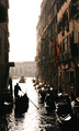
Veniceby TiNComment: I gave this a 10. I've been to Venice and this is even more beautiful than Venice! hahaha |
| 11/26/2006 11:47:08 PM |
|
 Photographer found comment helpful. Photographer found comment helpful. |
| 11/26/2006 11:46:29 PM |
|
| Photographer found comment helpful. |
| 11/26/2006 11:45:49 PM |
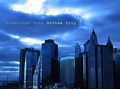
Bring your Umbrellaby Sunshine86Comment: Yay! Somebody else used Courier. You see, there used to be this thing called a typewriter, and gritty cities like Seattle had, like, writers and, like, journalists, and stuff, and so a typewriter font conveys grittiness... I feel your pain. 9 |
| Photographer found comment helpful. |
| 11/26/2006 11:43:20 PM |
|
| Photographer found comment helpful. |
| 11/26/2006 11:42:50 PM |
F#CK SHOESby kdeleonComment: This one I vote Most Likely To Actually Be Published As A Postcard. 9 |
| 11/26/2006 11:41:57 PM |
|
| Photographer found comment helpful. |
| 11/26/2006 11:41:01 PM |
|
| Photographer found comment helpful. |
| 11/26/2006 11:40:22 PM |
There's a Yellow Rose in Texasby scarbrdComment: I don't understand the smudges on TEXAS. Maybe if you smudged it on more letters and it didn't blend into the background, the effect would work better. Otherwise, I love this. 8 (p.s. those lips are too small!) |
| Photographer found comment helpful. |
Home -
Challenges -
Community -
League -
Photos -
Cameras -
Lenses -
Learn -
Help -
Terms of Use -
Privacy -
Top ^
DPChallenge, and website content and design, Copyright © 2001-2026 Challenging Technologies, LLC.
All digital photo copyrights belong to the photographers and may not be used without permission.
Current Server Time: 05/12/2026 09:23:54 PM EDT.