| Image |
Comment |
| 05/01/2007 07:44:31 PM |
|
| 05/01/2007 07:44:11 PM |
|
 Photographer found comment helpful. Photographer found comment helpful. |
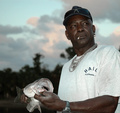
| 05/01/2007 07:42:46 PM |
Proudby senor_kasperComment: There's something that seems very genuine about this, and something more complex than pride. 9 |
| Photographer found comment helpful. |
| 05/01/2007 07:41:53 PM |
|
| Photographer found comment helpful. |
| 05/01/2007 07:41:39 PM |
|
| Photographer found comment helpful. |
| 05/01/2007 07:41:06 PM |
|
| Photographer found comment helpful. |
| 05/01/2007 07:40:53 PM |
|
| Photographer found comment helpful. |
| 05/01/2007 07:40:23 PM |
|
| Photographer found comment helpful. |
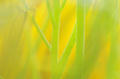
| 05/01/2007 07:39:58 PM |
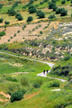
Relaxingby jcapps25Comment: I like how she looks into a field of texture, as though she is peering through the grass itself. I also like her expression, which is somehow determined and dreamy at the same time (determined to dream?). The way her skirt puffs out and then is cropped off makes it seem as though she is floating. This is a subtle but wonderful shot. 9 |
| 05/01/2007 07:37:49 PM |
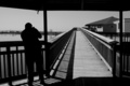
The photographerby ladpupmoeComment: I imagine the big square part of your composition is his photograph. He must have one of them large-format cameras! ;) 8 |
Home -
Challenges -
Community -
League -
Photos -
Cameras -
Lenses -
Learn -
Help -
Terms of Use -
Privacy -
Top ^
DPChallenge, and website content and design, Copyright © 2001-2026 Challenging Technologies, LLC.
All digital photo copyrights belong to the photographers and may not be used without permission.
Current Server Time: 06/26/2026 09:30:47 PM EDT.