| Image |
Comment |
| 02/14/2007 01:03:31 AM |
Good Pipesby Rae-AnnComment: This is pretty! I like your centering and of course the perspective, oh, and the frame works too. Possibly maybe I might give this a bump in contrast, noise reduction or saturation - maybe all three - but I guess that's the dpc warping talking. Or maybe you pulled this out of deep shadows and it won't bump anymore? Amusing take on the challenge too - making the idiom literal. Don't be too sad about the score - clearly a bunch of people did like it pretty well :) |
 Photographer found comment helpful. Photographer found comment helpful. |
| 02/12/2007 12:19:35 PM |
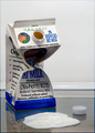
Lactose Intolerantby Rob OComment: This fits with the idea of 'intolerance' - in that he is throwing up. But actual lactose intolerance is more associated with symptoms of gas and diarrhea rather than vomiting. In that he is a milk container, it doesn't make much sense. It would be like being intolerant of your own contents - auto-immune maybe. I know I'm taking this really far but you asked for comments ;-)
I understand you needed something perhaps thicker than milk to show as the puke, but this really looked like 'other' to me. I thought it was sour cream. Actually, sour cream might be another title for the photo.
What you did with the carton, however, is really excellent. Very very personifying and creative. And I think your good score reflects this. Good job overall. I like this better than your alt, which wasn't as clean or interesting and probably would have proved to be too controversial. |
| Photographer found comment helpful. |
| 02/12/2007 09:48:47 AM |
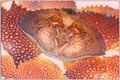
The Face in the Crabshellby noranekoComment: I enjoyed this. It almost has a Lichtenstein feel to it, haha. The muting of the whites worked well, really softened it. I noticed the effect while voting yet processing did not shout out to me, which is good. Btw, the face has such an old-fashioned look - like a chubby boy from a cereal box from 60 years ago. Very cute, and good spot! |
| Photographer found comment helpful. |
| 02/12/2007 02:35:55 AM |
Miss Betty Bidetby MelethiaComment: Terrific... and gloriously clean! Score should be higher. Shucks, you'd think the pissy voters would like this one. p.s. adding towel was darn clever! |
| Photographer found comment helpful. |
| 02/12/2007 02:27:06 AM |
|
| Photographer found comment helpful. |
| 02/12/2007 02:26:30 AM |
|
| Photographer found comment helpful. |
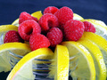
| 02/12/2007 02:25:45 AM |
Redeliciousby UbersteinyComment: Hey! Wait til yer 18 to do that! ;-) j/k... Great tonal balance, clarity, sparkle, and a very beautiful model. |
| Photographer found comment helpful. |
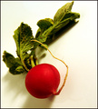
| 02/12/2007 02:22:12 AM |
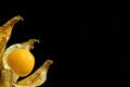
Simply Radishby tfarrell23Comment: Wow. How perfect. Nice job with the perspective, coloration and lighting. And finding a perfect radish. |
| Photographer found comment helpful. |
| 02/12/2007 02:20:15 AM |
|
| Photographer found comment helpful. |
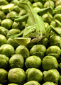
| 02/12/2007 02:19:33 AM |
Brusszilla - Destroyer of all Brussels Sproutsby landcameraComment: Love the picture. Excellent actor you have there. Your idea and the technicals are great, particularly the dof. I also happen to love Brussels sprouts with a little balsamic vinegrette and crumbled blue cheese. And after you bought all these, I hope you do too ;-) |
| Photographer found comment helpful. |
Home -
Challenges -
Community -
League -
Photos -
Cameras -
Lenses -
Learn -
Help -
Terms of Use -
Privacy -
Top ^
DPChallenge, and website content and design, Copyright © 2001-2026 Challenging Technologies, LLC.
All digital photo copyrights belong to the photographers and may not be used without permission.
Current Server Time: 06/19/2026 12:32:26 PM EDT.