| Image |
Comment |
| 05/02/2006 12:18:39 PM |
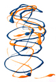
Imposterby lkpackardComment: sorry but there is nothing appealing about this--it looks a bit gross. |
| 05/02/2006 12:18:08 PM |
|
 Photographer found comment helpful. Photographer found comment helpful. |
| 05/02/2006 12:16:45 PM |
|
| Photographer found comment helpful. |
| 05/02/2006 12:16:26 PM |
Stardomby sherpetComment: nice composition but the colors seem over the top to me--the gravel is not nearly as sharp as it should be and looks totally oversaturated to the point where it's working against the image. |
| Photographer found comment helpful. |
| 05/02/2006 12:15:08 PM |
SYMMETRYby imagesloyolaComment: Nicely done--I just wish it were a tad lighter with a bit more detail but it's very effective. |
| 05/02/2006 12:14:30 PM |
Lines of Colorby sammigurlComment: an image like this that depends on the graphic lines for impact should be sharp thruout--yours is soft at the bottom. It's a nice idea and I like the composition. |
| Photographer found comment helpful. |
| 05/02/2006 12:13:29 PM |
|
| Photographer found comment helpful. |
| 05/02/2006 12:13:13 PM |
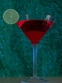
Lime and Wineby ZemmComment: you need to use a solid background with no texture of a neutral color. This background fights everything else in your images and detracts from it significantly. |
| Photographer found comment helpful. |
| 05/02/2006 12:11:59 PM |
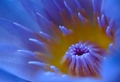
Calla Lilyby loveComment: Generally I like the composition and there is good detail in the flower, but I find the texture in the yellow background distracting and the yellow a bit too bright to the point it overwhelms the subtle coloring of the calla. I think it would benefit from some cropping to lessen the impact of the yellow, but if it were to be done again, I would pick a softer shade of yellow for the background (or adjust it accordingly in PS or whatever). |
| Photographer found comment helpful. |
| 05/02/2006 12:10:11 PM |
Stripes & Spotsby brizmamaComment: interesting composition--makes a good abstract of sorts. Good color, except the yellow in the heads of the pins looks too hot. |
| Photographer found comment helpful. |
Home -
Challenges -
Community -
League -
Photos -
Cameras -
Lenses -
Learn -
Help -
Terms of Use -
Privacy -
Top ^
DPChallenge, and website content and design, Copyright © 2001-2026 Challenging Technologies, LLC.
All digital photo copyrights belong to the photographers and may not be used without permission.
Current Server Time: 07/16/2026 09:51:57 PM EDT.