| Image |
Comment |
| 01/24/2008 05:20:29 PM |
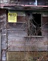
Postedby Donna21Comment: Very good job fitting the challenge here. It definitely feels abandoned. One thing I don't like about it however is that it doesn't have any negative space, making it feel a bit cluttered. It has pretty decent lighting as mentioned by Jason, maybe trying a more unique perspective rather than just eye level would have also added alot. Nonetheless it is a pretty good shot, and certainly meets the challenge as good as one can. Keep up the good work. |
 Photographer found comment helpful. Photographer found comment helpful. |
| 01/24/2008 01:13:35 PM |
Color Studyby mia67Comment: really cool shot, it almost has a glow to it. Love the post processing you did with it, really a very nice shot, great job. |
| Photographer found comment helpful. |
| 01/24/2008 12:00:44 PM |
Hole in the wallby BujanxComment: Incredibly interesting subject, I'll agree with citadel in that the bricks on the left are too dark making them harder to notice at first glance. Also one thing that the voters like in general would be adding a unique perspective. Hope all these comments helped, PM me if you have any questions. |
| Photographer found comment helpful. |
| 01/24/2008 11:57:53 AM |
Playing with Popcornby BujanxComment: One reason on this for the poor score is that it has poor lighting. A very good investment would be to get a cheap speedlight (an offbrand one would do) that you can use to bounce light off of the ceiling which will make a lot better lighting. Also some people may see the idea as too "childish", just cause lots of people are looking for crazy creative ideas. |
| Photographer found comment helpful. |
| 01/24/2008 11:54:54 AM |
s'no manby BujanxComment: Another great idea for this challenge. It looks a little blurry or missed focus. Also you may try lighting it from the side to add more contrast and interest to the shot. Just a few minor things to fix to add a whole lot to this shot. |
| Photographer found comment helpful. |
| 01/24/2008 11:53:01 AM |
Lost our Topsby BujanxComment: This shot has a lot of potential but it needs a few things. Adding contrast with your lighting would help this shot a lot. Also another thing would be making the background either a solid color, or a gradient of sorts. Those two things alone would add a lot. Also maybe try arranging them where they lead to the tops in the background to make that part stand out more, really nice idea. |
| Photographer found comment helpful. |
| 01/24/2008 11:48:56 AM |
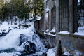
1905 super-phosphate plantby BujanxComment: First thing i thought when i saw this shot was that i would liked to have seen more of the building in this shot, and maybe used a different, more interesting perspective, maybe closer to the building, not really sure, but i think that that would add a whole lot to the shot. |
| Photographer found comment helpful. |
| 01/24/2008 11:47:11 AM |
dropby em3Comment: Really cool shot, looks like you may missed focus just by a tad, other than that though it is a very nice shot, and an incredible idea. |
| Photographer found comment helpful. |
| 01/24/2008 11:46:07 AM |
glassby em3Comment: Also a very neat shot, great colors and lighting, very nice idea and very well executed. |
| Photographer found comment helpful. |
| 01/24/2008 11:45:41 AM |
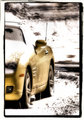
m6-2.jpgby em3Comment: Another great advertising type shot, great composition, very interesting background too, very nicely done. |
| Photographer found comment helpful. |
Home -
Challenges -
Community -
League -
Photos -
Cameras -
Lenses -
Learn -
Help -
Terms of Use -
Privacy -
Top ^
DPChallenge, and website content and design, Copyright © 2001-2026 Challenging Technologies, LLC.
All digital photo copyrights belong to the photographers and may not be used without permission.
Current Server Time: 07/22/2026 06:50:38 PM EDT.