| Image |
Comment |
| 09/03/2007 06:53:06 AM |
Success is in the Detailsby yankoComment: very good shot and layout, harmonic color scheme. don''t get the connection of "Success" and feather, though |
 Photographer found comment helpful. Photographer found comment helpful. |
| 09/03/2007 06:51:13 AM |
WOMENby lkn4truthComment: good stock photography. very questionable message, I assume and hope it is meant humorously. |
| Photographer found comment helpful. |
| 09/03/2007 06:48:37 AM |
|
| Photographer found comment helpful. |
| 09/03/2007 06:47:12 AM |
|
| Photographer found comment helpful. |
| 09/03/2007 06:45:03 AM |
|
| Photographer found comment helpful. |
| 09/03/2007 06:42:52 AM |
Individualityby rkligmanComment: beautiful shot that illustrates the message perfectly. typeface looks very odd due to pixelation |
| Photographer found comment helpful. |
| 09/03/2007 06:41:23 AM |
|
| Photographer found comment helpful. |
| 09/03/2007 06:40:19 AM |
|
| Photographer found comment helpful. |
| 09/03/2007 06:38:35 AM |
TEAMWORKby SamDoe1Comment: very good shot, like the lighting. doesn't really illustrate or emphasize the message IMO - or is it just some kind of humor I don't get? |
| Photographer found comment helpful. |
| 09/03/2007 05:53:04 AM |
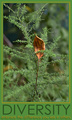
Diversity - embrace the difference you see in othersby sibelingComment: good take on the topic, image and message go perfectly together, love the "embrace" and how the bush and leaf are so different from each other. Typeface is too cold and plain IMO, shadow of the second line is rather distracting. |
| Photographer found comment helpful. |
Home -
Challenges -
Community -
League -
Photos -
Cameras -
Lenses -
Learn -
Help -
Terms of Use -
Privacy -
Top ^
DPChallenge, and website content and design, Copyright © 2001-2026 Challenging Technologies, LLC.
All digital photo copyrights belong to the photographers and may not be used without permission.
Current Server Time: 05/09/2026 01:18:13 AM EDT.