| Image |
Comment |
| 09/04/2007 04:50:46 AM |
|
 Photographer found comment helpful. Photographer found comment helpful. |
| 09/04/2007 04:48:35 AM |
Something will always growby xianartComment: excellent image, good color, back and blue borders work well. placement and size of headline I'm not so sure about. picture shows decay and type style reflects that to a point, but I think a more positive headline had made this poster more motivational. |
| Photographer found comment helpful. |
| 09/03/2007 01:13:27 PM |
Determinationby Wenders11Comment: cute one! good focus and color. color of text is a tad off, as is the background color, pure black with darker green text had ben my choice. |
| Photographer found comment helpful. |
| 09/03/2007 01:11:33 PM |
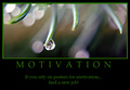
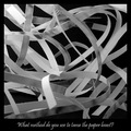
Need motivation?by MarellaComment: interesting take on the challenge, I see alitlle irony here... Don't think text and image (nice one) work together. |
| Photographer found comment helpful. |
| 09/03/2007 01:10:00 PM |
|
| Photographer found comment helpful. |
| 09/03/2007 01:08:43 PM |
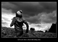
Dreamchaserby TezComment: overall a bit too much contrast. placement of the person is not viewer-friendly, as he/she runs out of the frame. layout is Ok, but not overwhelming; text could be larger. |
| Photographer found comment helpful. |
| 09/03/2007 12:42:11 PM |
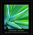
Individualityby purpleflutterby13Comment: well composed shot, petals could be a little sharper. nice lighting, though top right corner is a bit bright. white border is ok here. typeface of headline is somewhere in between, a classic typeface would have worked better, as would a modern sans-serif one; font color is a tad too bright. Handwriting font of subline works well again. |
| Photographer found comment helpful. |
| 09/03/2007 12:27:48 PM |
Stop bureaucracyby hajekaComment: very creative approach. good shot, only the bright top right corner distracts. Typeface is not too well chosen, a straight, clear font or typewriter font would have worked better. |
| Photographer found comment helpful. |
| 09/03/2007 12:24:50 PM |
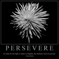
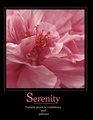
Serenity...by Rae-AnnComment: beautiful flower macro, might deserve a little bump in contrast. text and border color go well with the image. The capital "S" is too large and distracts a bit. line-breaks of copy text are very strange, make no sense to me |
| Photographer found comment helpful. |
| 09/03/2007 12:20:59 PM |
Beauty - Appreciate Simplicityby KatheComment: good shot, nice bokeh. not really a motivational poster IMO. Papyrus typeface is quite worn out, but that's not your fault. Placing of text looks rather incidental. |
| Photographer found comment helpful. |
Home -
Challenges -
Community -
League -
Photos -
Cameras -
Lenses -
Learn -
Help -
Terms of Use -
Privacy -
Top ^
DPChallenge, and website content and design, Copyright © 2001-2026 Challenging Technologies, LLC.
All digital photo copyrights belong to the photographers and may not be used without permission.
Current Server Time: 05/09/2026 02:13:19 AM EDT.