| Image |
Comment |
| 09/17/2007 07:36:01 AM |
|
 Photographer found comment helpful. Photographer found comment helpful. |
| 09/17/2007 07:33:03 AM |
|
| Photographer found comment helpful. |
| 09/17/2007 07:30:36 AM |
Fragranced II - Tribute to Sahkoby -Bec-Comment: good tribute that has some differences: black shirt instead of white bra, sepia tone instead of pure b/w, slightly different pose and a tighter crop. the crop through the hand is what will cost you some points, the rest is as good as the original. |
| Photographer found comment helpful. |
| 09/17/2007 07:21:45 AM |
Thought Process (Red Ribbon, Free Study 2007-03) by TommyMoe21Comment: definitely reminds of the original, but completely different in the details (other species, crop, expression). Excellent image that would have scored very high in a Free Study - as it'S a bit of a shoehorn here it will probably end in mid 6's |
| Photographer found comment helpful. |
| 09/17/2007 07:16:54 AM |
|
| Photographer found comment helpful. |
| 09/17/2007 04:44:07 AM |
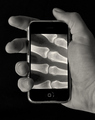
Evolve IIby ZeppKashComment: good take, though I miss the color here. the mobile looks better, though. |
| Photographer found comment helpful. |
| 09/17/2007 04:29:42 AM |
|
| Photographer found comment helpful. |
| 09/17/2007 04:27:57 AM |
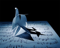
DeSousa's Swan Lakeby scarbrdComment: Lacks a bit of DOF, compared to the original, but I like the distortions on your note sheet better. color is a bit too "aqua" |
| Photographer found comment helpful. |
| 09/17/2007 04:24:50 AM |
"Summer" by Ursula by DrAchooComment: quite close! original is just a tad darker and shows more drawing in the petal. you aso have too much light from the left. still very good work. |
| Photographer found comment helpful. |
| 09/17/2007 04:21:23 AM |
|
| Photographer found comment helpful. |
Home -
Challenges -
Community -
League -
Photos -
Cameras -
Lenses -
Learn -
Help -
Terms of Use -
Privacy -
Top ^
DPChallenge, and website content and design, Copyright © 2001-2026 Challenging Technologies, LLC.
All digital photo copyrights belong to the photographers and may not be used without permission.
Current Server Time: 05/09/2026 05:08:42 AM EDT.