| Image |
Comment |
| 02/04/2006 12:16:03 AM |
Getting Readyby Commando303Comment: Nice twist on the topic, my only comment is that she left her glasses on, it would look better without the glare. |
 Photographer found comment helpful. Photographer found comment helpful. |
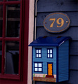
| 02/01/2006 10:15:52 PM |
Snail Mailby AmyVComment: Lots of potential, the white balance and levels need adjusting. The white door frame is pinkish, and the other colors seem muted. |
| Photographer found comment helpful. |
| 02/01/2006 09:49:07 PM |
|
| Photographer found comment helpful. |
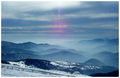
| 02/01/2006 09:45:01 PM |
France Vosgesby jeromComment: This would have been a wonderful shot if it were not for the lens flare. Not sure how to prevent that, I think changing the angle slightly might have helped. |
| 02/01/2006 09:41:26 PM |
|
| Photographer found comment helpful. |
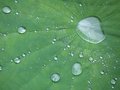
| 02/01/2006 08:53:23 PM |
Water Dropletsby cfischlComment: Beautiful picture, the composition and the focus are very nice, the only thing I would suggest on this one it to saturate your color a bit more. It will make a big difference. |
| Photographer found comment helpful. |
| 02/01/2006 08:48:25 PM |
Honduran Boy #2by cfischlComment: I like this one a lot. People pics are hard, and for the most part they only intrest the person in the pic, and the photographer. The look on the boys face here draws you in a bit. He seems like he wants to be tough so bad, but he is really a sweet kid. I would say that a way to improve this would be to crop out the other white shirt in the back, and perhaps compose on thirds. Your focus and lighting is good, shallower dof could have helped take the eye away from the kid in the back also. As far as the b&w treatment, it is good, but could use a bump in contrast. Your whites are good, but your blacks still have a bit of gray in them...your blacks should be black and whites should be white. |
| Photographer found comment helpful. |
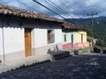
| 02/01/2006 08:36:03 PM |
Three Housesby cfischlComment: I love the color in this one, and the simplicity of the shot, reminds me of a Caribbean island. You have a good eye for exposure/processing. The lighting is wonderful, as well as the focus. I almost wonder what it might have looked like if you stepped in a few feet and swiveled a bit to get more of the trailing street, you don’t see cobblestone a lot and it adds interest to the shot. But, it is also fine as is. |
| Photographer found comment helpful. |
| 02/01/2006 12:48:41 PM |
|
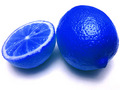
| 02/01/2006 12:45:56 PM |
Blue Theoryby lebowskiComment: I like this, very nicec detail in the smoke, but what are the spots on the background, I find them slightly distracting, because I cannot tell if they are on purpose of not. |
Home -
Challenges -
Community -
League -
Photos -
Cameras -
Lenses -
Learn -
Help -
Terms of Use -
Privacy -
Top ^
DPChallenge, and website content and design, Copyright © 2001-2026 Challenging Technologies, LLC.
All digital photo copyrights belong to the photographers and may not be used without permission.
Current Server Time: 07/21/2026 06:26:42 PM EDT.