| Image |
Comment |
| 10/03/2006 06:00:30 AM |
Sharpby bbrightComment: Greetings from the Critique Club!
Composition:
For me this is a nice abstract shot and the composition is good. However, I don't feel that the lines 'lead' the viewer to anything. In my opinion leading lines are something that grabs the viewers attention and pulls them in to the shot. Because of the choice of composition here, with being so close to the subject the viewer can't be lead into or around the image they are just hit straight between the eyes with the boat.
Technicals:
The lighting is a bit dull, more natural light on the day or a boost of the colours in PS may have helped this. It could be my eyes but the tire looks perfectly in focus whilst the boat itself looks a little soft. I also feel the shot could do with a little sharpening.
If you've got any questions about this critique, please feel free to contact me via the PM system.
- Natalya :o) |
 Photographer found comment helpful. Photographer found comment helpful. |
| 10/02/2006 05:46:49 PM |
going upby MarkComment: Greetings from the Critique Club!
Composition:
I love the placement of the balloon in the frame, really draws the viewer to the great colours and lines. I may have been tempted to have the balloon completely filling the frame in the top right hand corner but other than that the lines from the bottom lead you right up to the tip of the balloon, I think this is spot on!
Technicals:
The light is nice in this shot, your exposure is great but I do agree with one of your commenters, this could possibly do with a little sharpening.
I am not sure that I can really do a lot of 'critiquing' here as I feel the shot is technically good and composition is very nice.
If you've got any questions about this critique, please feel free to contact me via the PM system.
- Natalya :o) |
| 09/30/2006 03:49:52 PM |
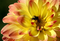
Making Seedby madcrabberComment: Greetings from the Critique Club!
Composition:
I like the position of the flower in the frame and you've got 'lucky' with the placement of the bee. I would like to have seen what this looked like with maybe 2/3rds flower 1/3rd background.
Technicals:
Brilliant use of natural light and the exposure is perfect. You have a nice 'bokeh' effect and good sharp focus on the flower.
My Personal Thought:
Going by the title I can sort of accept that this fits the challenge but, is it adhering to the spirit of the challenge? The 'seeds' at the centre are more like more petals waiting to open, unless it's a flower I haven't seen before. This maybe a reason why the shot didn't score a 6+.
If you've got any questions about this critique, please feel free to contact me via the PM system.
- Natalya :o) |
| Photographer found comment helpful. |
| 09/30/2006 11:31:36 AM |
Devil's Clawby lynnmarieComment: Greetings from the Critique Club!
Composition:
The first thing that strikes me about this image is the Devils Claws and seeds appear to just be floating and I find this very off putting. I do like how you have linked the two claws together and the few scattered seeds in the front help the overall idea.
Technicals:
Your commenters have pointed out the processing you have done on this shot is what has let you down. By turning the background to black you have lost detail and a natural look in the Devils Claw. As it is now the seeds in the front don't look in focus but I am not sure if this again is down to your processing, I would really like to see how sharp this image was before you did any editing. I can also see some editing marks around the top of the right hand claw.
My personal thought:
I think you would really benefit from purchasing some black material for your background, I have found mine extremely useful for still subjects like this. It would have mean't with this shot you would already have had your dark background and you wouldn't then have lost so much detail and the claws would have kept their natural look and colouring.
If you've got any questions about this critique, please feel free to contact me via the PM system.
- Natalya :o) |
| Photographer found comment helpful. |
| 09/29/2006 06:38:28 PM |
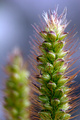
The Next Generationby SteveDunsterComment: Greetings from the Critique Club!
Hi Steve
Here goes....
Composition:
The whole impression, to me, is of a busy image with no obvious place for the eye to settle. The pinecone should be the focal point but does not really stand out and it is too central in the frame
I think concentrating more on the cone by using portrait format rather than landscape would have been better but also taking a further look around where you were and trying to find a cone with much less going on around it would really have helped this shot.
Technicals:
As your comments have suggested the image is way over saturated and this is the biggest problem I feel you have and the reason for you sub 5 score. Most of the detail has been lost on the pinecone and the overall image has a very unnatural feel to it.
I would suggest that if time allowed you tried to return to the area when the light was better as this would have prevented you from having to try and make the colours 'pop'. Failing the opportunity to return, a tighter crop and much less saturation may have worked better.
If you've got any questions about this critique, please feel free to contact me via the PM system.
- Natalya :o) |
| Photographer found comment helpful. |
| 09/29/2006 03:58:54 PM |
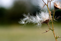
Macro Seedby trailwalkerComment: Greetings from the Critique Club!
Hi Dave,
First of all congratulations on your 2nd highest score and great work on your first try with the extension tubes!
Now down to the nitty gritty :o)
Composition:
I like your choice of background, it really makes the greens of the seed stand out. The mirroring of the first seed with the blurred background seed is a nice idea and both are placed nicely in the frame.
I think portrait format works well here to give the shot a feeling of depth that wouldn't be the same if you had shot this in landscape format
Technicals:
Excellent DOF with lovely detail in the first seed and enough blur on the background seed for the viewer to still know what it is but not be distracted by it. Your use of natural light gives the greens and purples on the seed a nice colour.The only thing I don't like is the slight burn out at the top of the seed.
It could be my eyes but I feel the image could do with a little sharpening to just bring out a bit more of the spikes on the first seed.
My personal thought:
This shot for me, although composed nicely, doesn't have the 'wow' factor of a ribbon winning image. But for your first attempt with the extension tubes you seem to be doing ok to me and I'd suggest sticking with it, you have the techincal abilities to produce some stunning images and I look forward to seeing them in the future.
If you've got any questions about this critique, please feel free to contact me via the PM system.
- Natalya :o) |
| Photographer found comment helpful. |
| 09/29/2006 01:10:50 PM |
Gone to Seedby mpreslarComment: Greetings from the Critique Club!
Hi Marty,
First of all congratulations on your highest scoring shot to date :o)
Composition:
I like the placement of the thistle to one side of the frame and the angle of the stem helps lead the viewer to the 'seeds'. I would agree with one of the comments below, the light patches in the background are a little distracting, particularly in the top left. Maybe getting a very slight higher angle and tilting the camera down a little would have enabled you to lose the white parts and just have the greens in the background?
I also think the thistle head on the right would look better if is was completely in the frame, as it is at the moment it leaves me wishing I could see the rest of it.
Technicals:
Excellent DOF, the blurred dark greens really help the white of the 'seeds' stand out. You have captured some lovely detail and textures in the stem and thistle heads but I do think it could do with being sharpened a little.
Hope this helps.
If you've got any questions about this critique, please feel free to contact me via the PM system.
- Natalya :o) |
| Photographer found comment helpful. |
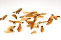
| 09/29/2006 10:35:58 AM |
Scattered Pine seedsby alpharichComment: Greetings from the Critique Club:
Hi Richard :o)
Composition:
I like the idea you have and feel the seeds work well against the white background. There are ,however, a few bits that distract me. Firstly the seed leaving the frame on the left handside, for some reason my eye is pulled in that direction and it doesn't in anyway help the composition. Also the seed in the foreground almost in the middle looks out of place as if a part of it has been cut off.
I am wondering how the shot would look if you had the camera slightly higher and titled down to give more of an over and across the seeds viewpoint, this may have helped to give less of a feeling that the seeds are floating too.
Technicals:
I agree with the comment below that a greater DOF may have helped this image, for me the out of focus seeds in the background are just too much of a blur.
I think you have managed the lighting and whites very well so a 'good job' on your exposure! :o)
Hope this helps.
If you've got any questions about this critique, please feel free to contact me via the PM system.
- Natalya :o)
|
| Photographer found comment helpful. |
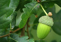
| 09/29/2006 10:09:00 AM |
Another Great Oak in the Makingby JacquiDComment: Greetings from the Critique Club:
Hi Jacqui,
Firstly this obviously meets the challenge title, so were are off to a good start :o)
Composition:
I like how close you have got to the acorn but feel the background has too much going on in it. If possible I would have tried to move the leaf in the bottom left side of the frame as this for me is the main distraction.
The shot may also have worked better as a portrait with the the leaves in the top left hand corner and the acorn coming down into the middle/lower third of the picture if you see what I mean.
Technicals:
I agree with the comment below, the lighting is a little flat. A brighter day with a bit more natural light on the subject would have really helped this but maybe further adjustments of Levels/contrast would also help to lift the colours.
I am a little confused about your reason for using Gaussian Blur? I am not sure if maybe by using this you have given the overall image a slight soft feel. Your aperture was 5.6 so you should have quite a shallow depth of field, maybe an adjustment to the point of focus may have helped.
My Personal Thought:
Some better natural light and a little work on composition and this may have scored better.
If you've got any questions about this critique, please feel free to contact me via the PM system.
- Natalya :o) |
| Photographer found comment helpful. |
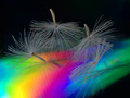
| 09/29/2006 07:20:40 AM |
Seed Spectrumby banmornComment: Greetings from the Critique Club:
Hi Robert
I like the idea and it definitely has 'seeds'in it so certainly matches the Challenge title.
Composition:
The position of the seeds in the frame and the appearance that they are falling is good. The spectrum of light adds another aspect to this shot that makes it stand out from other images that have used similar 'seeds'.
Tehcnicals:
The colours in the spectrum of light are nice, on my screen in the green on the right handside there appears to be some small patches that don't look quite right. This could just be the way it looks or a processing 'problem'?
The subject would suit a black background but again there appears to be some areas on either side of the frame that are a slightly different colour to the centre of the background. Small little details but on voting I would be looking at all these things.
I would agree with the comments below, the seeds are a little grey and would look better if you were able to lighten them to get them a bit whiter. I also agree that the seeds could benefit from slightly less sharpening.
My Personal Thought:
I may have been tempted to do two things with this shot. One would be to lose the spectrum altogther and just have the whiter falling seeds against the black background, but that would have taken away that extra 'something' this shot has. Or I may have placed the spectrum to go more from one corner to the other, say bottom right to top left.
If you've got any questions about this critique, please feel free to contact me via the PM system.
- Natalya :o) |
| Photographer found comment helpful. |
Home -
Challenges -
Community -
League -
Photos -
Cameras -
Lenses -
Learn -
Help -
Terms of Use -
Privacy -
Top ^
DPChallenge, and website content and design, Copyright © 2001-2026 Challenging Technologies, LLC.
All digital photo copyrights belong to the photographers and may not be used without permission.
Current Server Time: 05/09/2026 02:53:46 PM EDT.