| Image |
Comment |
| 10/18/2006 12:22:32 AM |
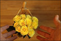
for my bestest friendby Ecce_SignumComment: Not a bad finish for your woody at all! And, you'll be pleased to know I am not even going to attempt to critique this one :o)
Love you too Andi XxX |
 Photographer found comment helpful. Photographer found comment helpful. |
| 10/18/2006 12:06:13 AM |
|
| Photographer found comment helpful. |
| 10/17/2006 11:50:56 PM |
IMG_2096_a_sm.JPGby manx_20Comment: Hi Arek,
Lovely fall colours! They always look so beautiful against a blue sky! For me however, this image lacks a point of interest, the viewer just seems to be directed to stare 'up' at the sky which doesnt have anything interesting for us to look at. I hope you see what I mean?
- Natalya :o) Message edited by author 2006-10-17 23:54:21. |
| 10/17/2006 11:48:14 PM |
IMG_1957_a_sm.jpgby manx_20Comment: Hi Arek,
What a beautiful little girl :o) I like your depth of field, slightly blurring the background has worked well here but I feel the almost central placing of the little girl is a bit off putting. With a shot like this it is always good to focus on the persons eyes if you can. I also think If you had slightly turned her so the light was shining on her face better then her eyes would not have been in shadow and this would have really helped the image in my opinion.
- Natalya :o) |
| 10/16/2006 01:46:54 PM |
'The Believer'by taljComment: Thanks for the comments :o)
To Barry and Andi, no, I didn't use a mirror. They are my hands completely unreflected :o)
As for the PP stuff, school is teaching me a little and have been spending some time with a 'tutor', oh and it always helps to have a PS 'Guru' as a friend! ;o) Message edited by author 2006-10-22 15:46:42. |
| 10/14/2006 06:09:44 AM |
Live to Skateby ShannonLeeComment: Love the position of the subject in the frame and again your editing really suits this shot. Only thing I find slightly distracting is the bright spot on the lip. Love the graininess and capture of movement :o) |
| Photographer found comment helpful. |
| 10/14/2006 06:08:12 AM |
Rythmicby ShannonLeeComment: Great Self Portrait! ;o) For me this would look better left as two image as they both have a lot of interest. The processing is nice, good DOF and nice detail :o) |
| Photographer found comment helpful. |
| 10/14/2006 12:03:36 AM |
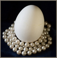
Nest of Pearlsby jfwolpertComment: wow some of your commenters have looked really closely! I sure didn't see you reflected in the pearls! I have to agree that getting rid of the marks on the egg (by moving its position?) may have helped your score a bit here. The background looks a little pixalised to me mainly on the top right handside and I am not a huge fan of the central position of the objects. I think you have met what I believed the challenge to mean and you have gathered exactly 2 objects so for me that gave you a few extra marks! Yanko's B&W idea sounds interesting, I wonder whether this would have more impact if you tried that? |
| Photographer found comment helpful. |
| 10/13/2006 05:56:17 PM |
Sunset Loveby ShaneBlakeComment: Beautiful colours! I would have cropped the branch out from the middle right hand edge of the frame but other than that I really like it and looks like you got the processing done pretty good :o) |
| Photographer found comment helpful. |
| 10/13/2006 05:54:10 PM |
Beale Streetby ShaneBlakeComment: One step to the left and a slightly more head on composition and this would have been perfect for me. I love the colorus but would have cropped the edge of the curb out as it is a little distracting :o) |
| Photographer found comment helpful. |
Home -
Challenges -
Community -
League -
Photos -
Cameras -
Lenses -
Learn -
Help -
Terms of Use -
Privacy -
Top ^
DPChallenge, and website content and design, Copyright © 2001-2026 Challenging Technologies, LLC.
All digital photo copyrights belong to the photographers and may not be used without permission.
Current Server Time: 05/09/2026 02:36:40 AM EDT.