| Image |
Comment |
| 10/21/2006 12:11:47 PM |
Free and hidingby BoltiComment: Greetings from the Critique Club Hjalti!
Firstly, congratulations on your 14th place finish! :o)
Composition:
I really like your choice of a more square crop to this shot, the models position in the frame is excellent and you have a good use of negative space above her. I would agree with one of your commenters, I am not sure that the ribbons help this shot, but then other commenters have said they like them. I suppose its personal taste, but to me the ribbons say 'party' yet the title tells me something different. Maybe I am not really getting the 'essence' of the person?
Technicals:
The high key effect works extremely well with the models tones and the minimalist look you have going on in your overall image. I think your lighting is excellent and there is some good detail in the models skin.
Overall an excellent image and great finish, well done :o)
If you've got any questions about this critique, please feel free to contact me via the PM system.
- Natalya :o)
|
 Photographer found comment helpful. Photographer found comment helpful. |
| 10/20/2006 08:38:30 PM |
welcomeby boysetsfireComment: I think you could be right Crystal, on looking at this image again I feel if the interest was mainly on the light areas (cropping the dark left side out) then the trash cans wouldnt actually look out of place...definitely an interesting area and somwhere you could find lots of interesting subjects! |
| Photographer found comment helpful. |
| 10/20/2006 08:07:11 PM |
norseman customerby jdannelsComment: Great use of DOF and again your subject is so sharp! A few things distract me in this image though, firstly the napkin in the lower right hand corner of the shot. Secondly, there is a slight lean which because you can see the edge of the table its quite noticable and thirdly the lines of light on the persons back detract away from the main subjects very interesting face (IMHO) :o) |
| Photographer found comment helpful. |
| 10/20/2006 08:04:11 PM |
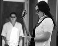
Stephanie and Steveby jdannelsComment: Another lovely sharp image with editing that suits the subject well. I also like your use of DOF and on reading your description its even better knowing this is teacher looking on at pupil. Great stuff :o) |
| Photographer found comment helpful. |
| 10/20/2006 08:02:38 PM |
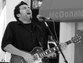
mahonby jdannelsComment: Great 'action' shot. I like your editing here, the image is nice and sharp and you have managed to isolate the subject from what is a fairly busy background. Nice one :o) |
| Photographer found comment helpful. |
| 10/20/2006 07:52:39 PM |
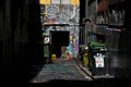
welcomeby boysetsfireComment: Lovely light on the graffiti. I would have taken at least a couple of steps forward here so that the foreground was not all shadow and you lost the uninteresting bins (trash cans?) on the right handside. I think the doorway with the graffiti surrounding it makes a fantastic subject on its own and I'd like to see it a little closer up :o) Is this a place you can revisit? |
| Photographer found comment helpful. |
| 10/20/2006 07:49:11 PM |
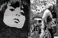
bleeding beautyby boysetsfireComment: WOW! what a cool image! Great background you have found here, your editing is really nice and the movement of lady walking past helps add a sense of the old and the new to this shot. Only thing I am not too sure about is if you could have got more straight on with the background, you appear to be at a very slight angle and although not really off putting it is slightly noticable. Where abouts is this? :o) |
| Photographer found comment helpful. |
| 10/20/2006 07:43:52 PM |
MWS sketch.jpgby jpochardComment: Great composition and your editing really works well with the subject. The only thing I find slightly distracting is the white (light?) on the left by the guys neck, for me its just a little too bright and draws attention away from the subject. Again, cool editing though :o) |
| Photographer found comment helpful. |
| 10/20/2006 07:41:30 PM |
Skyline Silhouette web.jpgby jpochardComment: Definitely agree with your commenters suggestion, a little less water makes this image that much better. I like the colours in the sky and water. I am a little distracted by the 'stadium' on the left handside of the frame, just by cropping half of it out I find the silhouette is more pleasing to the eye (just my humble opinion) :o) |
| Photographer found comment helpful. |
| 10/20/2006 07:36:38 PM |
Hustlerby jdannelsComment: Love the look of concentration on her face :o) Your editing is really good here, suits the subject and 'mood' in the shot nicely :o) Great composition, possibly like to have seen slightly more of the table to the right but other than that great shot! :o) |
| Photographer found comment helpful. |
Home -
Challenges -
Community -
League -
Photos -
Cameras -
Lenses -
Learn -
Help -
Terms of Use -
Privacy -
Top ^
DPChallenge, and website content and design, Copyright © 2001-2026 Challenging Technologies, LLC.
All digital photo copyrights belong to the photographers and may not be used without permission.
Current Server Time: 05/09/2026 02:37:15 AM EDT.