| Image |
Comment |
| 09/23/2009 12:50:19 AM |
Red Arrows by joekentComment: Congrats Joe! This was one of my favourites in the challenge :-) |
 Photographer found comment helpful. Photographer found comment helpful. |
| 09/21/2009 04:52:56 AM |
Coffee Breakby dsniderComment: Is the girl the thing that is supposed to be in focus here? I think this would have benefited from having her looking towards the camera so we, the viewers, could engage with your subject a bit better. Also, I don't like the way her hands a chopped off at the edge of the image. |
| Photographer found comment helpful. |
| 09/19/2009 10:05:37 AM |
I'm still standingby snafflesComment: I like the vibrant colours here but feel the composition isn't right, the image is far too busy. This is just MHO. |
| Photographer found comment helpful. |
| 09/19/2009 10:04:46 AM |
9 centsby RunzamukkComment: The background is extremely distracting here and it would have been better if the coins were completely in focus. This is just MHO. |
| Photographer found comment helpful. |
| 09/19/2009 10:01:14 AM |
Fantasia Nineby liangdaweiComment: Nice colours in the 9 but I am finding the background quite distracting at the bottom of the frame and I can't work out whether this is in focus or not. |
| Photographer found comment helpful. |
| 09/19/2009 10:00:09 AM |
Starship 200oby riversongComment: I'm afraid I can't see how this is connected to 9 at all, maybe I am missing something really obvious? The pinks/reds work well against the blue and the image is nice and sharp, but, for me this DNMC sorry. |
| Photographer found comment helpful. |
| 09/19/2009 10:00:05 AM |
Passersbyby MelethiaComment: For me, the composition is a little too busy and I am struggling to see how this image is connected to 9? |
| Photographer found comment helpful. |
| 09/19/2009 10:00:02 AM |
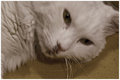
Livesby raishComment: I'm afraid this is completely out of focus which is quite distracting. I would have liked to see a better chosen composition, maybe with just the cats face with focus on the eyes. This is just MHO. |
| Photographer found comment helpful. |
| 09/19/2009 09:58:17 AM |
|
| 09/19/2009 09:51:52 AM |
Vibrant Nine'sby Kempostudent3Comment: I'm afraid I don't like the way this image has been processed at all, if anything your editing has made this shot worse rather than improved it...and I haven't even seen the original! The background is very distracting and I think this would have worked better if you just had one section with dots, not both. |
Home -
Challenges -
Community -
League -
Photos -
Cameras -
Lenses -
Learn -
Help -
Terms of Use -
Privacy -
Top ^
DPChallenge, and website content and design, Copyright © 2001-2026 Challenging Technologies, LLC.
All digital photo copyrights belong to the photographers and may not be used without permission.
Current Server Time: 05/06/2026 02:31:58 PM EDT.