| Image |
Comment |
| 12/23/2002 09:23:30 PM |
Poker nightby snsComment: Yours is one of the better game shots. I particularly like your sneaky low angle and the use of blur to draw attention to the cards. A well executed image. |
| 12/23/2002 09:21:27 PM |
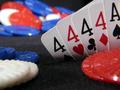
Oops! Sorry! Miscoun........by Harz_JoergComment: There are a lot of obvious card shots in this round. But yours stands above the rest with an actual story. Very nice touch with the smokin' 6 gun and the four corner theme. 8 |
 Photographer found comment helpful. Photographer found comment helpful. |
| 12/23/2002 09:18:56 PM |
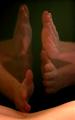
Four of a Kindby kandyjComment: Yes this is a cliche. But you have doane a great job of expressing a family. A warm gentle story. Nice skin texture for the most part. There is a slight plastic feel to the baby hands ( small nit pick...sorry). This is my fav shot for this week. Fab job....8 bullwinkle
|
| Photographer found comment helpful. |
| 12/20/2002 07:48:29 PM |
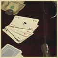
Shaken, not stirred... by AleciaComment: A superb tabletop image. Very dramatic lighting ( you can\'t go wrong with red ), no disturbing highlights, perfect DOF and a lovely touch with the spiral reflection. Some folks might like a little motion/action in the shot. But I think the bold shapes simply stated will get you among the top 10 this week. Very professional image..8 bullwinkle |
| Photographer found comment helpful. |
| 12/20/2002 07:47:49 PM |
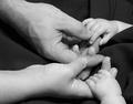
My healing hands: massage therapyby kosmikkreeperComment: An excellent portrayal of your occupation. I love your implementation of motion in the image. It absolutely gets your intended message across. I would like to see more of these type of images as opposed to static tabletops. The black background is a perfect typical choice. In a perfect world I would wish for a little more skin texture or shadow play on the back. This is a wonderful photo..8 bullwinkle |
| Photographer found comment helpful. |
| 12/20/2002 07:46:31 PM |
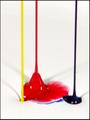
Sherwin-Williams Paint, Ops Mgrby falveyComment: The concept is well taken. Graphic bold simple images seem to be the way to rack up points here at DPC. So you are on the right track. I would have chosen a lighter colour blue. I am asking for the impossible for more swirly effect in the other colours besides red to bring visual motion/impact there too. But that would be another 100 shots later. I would be happy with one set or even no grey shadows on the white ( sorry for being so bloody picky over nothing ). This is a good image well on the way to becoming an excellent shot. Keep up the great work...7 bullwinkle |
| 12/20/2002 07:38:41 PM |
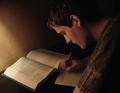
DeoxyribonucleicWHAT?! The Life of a Studentby KonadorComment: There are a LOT of elements that make a well felt mood. The browns in the wall,papers,clothes and face really tie the picture together well. I love how you melted the hair,book and shirt into the shadows to focus attention on the notes. The face skin texture is absolutely heaven perfection. The hint of hand motion breaks up the static elements ( this is very, very good!).I like the worn edge on the textbook and the triangle of elbow that repeats the other triangle elements. An excellent portrait....8..bullwinkle |
| Photographer found comment helpful. |
| 12/20/2002 07:31:06 PM |
Booksellerby andrewmComment: WOW! Talk about a graphic concept. Hit you on the head image happening here. You could not make a more bold statement if you tried. Nicely arranged pages. White against black...you can't get more visual angst than that. I would like to have a ghost hand turning a page for the human element. But that would be messing with perfection. Travesty. A good concept spoken well...7...bullwinkle |
| Photographer found comment helpful. |
| 12/20/2002 07:25:52 PM |
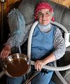
Happily Retired Grannyby camelotnorthComment: This is a really grand down to earth person picture. A comfortable country chuckle. A beautiful illustration. I particularly like the black tooth ,vacuum snake, red hankie hat, blue pullovers and home touches of lamp and wood panelling. I would like to personally see more abuse and grit on the frying pan to keep in character. And some scuffs and wear on the clothes. Well done...7 bullwinkle |
| 12/20/2002 07:19:17 PM |
Doctor for a dayby xertionComment: This image has the ingredients for a great image. I like the folds in the white jacket, your keen chioce of blue overshirt,blue pen and blue steth with the red accent. As a humble suggestion I would have gone in a little tighter. Perhaps just the right side only with one lapel,pens , steth and white shoulder folds against black negative space. The red steth really steals attention so I would snake that ever carefully into a "power" position. This is a pretty darn good image...7 bullwinkle |
| Photographer found comment helpful. |
Home -
Challenges -
Community -
League -
Photos -
Cameras -
Lenses -
Learn -
Help -
Terms of Use -
Privacy -
Top ^
DPChallenge, and website content and design, Copyright © 2001-2026 Challenging Technologies, LLC.
All digital photo copyrights belong to the photographers and may not be used without permission.
Current Server Time: 07/16/2026 10:24:05 PM EDT.