| Image |
Comment |
| 03/14/2007 08:22:23 AM |
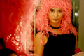
Pretty in Pinkby moviemanComment: I think a better title would have been, man I feel like a woman. I think that the overall photo was voted down more for subject matter than with the overall technicals of the photo. I know when I look at this during voting, It really suprised me to see this photo. I gave you a 6 BTW.
The six I gave was because of the soft tones on the face and the light spot in the upper right of the photo, and I found the actual hair (not the reflection) in the foreground slightly distracting. I do like the lighting and the composition overall. A bit deeper DOF would have helped the facial area and the hair in the foreground I believe.
I think you will do very well in the cross dressing challenge, but IMO, I do not think this was expected and caught speed voters off guard.
Hope this helps,
Rich |
 Photographer found comment helpful. Photographer found comment helpful. |
| 03/14/2007 07:12:50 AM |
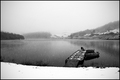
Day 12 - North Pondby meyersComment: The fog over the buildings in this photo is what first catches my eye, It is very thick and dense. Not to say this is a bad thing, but I wonder how it would look without so much denseness to it and we could see a silohuette or outline of the entire buildings. The imcompleteness of the building got my mind wandering up in the sky instead of leading into the frame
As for the scene before me, I think you did a good job capturing the wither solitude of this place, the white balance is nice, I love how some of the trees have the snow still in the branches. However, I wish there had been a bit more contrast in the sky.
I wonder also what this would look like in portrait mode? I think a bit of a crop off the left and the bottom may help a bit in lanscape mode. IMO, the thing that is missing for me in this shot that was in the fall one is the foreground subject.
Hope this helps.
Rich |
| Photographer found comment helpful. |
| 03/14/2007 06:37:13 AM |
Restedby BenComment: First, I love the feling of the snow falling in this photo. It gives a very subtle feel to the photo. I have looked at this on 3 monitors now, 1 of which was uncalibrated, which gave you some processing rings to the photo that are not there on a calibrated monitor. On the laptop monitor,(lower video resolution) the sky was more washed out. On my calibrated monitor, the overall photo is evenly light, maybe a bit bright in the sky. YOu could try to tone it down a bit with the burn tool.
I like the compostion, and the diagonal created with the platform in the water. I would however take a small crop off the bottm and a very slight one on the right hand side to force the platform and the dingy on to the lower right 3rd.
Overall I think this is a really nice photo, taken down by really nice photos in the free study and possibly people who are picky of their skys.
Hope this helps.
Rich |
| Photographer found comment helpful. |
| 03/14/2007 06:29:40 AM |
disconnectedby PhilComment: This photo reminds me of a scene from a horror movie that is a childs face fading to black, I cannot remember which one. This is a very powerful image. I like the lighting done on the pupils to have them stand out from the dark. I love the post processing done on the face to give the dirty look.
Honestly I wouldnt change a thing I think the exposure is dead on if the above is what you were going for and I love the compostion of the portrait.
I wonder if this would have done well in the low key challenge.
Hope this Helps.
Rich |
| Photographer found comment helpful. |
| 03/14/2007 06:25:28 AM |
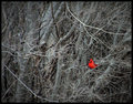
Color-of-Winterby JamesKWComment: Cardnials are beautiful birds. I like the feel of the desaturated tones with having one major contrasting color over mostly natural colors. In my opinion, though the shot is very beautiful the cardnial gets lost in the mix of branches and tree trunks. A tighter crop would bring more attention to the beauty of this creature.
With that being said, about this photo. The composition and postioning of the bird is nice, the tonatilty is very good as I have already stated. and the detail and sharpness is good. Again IMO, I would have like to seen more of the bird, maybe to get a bit of detail in the feathers or wings.
Hope this Helps.
Rich |
| Photographer found comment helpful. |
| 03/13/2007 07:55:25 PM |
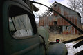
awaiting spring rains (re-edited)by shutterpuppyComment: The first thing I want to point out considering we are practicing our post processing technique is, see on the car there is a red light on the wheel wall, there is a halo around this. It normally is caused by oversharpening.
I like the composition of the car, the car not only leads your eye into the frame as a diagonal but acts as a leading line to the barn as well. The sky was processed well. The burning done to bring out the blues color looks real.
Overall it has a very oldish feel to it, dont know how to explain it better than almost the forgotten. This may look good as B&W also.
Hope this helps.
Rich |
| Photographer found comment helpful. |
| 03/13/2007 07:47:08 PM |
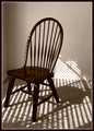
chairby bvlindalouComment: First thing first, I like the boarder you chose to place around the photo. It compliments the color of the chair well. I like the composition and positioning of the chair, with the slight diagonals created by the feet of the chair.
I feel, IMO, there isnt enough negative space on the left hand side. I like the shadows on the carpet that are diagonals cutting through the chairs shadow as well I think this adds to the feel of the overall photo.
The lighting on the back wall is a bit harsh and the the outlet on the same wall is un-needed. Clone out the outlet and maybe try a bit different shutter speed to tone down the highlights on the wall a bit. The lighting on the chair is very nice.
Overall, if you were to put this into the furniture challenge it would have scored in the 5.7-6.2 range. Its a nice photo.
Hope this helps,
Rich |
| Photographer found comment helpful. |
| 03/13/2007 07:30:57 PM |
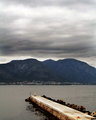
the pier.jpgby danica22Comment: I like the composition of the peir, the slight angle of it gives a great feel of depth, I also like the reflection of the peir into the water. The sky in this shot does not add to the overall photo I would crop this a bit and still have the same feel to it. I think this shot would do allot better if there was more light to it as I think you would get more detail in your mountain and the sky may add to the overall photo.
One more thing and I do not know if its me or just whats going on in the photo, but for some reason the horizontial seems a bit crooked to it. I do not know if it really is or not but it does feel like it.
Hope this helps.
Rich |
| Photographer found comment helpful. |
| 03/13/2007 07:25:14 PM |
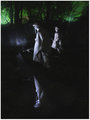
Reflections of War - Korean War Memorial.jpgby jpochardComment: I like the image overall, I like the lighting on the statues and the ability to see some of the background colors. The relfection in the water is beautiful. The only true thing that bugs me are the spotlights in the middle background. They do fight for attention a bit. I think the composition would be a bit better IMO, however if you had taken a few steps to the left hand side and got rid of the higher lighting area on the left in the background. But really this is the only thing I would change.
Hope this helps.
Rich |
| Photographer found comment helpful. |
| 03/13/2007 07:57:37 AM |
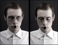
Style Fighterby lowonenergyComment: This set of portraits are decently done, I do see a bit of background noise but thats not a major issue and my be caused by the conversion for the website.
The lighting on the right side of the body seems a bit harsh, if you look at the hem line at the shold you cannot make it out, I think this is is cause by overexposure or to much light at that point. The lighting in the left photo also causes the eye to be darker and brings out the circles under the eye as well.
The post processing on the photos is good, I like the feel of the B&W ambience in the photo, I just think balance of the lighting would co along with with the tonality of the skin that you are dealing with.
Hope this Helps,
Rich
|
| Photographer found comment helpful. |
Home -
Challenges -
Community -
League -
Photos -
Cameras -
Lenses -
Learn -
Help -
Terms of Use -
Privacy -
Top ^
DPChallenge, and website content and design, Copyright © 2001-2026 Challenging Technologies, LLC.
All digital photo copyrights belong to the photographers and may not be used without permission.
Current Server Time: 06/26/2026 03:08:31 PM EDT.