| Image |
Comment |
| 01/25/2010 01:11:25 PM |
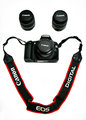
smile for the cameraby Eagle40Fox2Comment: Hi from the Critique Club
First impressions of the shot are that it meets challenge and is composed well.
The plain white background helps with the interpretation of a face but it also makes the shot quite sterile. I think this is the main reason the score was under 5.5. On a technical level there isn't much to say about the shot other than that the lighting could be improved on the camera body a little. Other than that it's fine.
For DPC it's just lacking a bit of "wow" that would get it up to a 6. |
 Photographer found comment helpful. Photographer found comment helpful. |
| 01/24/2010 01:44:19 PM |
Reaching For The Skyby DrakeComment: Hi from the Critique Club
First impressions are that the shot is done well. There is nothing overtly wrong with it. It has interesting composition and leads the eye well. The tones are nice.
For DPC there is a lacking element in the shot, that's the "wow" that a lot of your lighthouse shots display.
As for meeting challenge I think it lacks in that looking at your profile you don't see a shot like this easily. If you had taken a wide angle shot then yes, it would yell  Drake Drake. I am assuming this is a lighthouse.
This shot may have been a candidate for a dramatic B&W processing perhaps?
|
| Photographer found comment helpful. |
| 01/24/2010 01:39:31 PM |
Juggling The Creative Energyby ColeyComment: Hi from the Critique Club
When I saw this shot I knew it was yours. Your style was written all over it. I feel that the B&W is a bit harsh, especially when compared to your other B&W entries - maybe it's just because there is so much black in this one.
Other than that I can't find much to comment on regarding technical elements.
Overall this is a good shot that meets the challenge well but other than illustrating your style fails to grab the viewer in the same way that many of your (ribbon winning) shots do.
|
| Photographer found comment helpful. |
| 01/21/2010 07:39:28 PM |
Strandedby phooztComment: Hi from the Critique Club
First impressions are that the processing is over the top. That may sound strange given DPC often likes that but in this instance it feels wrong. Perhaps because the image is so narrow. Why is that?
The subject feels crammed into the frame, although general composition is good.
Once I look at the shot for a while (something many voters may not do) I see that the tones are good. It's really just the reds in the shipwreck that seem too much. I know it's a shipwreck because you said it was - otherwise I'm not sure it's that obvious. That would have hurt the score a bit.
I feel that if the shot was another inch or so higher then you'd have got a much better score. |
| Photographer found comment helpful. |
| 01/21/2010 03:43:01 PM |
arithmetic decayby GiorgioBaruffiComment: Hi from the Critique Club
My first impression is that the shot is that it is busy and I'm not sure exactly what I'm looking at.
Composition is not great as there are two major elements fighting for our attention.
Lighting, as observed by your one comment in voting, could be more flattering.
For DPC the trick is not to just get a shot the meets the challenge but also to make it interesting so that we stay and look a while. You've managed this in some of your other challenge entries, but not in this one :(
Gerry |
| Photographer found comment helpful. |
| 01/21/2010 03:36:58 PM |
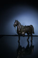
Horse of a thousand dreamsby snafflesComment: Hi from the Critique Club
My first impression is that the shot is nice and clean but something feels "off". I think that the negative space is not used to good effect, the subject feels small in the frame and we are drawn to look around but the nothingness isn't helping us get into the shot.
The lighting is very good. The focus seems a little out as the horses head seems OOF.
It's not obvious (to me) at first glance that the leg is missing and the horse is broken. Does he have it tucked up in some prancing fashion perhaps? In any case, some voters may ask "did it work to start with" - you can never tell what voters think!
Overall a good shot, probably deserved a higher score than it got.
Gerry |
| Photographer found comment helpful. |
| 01/19/2010 09:50:09 PM |
Please...by mshimer5Comment: Hi from the Critique Club...
My first impressions are that the shot is composed ok, although a square crop may have worked better as the area at the top of frame doesn't really enhance the image. There also seems to be a bit of noise showing.
Focus seems ok but there is an overall lack of sharpness to this shot.
If you could have got the dog to look towards the camera then we may have connected with the shot a bit more.
In summary, an ok shot that scored around what it deserved on DPC. Great subject, Good execution, Below average technicals. Work on those and you'll have the DPC formula!
I also suspect that not having a person as a model didn't help the scoring with those voters who expected people rather than pets. |
| 01/06/2010 03:04:06 PM |
|
| Photographer found comment helpful. |
| 01/06/2010 03:03:08 PM |
|
| Photographer found comment helpful. |
| 01/05/2010 02:03:19 AM |
|
Home -
Challenges -
Community -
League -
Photos -
Cameras -
Lenses -
Learn -
Help -
Terms of Use -
Privacy -
Top ^
DPChallenge, and website content and design, Copyright © 2001-2026 Challenging Technologies, LLC.
All digital photo copyrights belong to the photographers and may not be used without permission.
Current Server Time: 06/22/2026 07:27:19 AM EDT.