| Image |
Comment |
| 02/06/2003 12:07:14 PM |
Hello yesterday....by niwedimagesComment: Great title. Very ingenius. I really like the photo and the concept of it. But personally, and I said personally I have some problems. I don't really go for this DOF thing so many like. To me this whole thing should have been in as good of focus as the can on thel eft. It is great. Also the rounded background leaves dark triangles at the top two corners, very distracting. The shadows on the focused can are too dark, as is the end of the can. I realize you went with a loft of "correct' photography techs. This is why I believe they are rules of thumb and not laws, as do a lot of people. To me this one, because of the concept and your obvious photographic abilities, could have been a 1st place winner, with a score of 10. As it is it really should be scored very low. But I am going to give it a 6 because the concept is so good, it meets the challenge, it is different and unique, I really do love the whole idea, and I can see a lot of potential that is obvious you have thea ability to do. This is not my norm on comments or score but feel is warranted by this photo. I really wish you the best. This one is a perfect example why we should shot what we really like. |
 Photographer found comment helpful. Photographer found comment helpful. |
| 02/05/2003 10:38:21 PM |
Homework? What homework????by snsComment: This is neat. His right eye and the right side of his mouth look like he is saying something and getting ready to wink at you. I wish you had left a ittle more on the top of the photo. It appears a little of the head, not much but a little, was cropped off. Beautiful dog and really nice photo. Just zoom out a little for me. |
| 02/05/2003 10:35:15 PM |
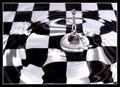
Two Classics by JackoComment: I don't understand this one. But I don't really like what I see. It's just not appealing to me. I think it is supposed to be water, thats why the background is not smooth. And I don't know what is in the center. It's just not personally my kind of photo. |
| Photographer found comment helpful. |
| 02/05/2003 10:32:29 PM |
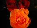
Another damn flower pictureby anelaComment: These roses do not look the same color, but I could be wrong. The two from the side in the background appear read and the main one looks orange or dark peach. This is disturbing and distracting. Also the 2 read ones are buds and this one appears opened up. Part of each flower was cropped off by doing such a tight crop. I feel they should have been left whole. The open rose is a very soft focus, as soft as the other 2. With them in the background I feel the main one should be brighter as yours is but also sharper focus. To me the only difference appears to be the amount of light. But I could be wrong. Pretty roses anyway. |
| 02/05/2003 10:24:51 PM |
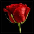
Happy Valantine's day, dear! by miracComment: I've got to know why put the water on a rose. I, personally, think it is as pretty without and don't feel it adds anything. Just wandering. To the photo. Personally I feel there is too much stem, without anything on it. I would have cropped it just below the rose itself or left some of the green sticking up the stem. I do like the background and think the rose is beautiful and in great focus. I personally like to see the photo from the end of the rose or angled so I can see the end. But that's just me. This is a really good photo of a great flower. |
| Photographer found comment helpful. |
| 02/05/2003 08:13:32 PM |
Screen Door Portraitureby greenem2Comment: This gives a really neat effect to the photo. It makes it look like it is printed on canvas. Hate the 2 little holes in your screen. Bet you didn't know they were there until you took the photo. This is a really neat, good photo. Great intuition and way to color outside the lines. I like it. |
| Photographer found comment helpful. |
| 02/05/2003 08:10:10 PM |
A Rose by any Other Name...by bdshortComment: There's only one other rose that comes close to this one and it may be a tad better, (or not) It has a little lighter background which make's it stand out just a tad more. But you both will get the same score of 10 because there is nothing more beautiful than a perfectly shaped rose photographed perfectly. And I'm not sure which one I like the best. How's that for a comment. I know it's not really helpful but it is true. As is the 10 you get. |
| 02/05/2003 08:01:56 PM |
Churchillby MorganComment: As beautiful as I expected: dog and photograph. He looks so regal laying here so perfectly. Beautiful rich colors and beautiful cropping job. He looks like this is a normal place to lay, or possess. He is absolutly beautiful. It's easy to take a 1st place photo when you have a 1st place subject. Not fair. Great job. |
| Photographer found comment helpful. |
| 02/05/2003 07:55:53 PM |
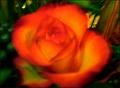
Just another Roseby jab119Comment: Beautiful peach rose. Leave off the water. Tops as it is. The beauty is in the rose. Background should be totally black or real soft light color. This could be a beautiful piece of art. Well done. Really nice focus and cropping. Perfectly shaped rose in perfect condition. Nice one. The more I look the better I like this. Also decided the background should be solid the color of the botom right corner or soft light color. Had to up the score to a 10. |
| Photographer found comment helpful. |
| 02/05/2003 07:48:39 PM |
|
Home -
Challenges -
Community -
League -
Photos -
Cameras -
Lenses -
Learn -
Help -
Terms of Use -
Privacy -
Top ^
DPChallenge, and website content and design, Copyright © 2001-2026 Challenging Technologies, LLC.
All digital photo copyrights belong to the photographers and may not be used without permission.
Current Server Time: 07/19/2026 11:01:58 AM EDT.