| Image |
Comment |
| 02/07/2003 08:30:04 AM |
E Type Jaguar 1961 Just add sales textby PaulkComment: When I get my breath back I'll comment. dream, dream, dream. Wish it were blue and mine. I couldn't afford the upkeep, but can dream. I really like the background. Nice job of capturing the beauty of this automobile. Perfect advertisment photo. Sell it to them, and give me the car. I'll give you a 10 for the car. |
 Photographer found comment helpful. Photographer found comment helpful. |
| 02/07/2003 08:26:18 AM |
Manhattan Beach Januaryby spidermanComment: Love the way you kept the sun from blinding you, and us. Great idea. Not so sure I like all the red. Is this the natural color it was? Good composition, nicely focused and cropped. Really like the talllllll tree. Normally wouldn't, but for some reason it looks good here. Love everything but the color. For me personally, I'd play around with the color some. |
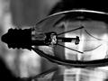
| 02/07/2003 08:22:56 AM |
Tungstenby theonlysilentbobComment: I'm wondering why landscape instead of portrait. Upright with all of the bulb would have been more fitting, I would think. Is that a reflection? It is not clear enough, therefore is distracting. The background being a solid color would have shown off the bulb so much better, in my opinon. That way there would have been nothing else to fight for your attention. Not sure this color tone worked to your advantage. Not sure what would have been better, though. I really do like your concept very much and think it could be a very interesting photo. Just needs better execution. Keep at it. |
| 02/07/2003 08:17:36 AM |
Bearly an Angel!by 3boyzMomComment: Too tightly cropped. The cross on the right side fits the photo well but can hardly been seen. In fact being as dark as it is, it is really a distraction. It's like a part of the background that shouldn't be there, as is the wall or whatever it is leaning against. Instead you should have made the background solid white. Either have it in, clearly visible or totally out. Sounds like I'm saying I don't like the photo, but it is just the opposite. I really do, or would, if this was changed. I really like close ups except when they chop up the subject. Zoom out some and add a little light and this is beautiful. |
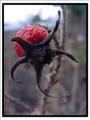
| 02/07/2003 08:12:13 AM |
When Roses Are Not In Bloomby Ricky CleaveComment: This really looks good. Don't know where you got the idea but it is fantastic. Gread DOF and nicely focused. What is this made of anyway. Can't quite figure it out. Belongs in the top. |
| Photographer found comment helpful. |
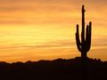
| 02/07/2003 08:09:46 AM |
Cactus Clicheby ArtifactsComment: Beautiful. Was the sky really this orange. I love it any way. I love silouitted shots. Well done. |
| Photographer found comment helpful. |
| 02/07/2003 01:08:05 AM |
Urban Youthby JPRComment: You sure captured that one and titled it correctly. The church down the road always has a ton of kids playing basketball on all 4 courts in the parking lot. Call me crazy but this appears to be covered in snow, including the basket ball. I know I'm not seeing things. This is great. Good focus, light, etc. it's an 8 |
| Photographer found comment helpful. |
| 02/07/2003 01:00:43 AM |
Up a Treeby kevinswopeComment: Love the angle of this shot. This makes the photo. Doesn't even need the title. Would liked to have seen the whole thing in focus, personally, or crop off the lower part that isn't in focus and leave the top. That would even be better. The more I look the better I like, (still prefer the bottome cropped of.) The rest if real good. Congratulations. I rally like it. |
| Photographer found comment helpful. |
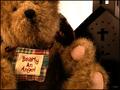
| 02/07/2003 12:57:02 AM |
Grandma's favoriteby kenboComment: This would make a great greeting card, maybe a birthday card for a grandchild from grandmom. You put a lot of thought into this. Really good photo. Cropped t to tightly. Besides that 1 things bother me.One is the tag or whatever on the left side. Maybe if I could read it I would see that it fit the photo. The other thing is what is sticking out from behind the bears head. Other than these things this is a fantastic photo. Good job. Spot clean these things after the challenge and you have a wonderful greeting card. |
| Photographer found comment helpful. |
| 02/07/2003 12:52:37 AM |
"This too... Shall Pass..."by sfarrell23Comment: Great play on scripture. Fits the photo and the photo fits the cliche. It's also a good photo except for the shadow. It cuts out the whole end of the football. Very good focus and great color, very natural and vivid. Only problem is the shadow. Otherwise great one. |
| Photographer found comment helpful. |
Home -
Challenges -
Community -
League -
Photos -
Cameras -
Lenses -
Learn -
Help -
Terms of Use -
Privacy -
Top ^
DPChallenge, and website content and design, Copyright © 2001-2026 Challenging Technologies, LLC.
All digital photo copyrights belong to the photographers and may not be used without permission.
Current Server Time: 07/18/2026 03:18:33 PM EDT.