|
|
|
Showing 1221 - 1230 of ~2617 |
| Image |
Comment |
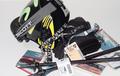
| 12/21/2002 10:20:34 PM | I'm a 64 year old ski bum/ski guide.by jimsappComment: I'm a 58 year old bum who wished she could ski and can't guide a mouse around the computer program. Good shot, clear, sharp, well composed, just too tight of crop on the top and bottom. I agree with your side edges. A strong 7. PTL |
| 12/21/2002 10:17:06 PM | Creative Thinkingby briancComment: The idea is wild. Don't see a particular readon for the cropping. Wish the whole thing had been in focus. I think that would have added at least 2 more points to it. Even like the shadow. I flat out like this - the idea more than the technology. I'll hvae to give you a 7 for it. PLT. I enjoyed the laugh that much. Thanks |
| 12/21/2002 10:13:20 PM | Booksellerby andrewmComment: I like this! Nothing exciting or intricate but I like it. It's diffferent. I would never have thought of this, nor would many others if they'll admit it. Good focus, perfect cropping. Love the arc. It kills me to say this, with the way I feel about B&W, but think it might have been good in B&W. Maybe not for this challenge but I think people would really look long and hard then. Still very good. Worth an 8 to me (Might have been a 10 in B&W but don't tell anyone I said so. PTL |  Photographer found comment helpful. Photographer found comment helpful. |
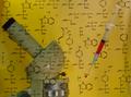
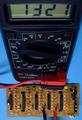
| 12/21/2002 10:09:40 PM | New Genes Cure Diabetesby BullwinkleComment: I have several thoughts on this one. Both items should, in my opinion, either be behind the chart or infront of it. Too distracting as it is. I know what a syringe looks like and want to see the machine unobstructed. And would like to have seen more of the machine. Like the chart, it is really neat and unique, but as placed is too distracting. Good idea just needs better execution, I feel. Good focus and good subject. As is I give it a 5. PTL |
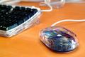
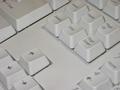
| 12/21/2002 10:04:32 PM | Desktopby bstewartComment: If the mouse is what you are shooting, the key board should not be there, and is just distraction. The mouse is uniquely showing colors from the light, looks good. If the whole thing is what you are shooting you have very poor focus. Do like the table they are on. As is, is only worth a 4. PTL |
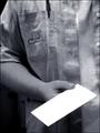
| 12/21/2002 10:01:32 PM | The Post Manby AnthraXComment: Doesn't look like this one is addressed either. Could be way, way far, up in the front, I guess. Not trying to be a smart-aleck but this photo shows you are one who mails stuff, not the mail man. So I'm really not how sure your title is correct. Yes, this is nit picking but then that's what voting on these is. It's a fairly good shot, all in all. Good light, nice composition, little too soft focus on the hand, white envelope blown out, but still not bad shot. Worth a 6. PTL |
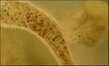
| 12/21/2002 09:57:15 PM | Detecting Osteoporosis: How Strong Are Your Bones?by tjuneau13Comment: Awesome shot. Is this a picture of an xray or what? I hope you tell us. And how strong is a bone like this? Doesn't look strong at all. By the way I like the photo. Not sure what ii is a photo of can't really justly judge it. But I like what I see - it's clear enough for me to see so I'll give it a 6. PLT |
| 12/21/2002 09:41:05 PM | Homeby hartlComment: Needs better focus. Must be a reason for just these keys, but darned if I can see it. Home? Sorry but only a 1. PTL |
| 12/21/2002 09:38:34 PM | Priority Mailby MarklaneComment: The way I see this one. You should have had better focus with the angle you took the shot. Really too much you or not enough of you. I know that sounded stupid but that is just what I meant - either one istead of what you have. You appear to be as much the subject as the letter - which by the way is addressed to no one, has no stamps, or "priority markings". These are pretty big things with this your subject. So have to mark down for them also. Good idea just bad execution. Sorry. I really hated to point these out. Can only give a 2, and that is for the idea.. PTL | | Photographer found comment helpful. |
| 12/21/2002 09:33:51 PM | Test Engineeringby paynekjComment: Strangle angle to the meter. But you know what - I kinda like it. It's different. Good thight crop, but maybe you shouldn't have cropped it quite so close at the top. Good focus. Beautiful colors. To nit pick the material is a little wrinkled on the left = draws you attention to it away from everything else. Good lighting. Over all good shot. Worth a 7. Would have been an 8 but not real "wow" or interest drawing quality. PTL. |
|
Showing 1221 - 1230 of ~2617 |
Home -
Challenges -
Community -
League -
Photos -
Cameras -
Lenses -
Learn -
Help -
Terms of Use -
Privacy -
Top ^
DPChallenge, and website content and design, Copyright © 2001-2026 Challenging Technologies, LLC.
All digital photo copyrights belong to the photographers and may not be used without permission.
Current Server Time: 07/25/2026 07:52:13 AM EDT.
|