| Image |
Comment |
| 12/24/2002 06:16:03 PM |
4by ndsComment: Very simular to one in another challenge. Personally feel that the light in the room is a little too bright. Also think the face should have been shadowed in darkness like the rest of the body, but that's just my opinion. Still will give it a 6. PTL |
 Photographer found comment helpful. Photographer found comment helpful. |
| 12/24/2002 06:12:46 PM |
Ready for Santaby vtruanComment: Unique looking fireplace. Think you should have moved back and gotten more of it in the photo. Would have given some warmth to the photo. As is is just 4 plain stockings hanging. With more of the fireplace would have said a home with 4 anxious little ones excitedly waiting. But will give it a 5. PTL |
| Photographer found comment helpful. |
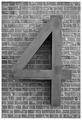
| 12/24/2002 06:09:28 PM |
BIG Fourby DougPazComment: Probably should have done this in color to give it some dazzle to keep it from being so plain. Bet the bricks look nice. The show up so clearly. The 4 looks like it could be a nice wooden one. Nice crop right in the morter joints. Technically right but lacks appeal. 6 is as high as I can go. PTL |
| Photographer found comment helpful. |
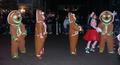
| 12/24/2002 06:06:14 PM |
Holiday Treatsby CreativeFlyPhotoComment: Where di you ever find these? A parade? And at night. Good focus, lighting, cropping, etc. Technically good, just doesn't grab me and say "wow". But then that's probably me. Can't cut you for that. It's a 7. PTL |
| 12/24/2002 06:03:05 PM |
Look Ma, four handsby GinaRothfelsComment: From the thumbnail I didn't like this at all and really didn't even want to open it. Just being honest. But now that I see it, it is really a neat statue. I don't particularly like the purple background on the dark blue statue. And I would liked to have seen all of it. I don't particularly like photos of other works of art, but this is ok. No real personal appeal to everyone maybe and the background is very hard on me. But I still must give you at least a 6. PTL |
| 12/24/2002 05:58:43 PM |
Greenby lamedosComment: Not bad. Like the black background. Good focus. decent placement. Kinda like the bright green then shadows of dark. Not a bad composition, just not "jump out at you wow". Still a 7 for the technicals and thought put in. PTL |
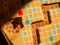
| 12/24/2002 05:55:52 PM |
4X4by catpixelComment: x4x4. You forgot 2 of them. I really hate to comment on a photo with such good focus and thought put into it. BUT here goes. I do not like the angle of the board; the shadows are terribly distracting, especially on the upper left hand corner; the lighting could be much better; the cropping is for I don't know what. The left hand corner should have been cropped out, as well as the dark place on the left upper corner, and right lower corner. I realize you cropped at an angle to keep from having a boring straight up and down square but it just didn't work here, in my opinion. If you were going for thirds, you could have accomplished that with cropping from just one square outside the up and down fourto one square below the whole thing to the right one square outside the r to one square above the top right four. That would have worked better in my opinion. Just a thought, but I will give you a 4 for the focus. PTL |
| Photographer found comment helpful. |
| 12/24/2002 05:44:00 PM |
4 sucks, 0s are better :-)by angelComment: I realize you have 4 zeroes. Personally I believe the price per gallon should have been shown, just for the realism factor. The writing on the right should have been cropped out all the way or all the way in. I love the color and the focus, but these other things need worked on. Can't give more than a 5. PTL |
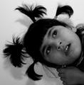
| 12/24/2002 05:25:49 PM |
Upside Down Kinda Day?by svitalComment: Cute but a little too dark, especially on the bottom side. I like the idea and the B&W. Good focus and cropping. Really like the angle of her head. Just needs better execution. Still a 5 is not really bad. PTL |
| 12/24/2002 05:23:32 PM |
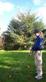
Fore! Fore! Fore! Fore!by Wheeler1992Comment: What are the "4" red things behind (?) her? They almost look like what she is trying to hit on the ground. They are too distracting, rather than adding to the shot. The shot is a little too light or bright, I can't figure out which. And the sky is a little washed out. While the grass at her feet is really dark. Wish I could tell you haow to fix this stuff. But I can give you a 5. PTL |
Home -
Challenges -
Community -
League -
Photos -
Cameras -
Lenses -
Learn -
Help -
Terms of Use -
Privacy -
Top ^
DPChallenge, and website content and design, Copyright © 2001-2026 Challenging Technologies, LLC.
All digital photo copyrights belong to the photographers and may not be used without permission.
Current Server Time: 07/26/2026 01:54:57 AM EDT.