| Image |
Comment |
| 01/04/2006 01:25:21 PM |
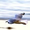
The Shape of Perfect Flightby GIS_boyComment: I love this shot. One thing that bothers me is that I cant see the birds head, the eyes in the shot would have made this a 10. I gave it a 7 |
 Photographer found comment helpful. Photographer found comment helpful. |
| 01/04/2006 01:22:01 PM |
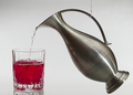
Classic Curvesby hughletherenComment: I like the photo and the colors but the string holding the object up is really distracting, might have tried some monofilimant fishing line so it would blend better, otherwise its a great photo. 6 |
| Photographer found comment helpful. |
| 01/04/2006 01:19:03 PM |
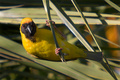
A Weaverby tonyvComment: Greetings from the Critique club. First off let me congratulate you on an amazing shot. I really like this. Although I didnt vote this challenge, I would have scored it an 8 or 9. As far as why it didnt score very well, alot of voters may not know that the sibject is named weaver, BTW I beleive that is a Southern Masked weaver, but thats not your fault. Now on to the critique.
Great compostion, very good focus, and I love the colors. SHallow DOF works very well here. The only thing I might have sugested was bumping the color up a bit. I think the voters really like colors that flash and jump out to them, maybe play with the hue or saturation on the yellow and make the bird jump out a bit. Overall a great job, and I am kind of surprised it didnt score above 6. Good luck on future challenges. |
| Photographer found comment helpful. |
| 01/03/2006 01:31:16 PM |
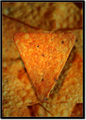
The CRISPiest Chip In The Bowlby sajinComment: Greetings from the Critique Club. After reviewing your photo I think you have met the challenge pretty well. Technically you have a small DOF that makes your main subject stand out and ask for the attention of the viewer. It has good focus and I like the border, it seems to add to the photo.
A couple of points I think could be improved, centering the subject doesnt seem to work well here, you could have moved the object to the corner of the photo and had the object come out of the corner, might play with different crops to see it. Also the angle on the light adds a bit of a distracting shadow behind the object, perhaps an light angle that moves the shadow to below it might have worked better. And the back ground being the same color as the foreground kind of blends it all together, maybe some different colors in the background to help your object jump out a little more. Overall good job and good luck with future challenges. |
| Photographer found comment helpful. |
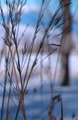
| 01/03/2006 12:11:40 PM |
Winter Grassby linda12201Comment: Greetings from the Critique Club. I have studied your entry and have some thoughts on it. First off you have met the challenge technically real well. Your photo definately shows a shallow DOF, well done. I voted this photo a 6 during the challenge.
A few points that might help you bring the score up for the next challenge. The main image is lacking the pinpoint type of focus on the main object that seems to be required to score well here on DPC. Your main subject is also a little dark. I would recommend playing with different lighting to help that out. The background while blurred is still a bit busy. Try and get the composition of your photo how you like it, and then step back and look at the background and see if you can get the view you like with a background that adds to your entry. And the last note is to try and remember to always use the maximum allowable size of 640 for the longest side of your entry. This alone would have brought up your score in my opinion. Well done and good luck with future entries. |
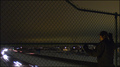
| 01/03/2006 10:34:52 AM |
Alone with autophobiaby MQuinnComment: Greetings from the Critique club. After viewing your photo and trying to decide what I like and what I think could be better here are my conclusions. I think that you have portrayed a fear to the viewer well through parts of your photo. The subject against the fence alone at night portrays that very well. It sets a mood and the lighting is well done perhaps a single light on the subject could have helped. I think that the cars are a bit distracting and take away from the "alone" theme. Had the cars not been in the photo I think it would have done a better job of portraying the feeling of being truly alone. Rules of thirds are pretty well followed, however choosing a different spot without the top post of the fence going off view could have helped. Perhaps cropped the fence top post off so all you can see is the fence across the screen. The shot is a little dark, I think that perhaps the lights on the cars may have messed with exposure a little. Overall I think you did a pretty good job, and am kind of surprised that it didnt score a little higher. Good luck. |
| Photographer found comment helpful. |
| 01/02/2006 09:57:53 PM |
I'm scared of Balinese statues; Garuda and Puppetsby pa_cuthbertComment: Greetings from the CC. I think your photo shows true fear. The expression of the subject adds to that. Rules of 1/3rds applied pretty well. Now on to the critique part.
The color and lighting seem very flat and maybe even a bit noisy, not sure if that was intentional to try and set the mood but I think it takes away and doesnt add to the photo. The composition is pretty good, however the wall and cabinet? in the background appear to be leaning and take your focus off the subject. I realize that moving the statues may not have been an option, however moving the subject to take away distractions in the background may have helped score better along with the lighting change. Good luck with future challenges. |
| Photographer found comment helpful. |
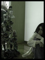
| 01/02/2006 09:41:51 PM |
All eyes on youby nico_blueComment: Greetings from the CC. Wow an oppurtunity to Critique a great photo. The photo has true emotion to it. I can almost feel the fear of the chair. The lighting sets the mood well. And over all a well done photo as usual for you. A few things do distract me about it, but they are nitpicky. The white pieces of dirt around the floor do distract a bit. And the almost blown out part of the desk at the upper left of the photo. I think the name of the phobia in the title might have helped a bit, however the title you gave it is powerful and fits very well so its hard to say. |
| Photographer found comment helpful. |
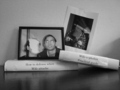
| 01/02/2006 09:25:10 PM |
Wife-o-phobia (or Agliophobia- Fear of pain)by zxaarComment: Greetings from the CC. This is a funny shot. With a good poke at humor. Black and white works well. However the challenge was to let your picture relate a fear or phobia and relate the fear to the viewer. I'm not sure a light hearted attempt worked well with this challenge and I think your score reflected it. Photos taken of other photos generally dont do well. The flash reflection on the photo takes away from what you have in the photo. I think the photo scored just about where I would have voted if I had voted this challenge. Taking a more serious approach to a serious challenge will net you better scores. Good luck.
|
| Photographer found comment helpful. |
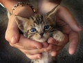
| 01/02/2006 08:42:59 PM |
Fragilityby dinodeano89Comment: Greetings from the CC and welcome to DPC and the challenges. First off let me tell you what works well with your photo. You have definatly caught the viewers attention with the cute cat. The blue eyes are a point that draw the viewer in and want to keep the attention. The title is pretty good as well.
Now on the the critique. The challenge shallow depth of field points to a small field of sharp focus with the background and possibly foreground blurred out to maintain the viewers attention on the focal point. In my opinion this image doesnt have that, the background and the foreground are almost all in focus. The bracelet on the wrist holding the cat is distracting. To help with shallow DOF, you need to focus closer and take the background further away from the subject to create some blur. Overall a pretty good score for your first entry here on DPC. Good luck with future entries. |
| Photographer found comment helpful. |
Home -
Challenges -
Community -
League -
Photos -
Cameras -
Lenses -
Learn -
Help -
Terms of Use -
Privacy -
Top ^
DPChallenge, and website content and design, Copyright © 2001-2026 Challenging Technologies, LLC.
All digital photo copyrights belong to the photographers and may not be used without permission.
Current Server Time: 07/16/2026 03:35:12 PM EDT.