| Image |
Comment |
| 05/04/2009 08:29:44 PM |
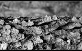
Slow Motionby BujanxComment: Loved the humour in this. Brilliant idea and expertly shot. Congrats for the PostLumie! |
 Photographer found comment helpful. Photographer found comment helpful. |
| 05/04/2009 08:27:28 PM |
flutterbyby posthumousComment: Ha, turning a dpc cliche on its head! What could be more poetic? |
| Photographer found comment helpful. |
| 05/04/2009 08:23:09 PM |
~ V a q u e r o ~by hihosilverComment: I will echo everyone's sentiments on this. It most certainly captures the spirit of the challenge. Just a pity we can only view it at this size here. |
| Photographer found comment helpful. |
| 05/02/2009 11:28:36 PM |
|
| Photographer found comment helpful. |
| 04/29/2009 07:31:58 PM |
The Pipeby Ecce_SignumComment: Oh hey, just saw this masterpiece now, congrats for the Posthumous Blue! |
| Photographer found comment helpful. |
| 04/29/2009 07:27:51 PM |
|
| Photographer found comment helpful. |
| 04/29/2009 07:00:19 PM |
Clarissa's Wristsby JimiRoseComment: I connected with the shot because of personal experience. So for me, the concept of 'happy, pretty young girl with ugly injury/disability = not quite right' came through loud and clear, and I voted highly.
One thing that did occur to me however, was the method of b&w conversion. Her complexion looks too waxy and lip definition is almost non-existent (which is an important consideration because her smile plays a big role here). Using the red filter (and max white) when converting to b&w will typically cause this to happen.
The low score could just be a simple matter of folk not liking the edit. These days, with people complaining about comments and angry pm's, not many will risk telling you they don't like your artistic choices... Message edited by author 2009-04-29 19:01:00. |
| Photographer found comment helpful. |
| 04/27/2009 06:49:30 PM |
|
| Photographer found comment helpful. |
| 04/27/2009 06:39:12 PM |
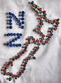
Where im fromtby keriboiComment: lol@ Steve's comment
Originally posted by Yo_Spiff:
New jerZey? |
You realise of course Dane, that most Americans have never seen a map, much less know what New Zealand looks like ;) j/k.... or not.
Nice idea for a challenge like this one. Still might be worthwhile re-shooting with stock photo usage in mind. Try replacing the white background with blue. That way, if there are any creases/shadows, they'll just represent ocean waves. I would suggest changing the colour of the tacks to red and white for the country outline (making a connection to the flag with red/white against blue) and maybe black for the letters NZ?
p.s. If you ever realise you've made a title typo after a challenge has already started, just contact SC and ask them to change it for you. They're a pretty cool bunch and usually quick off the mark :) Message edited by author 2009-04-27 18:44:53. |
| 04/27/2009 01:33:44 AM |
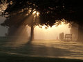
Skimmingby MelethiaComment: I'm always late to the dang party! Great choice Deb. The light bouncing up under the wing, adding a subtle glow, is what tips the scales for me. Beautiful and most definitely poetic. |
| Photographer found comment helpful. |
Home -
Challenges -
Community -
League -
Photos -
Cameras -
Lenses -
Learn -
Help -
Terms of Use -
Privacy -
Top ^
DPChallenge, and website content and design, Copyright © 2001-2026 Challenging Technologies, LLC.
All digital photo copyrights belong to the photographers and may not be used without permission.
Current Server Time: 07/19/2026 10:04:09 AM EDT.