| Image |
Comment |
| 09/02/2003 12:16:12 AM |
|
| 09/02/2003 12:14:57 AM |
|
 Photographer found comment helpful. Photographer found comment helpful. |
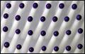
| 09/02/2003 12:13:39 AM |
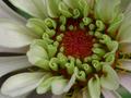
Naturallyby katlynComment: Looks like a bunch of little "9"s. Pretty interesting. The picture itself (quality) isn't that good and looks a little out of focus and low lighting. |
| Photographer found comment helpful. |
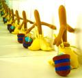
| 09/02/2003 12:12:23 AM |
Fashion line upby AnastasiaComment: It's cool but should have shot it so there's less of the black on top and more of the clothes on the bottom showing. Great light and contrast, really good. |
| Photographer found comment helpful. |
| 09/02/2003 12:11:01 AM |
|
| Photographer found comment helpful. |
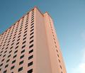
| 09/02/2003 12:08:21 AM |
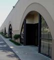
"Windows"by tfarrell23Comment: Should have cropped several inches from the right side I think. Really cool color in the building however and fits challange well. But this should defintely be more of a "portrait" sizing and not square. |
| Photographer found comment helpful. |
| 09/02/2003 12:04:51 AM |
|
| 09/02/2003 12:03:18 AM |
Hair Brushby JackoComment: Oh.... great idea and well done! The blue tips are very strong against the white of the brush. Great!! 8. |
| Photographer found comment helpful. |
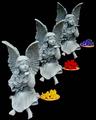
| 09/01/2003 11:58:02 PM |
Adagioby DougPazComment: The contrast seems a little weak. You should use Levels to strengthen it a little. |
| 09/01/2003 11:56:42 PM |
|
Home -
Challenges -
Community -
League -
Photos -
Cameras -
Lenses -
Learn -
Help -
Terms of Use -
Privacy -
Top ^
DPChallenge, and website content and design, Copyright © 2001-2026 Challenging Technologies, LLC.
All digital photo copyrights belong to the photographers and may not be used without permission.
Current Server Time: 07/22/2026 07:42:52 AM EDT.