| Image |
Comment |
| 05/13/2003 03:49:01 PM |
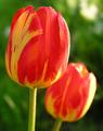
Painted Tulipsby inspzilComment: Very good flora shot. I would like to see some blue in this shot, but since there isn't, I will just have to admire the clarity and composition of what is presented. The use of shallow DOF makes the shot more interesting to look at. The time of day the shot was taken helps create a nice soft even lighting on these flowers. Well done. 8 -danny |
 Photographer found comment helpful. Photographer found comment helpful. |
| 05/13/2003 03:46:41 PM |
"Cahoots"by casualguyComment: This is one of the better paint pics. The lighting is well done to minimize reflections. The yellow seems hot to me, perhaps tuning down the saturation for yellow might lessen that. The composition is cool the way the paints flow together in that pattern. Good pic. 8 -danny |
| 05/13/2003 03:44:17 PM |
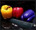
Primarily Peppersby kirbicComment: I must say, this is very interesting to look at. Your presentation is very nice. The lighting may need to be diffused some and some of the negative space in the top of the frame could be cropped out, but other then those two items, you have a nice shot that would make a good print. 8 -danny |
| Photographer found comment helpful. |
| 05/13/2003 03:39:53 PM |
Balloonsby WILDBLUEComment: So well done in lighting that you can't make these out as balloons. I also feel that this challenge needed representation of all 3 primary colors. The saturation and lighting are perfect! I like your abstract approach as well. Nice shot! 8 -danny |
| Photographer found comment helpful. |
| 05/13/2003 03:38:21 PM |
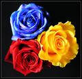
Primary Rosesby kiwinessComment: Your composition and layout are nice. The colors on the black work to make a powerful impact on the viewer. I would like to see the saturation turned down a little. It's almost to much as the blue looks too hot. Nice shot. 8 -danny |
| Photographer found comment helpful. |
| 05/13/2003 03:34:53 PM |
Primary Peppersby ToddhComment: Nice clear colorful picture. I'm sure I'm not the first to say it, but I'd prefer the stem pointing at the yellow top. As it is now, it draws my eye out of the frame instead if inward towards the other pepper. Your colors and saturation is well done. 8 -danny |
| Photographer found comment helpful. |
| 05/13/2003 03:33:40 PM |
Primary Windsby K-RobComment: I like the composition and presentation of the flags. The blue sky with the clouds makes for a nice backdrop. I would like to see you boost the saturation a little, but be mindful of possible noise it may introduce. 8 -danny |
| Photographer found comment helpful. |
| 05/13/2003 03:30:44 PM |
Blue Potby DennisFComment: Excellent flora! The combination of lighting from front and back make for a pleasing warm shot. I like how the tips of the inside part seem to sparkle. Your composition is good and the abstract in the blue adds interest. 8 -danny |
| Photographer found comment helpful. |
| 05/13/2003 03:27:36 PM |
Primary Ropeby KazComment: This has a familiar feel to it. :-)
I like your composition and colors. They make this a strong shot. I also like that the blue and red rope have the other colors innertwined. Good work! 8 -danny |
| Photographer found comment helpful. |
| 05/13/2003 03:25:56 PM |
Rain, Rain, Go Away!by DougPazComment: Precious shot! Only thing I would change is a tighter crop on the right side so that the girl isn't in the dead center of the frame. Other then that, excellent work! 9 -danny |
| Photographer found comment helpful. |
Home -
Challenges -
Community -
League -
Photos -
Cameras -
Lenses -
Learn -
Help -
Terms of Use -
Privacy -
Top ^
DPChallenge, and website content and design, Copyright © 2001-2026 Challenging Technologies, LLC.
All digital photo copyrights belong to the photographers and may not be used without permission.
Current Server Time: 06/12/2026 02:57:46 AM EDT.