| Image |
Comment |
| 05/19/2003 07:36:30 AM |
|
 Photographer found comment helpful. Photographer found comment helpful. |
| 05/19/2003 07:35:47 AM |
|
| Photographer found comment helpful. |
| 05/13/2003 11:46:57 PM |
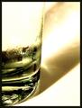
8 Ouncesby sherComment: I like the abstract nature of this shot. The composition is great. 8 -danny |
| Photographer found comment helpful. |
| 05/13/2003 10:46:08 PM |
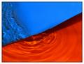
BYR Ballsby dacrazyrnComment: This is a great concept. I'd like to see a reshoot where a fill flash is used from below and the lighting above is lower in the sky. I think that the symmetry presented here is strong. 7 -danny |
| Photographer found comment helpful. |
| 05/13/2003 10:44:15 PM |
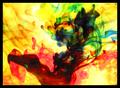
Medleyby greenem2Comment: Wonderful abstract! The saturation of the yellow then the bursts of red and blue make a wonderful pattern. Did you try flipping the picture so the blue was on the left side of the frame? I wonder how that would change the feel of the shot? Would it make it calmer or more turbulant? Good effective picture. 7 -danny |
| Photographer found comment helpful. |
| 05/13/2003 10:42:09 PM |
Recurring Primariesby MalokataComment: Nice crisp shot. The use of lighting is very effective in setting the mood. GOD I hate laundry! The perspective seems to be going down hill to the left to me. Perhaps a different angle would have lessened it. Good work. 7 -danny |
| Photographer found comment helpful. |
| 05/13/2003 10:39:54 PM |
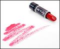
Cinnamon Redby StevePaxComment: Simple, high key used effectively. I would like to have seen the other primary colors included. The leading line from the lipstick on the paper to the lipstick works nicely. 7 -danny |
| Photographer found comment helpful. |
| 05/13/2003 10:37:18 PM |
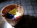
Unwrappedby friscaComment: I like the simple concept of this shot. I do feel that a tighter crop and the light being angled differently or bounced off a near by object would help with the hot spot on the package. The ribbon is a nice touch and adds a human touch to it. The package being turned so that the folded side is less visible would also put a more polished feel to it. 7 -danny |
| Photographer found comment helpful. |
| 05/13/2003 03:52:00 PM |
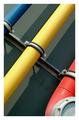
Tubesby RemieComment: I like the use of colors and shadows in this abstract. The presentation is simple and I feel the angle of the pipes makes for a strong picture. Well done. 8 -danny |
| 05/13/2003 03:51:06 PM |
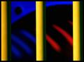
The Zooby FrooberComment: Very well done abstract. I like the use of shadows and tones throughout. Your focus may be a little soft on the yellow bars, and the crop could stand to be tighter on the right to mimic the black space on the left. I have no idea what this is, but you made a very nice presentation out of it. 8 -danny |
| Photographer found comment helpful. |
Home -
Challenges -
Community -
League -
Photos -
Cameras -
Lenses -
Learn -
Help -
Terms of Use -
Privacy -
Top ^
DPChallenge, and website content and design, Copyright © 2001-2026 Challenging Technologies, LLC.
All digital photo copyrights belong to the photographers and may not be used without permission.
Current Server Time: 06/12/2026 01:27:25 AM EDT.