| Image |
Comment |
| 02/03/2003 07:46:57 AM |
|
 Photographer found comment helpful. Photographer found comment helpful. |
| 02/03/2003 07:43:13 AM |
|
| Photographer found comment helpful. |
| 02/03/2003 07:40:29 AM |
|
| 02/03/2003 07:28:36 AM |
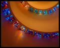
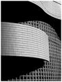
Helical Illumination by crabappl3Comment: Thanks everyone. And thanks GoodTempo for going out shooting with me that day. If you all didn't notice there are two views of this same window treatment and there were two of the same door handles in squares.
This was a lucky find and to get a ribbon with it is just fantastic! |
| 01/31/2003 09:09:23 AM |
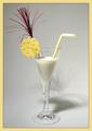
Cheers!by elgominComment: Critique Club Comment:
Excellent composition! I like the added cheese wedge on the rim of the glass. Reading the comments below, seems people either liked or disliked the shadow, those who disliked it probably don't realize the difficulty of lighting this shot. You have done well with your one diffused light. Your glare on the glass is nonexistent, and you have no areas in the background that stand out as too bright. I really like how you've centered the shot and added the festive color.
The only thing that really stands out for me is your choice to use F/2.8 with such a close shot. Would a smaller aperature of F/8 have worked better so the whole straw would be in focus? Some shots work well with a large aperature, but when being in this close, and with so much detail, in my opinion, it's best to capture as much as you can within your camera's limit.
All in all, I like this shot. Your studio work is done well!
Now, where are my cookies to dunk into this?
-danny |
| Photographer found comment helpful. |
| 01/30/2003 10:27:17 PM |
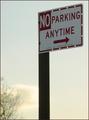
"NO" means "NO"by dimitriiComment: Critique Club Comment:
What we have here is a sign. Nothing wrong with it just being a sign, but the shot doesn't have anything that grabs my attention. The head on perspective although technically off to the side, and the pole being in the middle of the frame leaves my eye nowhere to go. The cloud and tree in the background could be used to enhancee this shot. By including more of them and less pole, you'd be contrasting the cold sharp edges of the sign with the curves and natural elements presented around you.
Technically the photo is sharp. The F/stop blurring the background gives good focus on the sign. Your lighting is a little soft on the sign and the colors are muted. Doing some manipulation with your software to make the sky deeper blue and the clouds warmer would help make this a stronger composition for me.
You have all the elements available to make this a stronger shot. Perhaps try some reshoots at different heights and angles to see if you can make the statement "NO" means "NO" stand out. |
| 01/30/2003 10:11:48 PM |
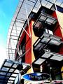
The High Streetby GinaRothfelsComment: Critique Club Comment:
The contrast of sharp angles with the curves of the overhang and street sign have a powerful impact with me. When a photographer can capture different textures and elements with in his shot, it shows me that they have an artful eye and are looking at the world from a different perspective. Your shot here shows just that. The bold oranges with the cool blue contrast beautifully to the eye as a perfect marriage of warmth and cold. The cold is further carried into the metal of the structure while the warmth is seen in the highkey of the sky and reflections off of the building.
Techinically I think that you have a very sharp picture. There is some edgies on the white curved part that are probably do in part to your compression of the image. I also am a little distracted by the noise in the sky. Both of those do not however take away from a strong composition.
This is a good shot! Keep them coming! |
| Photographer found comment helpful. |
| 01/27/2003 04:01:14 PM |
Wall of Windowsby NatashaComment: Nice abstract shot. The tones and lighting are perfect. I love the flow of the curved shadows against the square of the windows. Well done, in my top 10 this week! |
| Photographer found comment helpful. |
| 01/27/2003 04:00:27 PM |
|
| 01/27/2003 03:59:41 PM |
All Closed Upby JeanComment: Colors texture, contrast are all very nice. This is one of my top 10 this week. Good job! |
Home -
Challenges -
Community -
League -
Photos -
Cameras -
Lenses -
Learn -
Help -
Terms of Use -
Privacy -
Top ^
DPChallenge, and website content and design, Copyright © 2001-2026 Challenging Technologies, LLC.
All digital photo copyrights belong to the photographers and may not be used without permission.
Current Server Time: 06/11/2026 08:09:09 AM EDT.