| Image |
Comment |
| 02/24/2003 10:39:02 AM |
|
| 02/24/2003 07:52:01 AM |
|
| 02/23/2003 02:27:11 PM |
Grandstand Piano Keysby DougPazComment: Very unique perspective. This is a good shot with very good leading lines. It's in my top 10 this week! |
 Photographer found comment helpful. Photographer found comment helpful. |
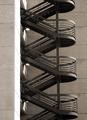
| 02/23/2003 02:26:01 PM |
Up The Wallby ShiiizzzamComment: The curves presented here in contrast to the hard lines of the building make for a nice composition. I also like the crop at the top and bottom, it is a very pleasing symetery. Your decision to desaturate was also good, it makes the steel of the stairs seem that much cooler. Great shot, in my top 10 this week! |
| Photographer found comment helpful. |
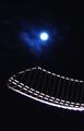
| 02/23/2003 02:23:51 PM |
Moon Rythmby amonteforteComment: I like the combination of the moon with the cold steel structure. This is a very nice shot! It's in my top 10 this week! |
| 02/23/2003 02:22:57 PM |
|
| Photographer found comment helpful. |
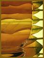
| 02/23/2003 02:21:30 PM |
Harmonyby JeanComment: Excellent use of refraction. The pattern is unique and so clear. Excellent lighting. Perfect shot! In my top 10 this week! |
| Photographer found comment helpful. |
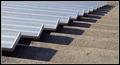
| 02/23/2003 02:16:26 PM |
Structures of an Old Factoryby nathaliedooComment: Critique Club Comment:
You really have a nice perspective here. The combination of the cold steel with the cool blue sky are a nice combination. Without being able to modify the perspective in post processing, this angle is good. Your decision to square the tunnel at the end works well. My eye is drawn to it and it makes me wonder whats beyond. Your technical skill is good. There are no artifacts or over sharpening problems. I like the colors here, they make me feel small within this structure. I'm not sure a square crop was the best decision here, but you probably chose it to exclude some undesirable building on the right.
You have a strong shot here! Good Job!
-danny |
| Photographer found comment helpful. |
| 02/20/2003 04:25:10 PM |
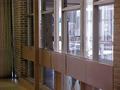
ghostby DustinComment: Critique Club Comment:
Nice idea and well executed! I like you concept here. The 'waldo' is clearly seen, but by being translucent not the main focus of the shot. Your angle and composition are good. Might work stronger at a sharper angle so as to block out the divider from the left side of the shot. Being that you are working with light from outside as well as inside, your metering is good. The balance between light and dark is good. You have a little noise in your shot, but not enough to distract.
Good originality and execution. |
| 02/20/2003 04:18:42 PM |
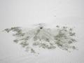
Are You There?by dasein06Comment: Critique Club Comment:
Try as I might, I do not see a 'waldo' in this picture. Being that the subject of the contest was to hide person in an otherwise personless photo, I think you hid him to well. That being said, the rest of the photo doesn't really grab my attention. The focal point is the hole in the absolute center of the frame. The dirt pattern is interesting but not enough to have your viewers attention captured. Lighting and focus are good as well as post processing compression and sharpening.
Keep submitting and keep shooting! I see this is your first entry... Glad to have you on board! |
Home -
Challenges -
Community -
League -
Photos -
Cameras -
Lenses -
Learn -
Help -
Terms of Use -
Privacy -
Top ^
DPChallenge, and website content and design, Copyright © 2001-2026 Challenging Technologies, LLC.
All digital photo copyrights belong to the photographers and may not be used without permission.
Current Server Time: 06/11/2026 08:09:14 AM EDT.