|
|
|
Showing 431 - 440 of ~8888 |
| Image |
Comment |
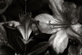
| 04/06/2011 10:01:49 PM | S p r i n g T i m eby chelseaXOXOComment: Greetings from the Critique Club! You requested an in-depth critique of your image, and here it is:
This is a beautiful image in many ways. The flowers are poetic and tragic in their beauty; the tones are soft and gorgeous; the depth of field is interesting to the eye, leading in and out of focus.
However - for the challenge Edward Weston, it's not really fitting. I will try to illuminate why. Weston uses a deep depth of field - that means everything is in the same degree of focus (sharp) throughout the entire image. Even in his closeups, he has a degree of distance, so the viewer can approach the subject. He uses predominantly pure black and white, as well as deeply contrasting tones. His subject is in the frame in its entirety (for the most part). Your image doesn't follow any of these conditions, which is probably why it did not receive a very good score.
If I may recommend, take a look at Weston's body of work, and take a look at the top 10 scoring images in this challenge - that might give you an idea of the style that was sought after for this round.
I feel your work overall has a strong artistic tendency, which you should really continue to pursue. With some technical improvement I think you could become a remarkable photographer.
Best wishes,
Alicia
|
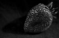
| 04/06/2011 04:53:57 PM | berry goodby disassociationComment: Greetings from the Critique Club! You asked for an in-depth critique of your image and here we go:
I like your choice of subject - something so recognizably red in B&W. The lighting is also pretty good.
There are a few challenges, which are reflected in your score:
Edward Weston uses deep depth of field in his images, so everything is in the same amount of focus. In your photo, you used a shallow depth of field, so only a part of the strawberry is in focus. Your 18-55mm might have worked better for this particular shot.
The crop is very tight - it doesn't give the viewer any room to approach the subject. Stepping back from the berry would have helped create a sense of dimension. With the tight crop, the image appears fairly flat.
The cloth upon which the berry sits is so nice and sharp that it brings attention to it, and it competes with the structure of the berry. A untextured cloth might have worked better here. Also, correcting some of the things mentioned above would have eliminated focus on anything other than the subject itself.
I hope this is useful to you!
Best wishes,
Alicia
|  Photographer found comment helpful. Photographer found comment helpful. |
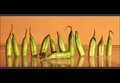
| 04/06/2011 04:44:58 PM | Fallen Soldierby glenncComment: Greetings from the Critique Club! You asked for an in-depth critique on your image and here it is:
First response is a snicker - Beans! What an idea... I wonder how you came up with it. The little ends of the beans give this a whimsical flair. The color is good, and the background color also works to compliment the green of the beans. Reflections add an extra dimension. Lighting is good, as well.
This image has no content to speak of, but then you read the title and stop short. Perhaps it's just me - but I feel the title is a bit of a non sequitur in the face of beans. The depth of field is a little off - the beans on the outer limits are out of focus. And lastly, I feel the border is a bit heavy.
You scored very well - good for you!
Best wishes,
Alicia
|
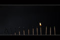
| 04/06/2011 04:36:13 PM | Tenthby stantheman1313Comment: Greetings from the Critique Club! You asked for an in-depth critique of your image and here it is:
Congratulations on placing top 20 in a very open-ended challenge. Your image is well executed as also reflected by your decent score.
The concept is good - not only 13 matches and one burning, but there is a progression in the burned matches, which creates some visual interest. The light source seems to be coming from the left, and as such illuminates the first half of the matches pretty well. Further to the right, though, the lighting is a little challenged, and I find myself squinting to make out more detail in that part of the image. The lighting or lack thereof is also what makes the right part somewhat flat. That would be my only technical critique for this photo.
Conceptionally it's cute, no real content. Here on this site that is rewarded nonetheless. The border really brings this photo together - good choice in using it as you did.
Best wishes,
Alicia |
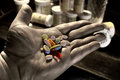
| 04/06/2011 04:28:48 PM | Daily Breadby picjunkieComment: How funny! Greetings from the Critique Club! You asked for an in-depth critique and here we go:
There's not a whole lot I could say that you haven't heard from me already. Regardless - I really love this image. It is a completely original and personal take on the challenge topic, and I can see by the comments that you hit a nerve with the viewers/voters. There are many slick images out there, but in the end, the photo that touches people is the one that counts.
Your post processing is very original and emphasizes the subject (the pills) without being pretentious. The composition is good with the angle of the hand, the background telling more of the story, and lastly the positioning of the pills themselves.
Some challenges - The lighting is a little harsh where it hits the thumb. An additional light source might have helped with that. The bottom right corner is a little distracting because of the light ridge of the table. Since this is advanced editing, you could have perhaps burned that ridge to make it blend in a little. This way the eye sort of wanders there.
Congratulations on your first entry and on a great score!
Alicia | | Photographer found comment helpful. |
| 04/06/2011 08:39:39 AM | | | Photographer found comment helpful. |
| 04/06/2011 08:37:25 AM | Horseby PaulComment: Stunning image, Paul - so glad you got the PH Blue for this! | | Photographer found comment helpful. |
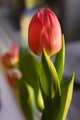
| 04/05/2011 07:00:53 PM | Spring I missed you tooby KINGComment: Hello from the Critique Club! You requested an in-depth critique of your image, and here it is:
I see your score is not bad, but also not great. In taking in the photo, I notice a few things that might explain why it did not score higher.
The topic was Focal Point, and in this case, it's obviously the tulip. The subject (tulip) is centered in the composition, and it fills most of the frame. Therefore, the eye is not lead through the image to the subject, which would be more desirable. Since there is no flow to the composition, the image appears somewhat static.
Even though the sun was setting, the light is a little harsh. In Basic Editing, some of this could have been corrected with Levels, Curves, Shadow/Highlight - depending on what kind of editing software you use.
The focus on the subject is a little soft, which presents too little contrast to the soft background.
The colors of the flower petals and the leaves are beautiful. And who doesn't love a tulip!
I hope this helps a little with future editing and composition decisions.
Best wishes,
Alicia |
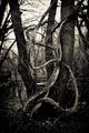
| 04/05/2011 12:57:03 PM | Time to leaveby AbraComment: Hello from the Critique Club! You requested an in-depth critique and here it is:
You have captured a great urban grittiness. I think the high ISO worked in your favor here. The contrast between the ornate building elements on the left and the raw wall and rebar on the right is wonderful. But of course it's about the birds, and as such, the image is very cohesive, bringing the eye directly to the subject, which is suitably light and sharp (you know... besides the motion blur). The perspective - slightly from above - really gives the photo a lot of depth.
Normally I'm a frame hater, but in this case, the frame adds a finishing element, making the image more artistic than journalistic.
I love the tones of the image as well - and the light/dark contrasting areas.
What could be improved? Compositionally, the image is somewhat long, placing the birds in the center. I see where you wanted to include certain elements, so changing the layout would have sacrificed parts of the building ornaments. After holding my hand here and there to see how that would have worked, I wonder if a tighter crop wouldn't have been beneficial.
Hope this is of some value to you.
Alicia | | Photographer found comment helpful. |
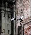
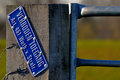
| 04/05/2011 12:41:45 PM | No Entry by MarvioPhotoComment: Hello from the Critique Club! You requested an in-depth critique of your image, and here we go:
The challenge was Focal Point, and you chose the sign as the main subject of your image.
The colors and clarity are very good. The background is suitably blurred to bring the focus onto the subject. At the same time, the background color is a good compliment to your subject - the sign.
The composition presents a bit of a problem: The post and the sign are one element of the image. This takes up about half of the frame. Since the topic is focal point, the focal point in your photo is somewhat large. The eye is not lead to it, it's more like you can't miss it because it's so big. The other challenging aspect of the image is that it is basically cut in half. One half is the subject and the other half is background (and some fence). This aspect of the composition keeps the whole image from flowing and makes it somewhat static. I would imagine that's why it did not score better.
However, you did get some very favorable comments. Your sharpening and color techniques are both excellent. I see this was your first entry! I hope to see more from you in the near future. I'd like to encourage you to enter often and vote a lot - both of which are excellent learning tools.
Happy shooting!
Alicia |
|
Showing 431 - 440 of ~8888 |
Home -
Challenges -
Community -
League -
Photos -
Cameras -
Lenses -
Learn -
Help -
Terms of Use -
Privacy -
Top ^
DPChallenge, and website content and design, Copyright © 2001-2026 Challenging Technologies, LLC.
All digital photo copyrights belong to the photographers and may not be used without permission.
Current Server Time: 06/22/2026 10:54:45 AM EDT.
|