| Image |
Comment |
| 10/27/2005 05:38:57 PM |
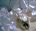
skull in lightby painthorseComment: I think the crumpled up paper creates too much texture. It causes the light to do funny things I would have like to have seen the skull only on the faux fur background. 6 |
 Photographer found comment helpful. Photographer found comment helpful. |
| 10/27/2005 01:00:01 PM |
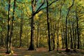
thru enchanted woods.jpgby elee3009Comment: This looks very ethereal to me. I love it. I would love to see a big print of it. The lights, shadows, colors all very nice. Message edited by author 2005-10-29 09:28:08. |
| Photographer found comment helpful. |
| 10/26/2005 11:30:02 PM |
Neon Paintby houwelingenComment: This image turned out a little light for my taste. I do love the colors and the composition. 6 |
| Photographer found comment helpful. |
| 10/26/2005 11:08:06 PM |
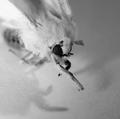
light as a featherby sodastreamerComment: This is different from any of the photos seen so far. The lighting you used created an interesting shadow that I think really stands out. I love the texture too. 8 |
| Photographer found comment helpful. |
| 10/26/2005 11:03:57 PM |
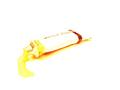
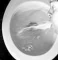
Projectile Whiteby StrikeslipComment: This would have been great for the current Shutter Speed challenge. I am not really fond of the subject material, but you have created an interesting image. 6 |
| Photographer found comment helpful. |
| 10/26/2005 11:02:14 PM |
Soft Light Doggieby kenskidComment: How sweet. I love the background. My ony issue with this image is the soft focus. This may be intentional, but I would prefer a sharper focus. Very sweet subject though:-) 7 |
| 10/26/2005 11:00:03 PM |
|
| Photographer found comment helpful. |
| 10/26/2005 10:58:34 PM |
Ghostly Mothby vtruanComment: I would have liked to have seen this in color. I think it would be very pretty. As is, I love the textures. 6 |
| Photographer found comment helpful. |
| 10/26/2005 10:57:18 PM |
Candleby merlsComment: I am not fond of this image composition. Perhaps a more head on approach would be better. Here, you lose the line and texture of the wall as well as the interesting shape of the socket. I think the candle just doesn't fit either. You did shoot light on white though, so you met the challenge. Just not a very mocving arrangement. 5 |
| Photographer found comment helpful. |
| 10/26/2005 10:54:24 PM |
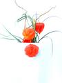
Beautyby mihaibadicComment: I love this image, but I wish the tis f the leaves weren't cut off. I also would like to see a little more of the vase outline. Very dramatic with the rich red tones. 8 |
| Photographer found comment helpful. |
Home -
Challenges -
Community -
League -
Photos -
Cameras -
Lenses -
Learn -
Help -
Terms of Use -
Privacy -
Top ^
DPChallenge, and website content and design, Copyright © 2001-2026 Challenging Technologies, LLC.
All digital photo copyrights belong to the photographers and may not be used without permission.
Current Server Time: 07/18/2026 06:47:57 AM EDT.