| Image |
Comment |
| 04/04/2006 11:57:16 AM |
Minneapolis Molineby bladComment: The first thing I notice when I look upon the picture is this man's gaze. He has this penetrating gaze that just arrests you. You managed to capture that exceptionally well. As this is the yellow challenge this composition would have been better had the man been leaning on the yellow tractor instead of that off camera orange one. His stance is great, but I would have prefered it not to be obscuring the yellow tractor nor the grille of the tractor. As the viewer, let us see more of the tools of his trade - show us more don't obscure it. The face of this gentleman has lots of character and the composition would have more visual impact if it was taken as a middle portrait shot - mainly from the waist up so as to draw more focus onto the individual and even less on the surrounding background. |
 Photographer found comment helpful. Photographer found comment helpful. |
| 04/04/2006 11:43:16 AM |
pINkTRUDER ALERTby obsidianComment: Bright, cheerful and sunny are the words that I would use to describe this composition. This photo is very much springtime picnic with a cup of tea personified:-) Yellows are bold and vibrant and that splash of pink just adds another cheerful spring color for visual interest. The reflections on the teapot are a tad distracting and a good polorizer lens would eliminate those reflections. While the white background helps make the main subject stand out it creates a stark and sterile feel that is the exact opposite of the cheery, springtime mood you are creating with the flowers & teapot. Perhaps another color that is readily associated with spring would be a better compliment to the main object present in the photo - say a solid mint or grass green background - perhaps even a bright checkerboard pattern that children's artist Mary Engelbreit is fond of using in her borders would help boast that springtime bright colorful presentation seen in your photo. |
| Photographer found comment helpful. |
| 04/04/2006 11:41:23 AM |
"April hath put a spirit of youth in everything". — William Shakespeareby XileboComment: A beautifully composed picture that upon viewing Sting's song "Fields of Gold" began playing in my head. The yellow hues of the swaying flowers dominate the scene of this composition. Part of me would like to have the flowers in the foreground in sharper focus while another part likes the soft off focus look for it adds motion to the shot. I think and feel the breeze that blows over the swaying flowers. I think the model adds visual interest as she sits and reflects in this golden field. Lastly my only critique on this piece is that I wish that she had positioned her knee to be concealed by the flowers. The reason is because it detracts from the scene in which she is surrounded by this field of flowers. The upraised knee blocks the view of the flowers behind her and breaks up the vision of her being encircled by this sea of golden beauty. |
| Photographer found comment helpful. |
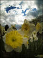
| 04/04/2006 11:28:59 AM |
Surrealistic Narcissus Pseudonarcissusby hyperfocalComment: Love the colors and presentation of the flowers in this shot! The flowers are in lovely bloom and sharp focus. Beautifully done and captured. This is a really good shot but it could be even better. As it stands now the areas of brightness and vibrancy rests more in the sky than in the properties of the flowers. Because they are in the foreground and are stereotypically brilliant and bold in hue they should be the ones that are dominating the scene with their vibrant colors. Instead their tones are more subdued and darker. My suggestion is to (if you can) manaully adjusted the settings to underexposure, and use the flash to get the right exposure on the flowers. This will give you a "studio" feel on a cloudy bright day. As an example this photographer managed to capture this //www.deviantart.com/view/30533681/ and I think you could do the same with this composition. |
| Photographer found comment helpful. |
| 04/04/2006 10:45:40 AM |
Yellow Tulipby panasaComment: This is a good photo and has potential to move out of the good category into the outstanding. Speaking of 'outstanding' the yellow tulip stands alone in at field of red tulips. You need to further categorizes this lone colored tulip as standing out from the crowd not only be color but by stance and position. The red tulip to the right obscures a small portion of the yellow tulip not to mention appears to tower over it. This overshadows the yellow tulip and robs attention away from it - which it should remain your main focus with nothing to distract or detract attention away. Positioning the yellow flower to appear in the far left hand corner would call direct attention to it and subtly move it to be 'first' in line just as long as it is in sharp focus while the red flowers tend to lose sharp focus as you move down the line. Also I love how you managed to capture this yellow flower with just one single dewdrop hanging precariously near the bottom petals. It further makes this flower distinct from the rest. Lastly I have to mention that the hues in this composition are beautiful and vibrant. |
| 04/04/2006 10:32:25 AM |
little yellow riding hoodby mandyturnerComment: Good shot and has potential. Framing is good with sharp focus on subject -the young girl under the yellow hood. Lighting is a bit harsh on her features as that there are areas where the light falls such that the rosy tones of her skin are lost. You want to keep the tones of the skin even so lighting is critical. Keeping an even, rosy tone to her face would improve the portrait's appeal not to mention play into the fairytale connection of happy, cherubic girl skipping to granny's house. If using natural lighting the best times are early morning or late afternoon because the light provides a richer warmer tones. Late afternoon and high noon typically has the harsher white light because it is the full strength of light of the day - of course cloud cover can change that by diffusing and shattering the light thus lessening the harsh lighting to subjects. Background could be better suited to the title theme by either showing green foliage or just a dark background to make the yellow hues of the hood visually pop out. Lastly, in keeping with the title theme the inclusion of the girl holding a basket would strengthen the connection to the fairytale story. |
| Photographer found comment helpful. |
| 04/04/2006 10:14:05 AM |
Early Morning Fishingby philupComment: A nice scenic fishing picture. It is a good picture and has all of the right elements but it needs a little more work for it to move into the outstanding category. First off the location and angle are good - you have the scenic background of the lake and the lovely glow of an early morning sunrise. You have a side profile shot of the fisherman such that we have a good view of what he is doing - holding the fishing pole. The problem is with the angle and location of where you choose to shot this. The barren trees in the background do nothing for the shot other than distract attention away from the sunrise AND it's tangle of barren branches help lose the fishing pole's defining shape. The fishing pole needs to be distinct and separate from those trees. If it were at all possible I would recommend finding a location where there are no trees to act as a backdrop to distract attention away from the fisherman, the fishing pole and the lovely sunrise. Next I am not too sure that the yellow outfit he is sporting is overall complimentary to the mood you want to present in the picture - serene, calm and tranquil. That yellow is overbearing to the serenity that the scene presents. I know that something has to be yellow to meet the challenge but I think you could have very easily played up those warm and wonderful yellows & oranges in the sunrise. The colors of the sunrise would become the major element that is the backdrop to just a side profile of the fisherman in silhouette. |
| Photographer found comment helpful. |
| 04/04/2006 09:53:06 AM |
The Mustard Fieldby FotoMunkiComment: A lovely shot of a young girl in a meadow full of flowers in full bloom. The picture speaks of springtime and is very endearing. Focus on your main subject is good. The little girl is in sharp focus and we can clearly see the features of her sweet face and her hands. The umbrella is a nice addition but the teddy bear textures are a tad distracting for the pattern on the umbrella competes with the patterned texture of the field of flowers. In the eye of this viewer those patterns clash and they do not compliment each other. A solid color or two-tone pattern on the umbrella would be less distracting for the composition and more complimentary to the surroundings. Lastly, the field of flowers that radiate away from your focused subject (the little girl) could be in sharper focus as well - perhaps a smaller aperature setting (8 to 16) would increase the depth of field and bring everything into sharper focus. |
| Photographer found comment helpful. |
| 04/04/2006 09:37:12 AM |
clownin' aroundby hopperComment: Those bold and vibrant colors of her hair really pop out and grab the eye's attention. The composition is good but overall uninteresting as the backdrop is bland and takes the focus away from where it should be. Your main subject shows us something very interesting - the smile she hides behind her upraised hand, the level stare of her eyes as the sunglasses fall to the bridge of her nose, that neon color of yellow & orange wig that she is sporting. That is where you want the viewer's attention to stay on. That is where the 'action'/meat of the shot lies and it is getting lost in the surroundings. Don't be afraid to get closer to your subject. I think a head shot from the lower part of her upraised hand to the the top of that hair spike would be a much better composition that would draw the viewer in and hold the attention.
This is a good shot and it has great potential if you get closer to your subject. |
| Photographer found comment helpful. |
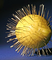
| 04/04/2006 09:28:48 AM |
S-H-A-R-Pby cheekymunkyComment: Not a prickly pear but a sour lemon whose taste appeal really pierces those taste buds. This is a very interesting composition that has potential. First off a richer deep blue (like a royal blue) would be a better background for it would it would compliment the yellow hue of the lemon not to mention make it pop visually. The blue here on the ground plane is a rather flat blue that lacks vibrancy. The lighting here is a bit harsh for you can see where it has "blasted out" some of the details on the top left half of the lemon - you can see more details in the skin (the pores) of the lemon that faces away from that harsh lighting. Showing the full lemon spiked with needles would also help with the composition - here you chop out some of the details on the far right hand side of the lemon. If you show us your full subject it makes the viewer appreciate it more. Lastly, the sharpness of this subject needs improvement. The needles and the lemon in the foreground should look as sharp as they are in the foreground. A smaller aperature setting (16 would be the best as long as you have the camera on a tripod to keep it steady while the shutter stays open for an extended time) would help with the depth of field and make things in the foreground and background appear sharp as a tack - or rather a needle as in the case here:-) |
| Photographer found comment helpful. |
Home -
Challenges -
Community -
League -
Photos -
Cameras -
Lenses -
Learn -
Help -
Terms of Use -
Privacy -
Top ^
DPChallenge, and website content and design, Copyright © 2001-2026 Challenging Technologies, LLC.
All digital photo copyrights belong to the photographers and may not be used without permission.
Current Server Time: 06/11/2026 08:30:05 AM EDT.