| Image |
Comment |
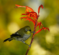
| 09/05/2006 01:12:10 PM |
Cape White-Eyeby wsteynComment: I like the square crop because it keeps a tight focus on your main subject - the bird perched on the flower. The blurred background provides the perfect backdrop for the bird to visually pop off the page. Love the colors. I know the relative size of those flowers so this is a really small bird to be perched like that - because of that I can appreciate and get a sense of scale. My only critique is that I wish the composition had captured the bird head more in profile so that we can see his eye and beak more. Picky, picky, I know - that is sometimes very hard to accomplish but if one can get the shot it does improve the appeal of the composition. |
 Photographer found comment helpful. Photographer found comment helpful. |
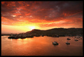
| 09/05/2006 01:05:32 PM |
Peyto Lakeby srdanzComment: I like the sweep of the mountains and the interesting textures seen on the rock face in this landscape photo. The inclusion of the foreground ground plane detracts from the appeal of the image because your main focus should remain locked tightly on the beauty of the lake and the mountains in the background. The other element that is a detraction from the visual appeal is the color of the lake itself. It appears unnatural in it's settings. The color is close to that of turquoise/bright aquamarine - not a normal lake color especially since the water would most likely reflect that of the color of the sky if anything. Here it is a flat color that shows no reflection of it's surroundings. |
| Photographer found comment helpful. |
| 09/05/2006 10:23:39 AM |
Pointe Shoes by angela_packardComment: Love this portrait shot! The lighting cast upon the subject is soft and complementry. It illuminates exactly what it needs too at the same time shining the spotlight upon the main subject. I look upon this photograph and can almost think of it as a portrait painting - a study on the life of a dancer/ballerina. All those shoes that she holds represent all her experiences as a dancer - all the untold hours spent practicing and perfecting her craft. Very visually interesting and compelling to look upon. |
| Photographer found comment helpful. |
| 09/05/2006 10:14:13 AM |
Surprise!!!by nephotoComment: Love the expression in this composition!!! A reflected surprise as you caught her looking in the mirror. The B&W was a nice choice for it heightens and calls greater attention to the focus of the shot - the expression of surprise. Had it been in color, it might have not had the same impact for the color may or may not have called attention away from the main focus. My only critique is that I wish she held the mirror out a tad more farther to get the full "O" surprise expression of her mouth in the frame of the mirror. |
| 09/05/2006 10:08:11 AM |
Pray for Surfby ShannonLeeComment: Love the golden hues of the sky but that hue continues down to the ocean color and the sand which gives the image an overall flat appearance. There is no range of tonal hues. The yellow hue of the surf and the ocean just does not look right to the eye at all - there should be some blue tones but there are not. Everything has a yellow cast and as such a normally appealing shot of the sand & surf appears flat and unappealing. I think that if you removed that yellow cast that dominates the scene (either by not using the camera filter or removing the adjustments of color levels that colored the scene) would greatly enhance the appeal of the image. |
| 09/05/2006 09:57:45 AM |
The Stareby timfythetooComment: Those colors on the tiger really pop off the screen! They are bold and rich in hue. And the stare of this majestic beast is captivating ... and frightening for he is looking at us with a hunter/prey glare. Love the composition in which you included his surroundings in the photo composition. I get the feeling that it is as if we have stumbled out of the brush and disturbed this tiger's drink. |
| Photographer found comment helpful. |
| 09/05/2006 09:54:32 AM |
Puerto de Ensenadaby postoakinversionComment: This is a beautiful waterscape shot. Love how the colors in the sky light up like fire and for added interest there are the boats that are sailing out upon the waters. My only critique is that closer to the setting sun the colors of the sky get washed out. Playing with color levels along with brightness/contrast tools could eliminate that and mak the colors more rich and vibrant in this photo. |
| Photographer found comment helpful. |
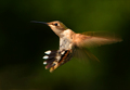
| 09/05/2006 09:48:58 AM |
Changing Directionsby RefocusedComment: Stunning capture of this hummingbird in flight. It seems caught in suspended animation so that we can fully appreciate the beauty of this tiny creature. Great still on the beating wings - one still sees all the beautiful details of the wings while the image still mantains the capture and feel of motion. |
| Photographer found comment helpful. |
| 09/05/2006 09:45:20 AM |
Baby Faceby loriprophotoComment: Love the composition on this photo. The curve/sweep of the neck as the young horse turns it's head to show us it's profile adds visual interest and appeal. The coloration of the pony is beautiful and we get see all the lovely soft detail of the pony's mane and fur/hair. |
| Photographer found comment helpful. |
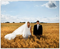
| 09/05/2006 09:39:31 AM |
Field of Dreamsby PedroComment: Love the way the sunlight plays on the wheat field for as it sways in the wind it looks like it is alight with a golden fire. Lighting is wonderful in this for it illuminates the bride & groom wonderfully. The bride and groom that stand there don't look too happy and it makes me wonder why - their expressions appear neutral. Given that this represents their wedding day I would think that they would at least be wearing a smile or be holding hands in the composition. Instead they stand apart and it makes me think that they are not at all close to each other - in fact, the stance and neutral expressions communicate an uncomfortablness between them. I am not sure that is what you wanted to communicate in this photo given the positive imagery of the title. One last insight is that that you could crop off about 20% off the top for there is too much sky/negative space that does nothing for the composition overall. A closer crop helps keep the attention more tightly focused on the main subjects. |
| Photographer found comment helpful. |
Home -
Challenges -
Community -
League -
Photos -
Cameras -
Lenses -
Learn -
Help -
Terms of Use -
Privacy -
Top ^
DPChallenge, and website content and design, Copyright © 2001-2026 Challenging Technologies, LLC.
All digital photo copyrights belong to the photographers and may not be used without permission.
Current Server Time: 06/11/2026 11:14:02 PM EDT.