| Image |
Comment |
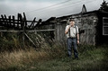
| 09/06/2006 11:04:24 AM |
Home Is Where the Heart Isby Joey LawrenceComment: I really like the look and feel of this photo. The colors and textures present give it an earthy & grungy feel that gives a really moody feel. Even though the house appears run down the man stands there and one gets the feeling he is comfortable just we he is - it is his home after all which is what the title of the piece communicates to us. The only critique I have for the this photo is that while it shows the realism of the place, those telephone wires do nothing but distract and detract. I know some would clone them out and perhaps that might be an option so that they do not draw attention away from the main focal points of the photo. |
 Photographer found comment helpful. Photographer found comment helpful. |
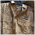
| 09/06/2006 10:45:25 AM |
Signed Khaki Shirts in Memory of Steveby sherpetComment: I think this is one of the more emotionally hard hitting of all the images I have seen. It is hard to believe that someone who displayed and lived life with such zest and enjoyment is just gone. A husband, a father, and strong spoken spokesperson for the environment & wildlife whom you could not help but smile with - is gone. I look at this khaki shirt and am moved because many people loved him for who he was and what he did for the community at large. But what is really hard is too look at, is that empty shirt - his trademark Khaki shirt that he donned - now hangs there lifeless reminding us very deeply of the loss. R.I.P Steve Irwin. He will be missed. |
| Photographer found comment helpful. |
| 09/06/2006 10:27:14 AM |
Parkedby MelethiaComment: There are alot of interesting lines and shapes presented in this abstract composition. The only thing that is a major distraction from the visual appeal of the photo is that the image is overexposed/blown out. There is a loss of tonal detail in the upper portions of the shopping carts. Many of the crossbar lines of the basket are a flat one tone shade of bright white. The brightness of the white is almost glaring to view. |
| Photographer found comment helpful. |
| 09/06/2006 10:11:02 AM |
Mother & Childby manic35Comment: Love the soft lighting and the pose of the mother & child. The soft lighting casts a gentle glow and feel to the photo. Perfect for it adds to the tender moment of the mother cradling her child. My only critique on improving the photo is that it is a shame that the shirt hides some of the baby's face. For if the shirt was not obstructing the view, the viewer would then actually see another tender moment of the child's head resting comfortably upon his mother's chest. |
| Photographer found comment helpful. |
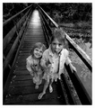
| 09/06/2006 10:03:19 AM |
Lollypopsby whiteroomComment: Lighting and contrast tones are spot on in this B&W. Love the expressions on the two girls - one adorable smile and the other happily sucking on the lolly. Interesting how the composition includes the bridge going off into 'vanishing point of the horizon line'. It is the path that the girls come from as they stand in the foreground infront of us. But I really don't think you needed to include the whole bridge as that the main focus is the two girls. Had the composition been trying to introduce a conceptual idea of 'pathways we travel' or 'life paths' then I could see a reason for inclusion. But, as I see it here it doesn't add anything to the composition and serves to distract our attention away from the human interest element which are the two girls. They are the main focus of the shot and a tighter focus and crop would keep the attention focused solely on these two. |
| Photographer found comment helpful. |
| 09/06/2006 09:48:41 AM |
Up Hillby shudderbugComment: I like the concept and the capture, but certain elements were needed to place this photo in the above average category. First off, the colors are nice and vivid. I like the slope of the hill and the long distance shot calls wonderful attention to the curve. Next the cyclist adds the human interest element - we watch as he struggles to get his bike up the slope. Now to the element that complicates and distracts - the clouds. Had it been a simple blue sky you would have a simple & clean presentation of shapes & colors. For example the composition could have the green grass and the blue sky - and the line seperating them would be the slope of the hill. Shapes and colors would be main players to make the composition visually appealing. Even more so would be the addition of another key player (which you have here), the cyclist. A crop or composition where the line of the hill slope begins just above the bottom left corner and then ends just below the top right corner of the photo would communicate the thought of a steep slope this cyclist must climb. It would also add visual interest to the viewer because we 'see' and observe his ascent to the top. This is a good shot that shows potential because you already have most of the elements there - it is just a matter of how you compose them to create a greater visual impact. |
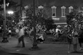
| 09/06/2006 09:32:31 AM |
The Gatheringby ecameronComment: The scene is way too busy. Yes this is a good capture of daily life but there are so many elements and things to look at that it lacks a main subject. Our eyes roam aimlessly. In the photograph, you give us nothing to center our focus on - we look for a main focal point but there is none. Calling a viewer's attention by making/choosing a main subject improves the visual impact and audience appeal of a photo. If you show us something unique or focus on something interesting to call out in this scene then you will capture your audience's attention. For instance, the sitting couple that is partially hidden behind the lamppost, they seem to be deep in conversation. Perhaps during the course of conversation, interesting facial expressions can be seen - he says something and she laughs, they look at something, smile, and hold hands. Why would that be interesting? One reason is that it shows human expression and for the viewer that can be interesting for it adds human interest to the 'story' your picture attempts to tell. This is just one example of centering and finding a main subject to be the focal point of your photograph - I am sure that in the bustling scene of activity here that there were many other opportunities. |
| Photographer found comment helpful. |
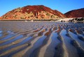
| 09/06/2006 09:20:54 AM |
Low Tideby Tap10Comment: The composition to highlight and make the shapes of the lines in the low tide the main subject makes the shot interesting. But while the concept is good the composition needs improvement. The colors on the mountain in the background appear a bit too oversaturated which tells me that this was done to get a punch of color. It does add color but it does not appear natural to my eyes. Generally it is early morning and very late afternoon hours that will give the photographer some wonderfully rich and deep tones - not to mention the potential for a colorful sky if there are clouds at that time. I believe, given the title, that the main focus was the shapes/lines of the low tide. But you have introduced another element that I think is rather distracting and detracts from the image -that is the mountain in the background. Perhaps a change in angle and tighter focus would have made a rather unique composition that moves from average snapshot into a above average shot. I.E. shoot the picture with the camera looking down at a 45 degree angle and tight crop showing the lines with just the reflection of the sky and the mountain to add visual interest & color. |
| Photographer found comment helpful. |
| 09/05/2006 02:55:15 PM |
A Magical Place by SherwinJamesComment: It has been said time and time again the lighting is spot on! The way it illuminates this flower is what elevates it into something mystical and magical. The water bubbles also add the element of magic 'fairy dust' or little dewdrops of magical light falling off the petals. Square crop keeps attention focused tightly on this magical flower while the black backdrop really allows the flower to shine and visually 'pop' off the page. |
| Photographer found comment helpful. |
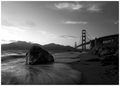
| 09/05/2006 01:19:06 PM |
S E N T I N E Lby NaldComment: This is a beautiful B&W shot of the waters of the bay and the SF bridge. I like how you composed the shot taking it from a low angle level to the rock in the foreground. This creates such a visuallly interesting photo. I see two sentinels here. The composition shows them both off perfectly for one dominates the foreground while the other dominates the background. The first is the rock who has been sitting there for countless years enduring the waves of the river. The second is the bridge that towers over the river off to the right hand side of the composition. One last note about the rock in the foreground, I love how you captured the movement of the waters for it is the sweeping motion that adds visual interest as well as movement to the piece. |
| Photographer found comment helpful. |
Home -
Challenges -
Community -
League -
Photos -
Cameras -
Lenses -
Learn -
Help -
Terms of Use -
Privacy -
Top ^
DPChallenge, and website content and design, Copyright © 2001-2026 Challenging Technologies, LLC.
All digital photo copyrights belong to the photographers and may not be used without permission.
Current Server Time: 06/11/2026 09:43:29 PM EDT.