| Image |
Comment |
| 03/01/2007 03:02:41 PM |
Songs of Loveby taljComment: The concept behind this idea is great Natayla!! But I think both you and I know that it could be better. Speaking of better, when you do get better (and you will) I think this is a wonderful concept to revisit and reshoot. The main problem with this is that the hearts are all flat and one dimensional. Mayhap staggering some nearer and some a tad further so that you can get some DOF in there. I really like how the hearts are reflected back in the CD because it strengthens the connection between the two main objects. The other thing that you could do to give the hearts more dimension is make some not quite so symetrical AND add a little color variation/shading. The shading can be relatively easy just use a slightly darker shade of red paint and a sponge and lightly dab all over the hearts. |
 Photographer found comment helpful. Photographer found comment helpful. |
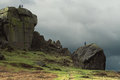
| 02/27/2007 01:45:19 PM |
Cow and Calf Rocksby taljComment: Wow, this is a fabulous place to explore and climb rocks! :-) Great photo! My eye roams amoung the tall stone 'cliff faces', the lovely greens of the grass, and the gloomy grey of that foreboading sky. |
| Photographer found comment helpful. |
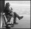
| 02/16/2007 07:37:18 PM |
DSC_0033_edited-1.jpgby alexjackComment: Saw this in the "Pick your favorite thread" and had a closer look. Absolutely fabulous candid street portrait! There is such character in the face of this man and his pose with the guitar - I sit here and wait to hear him start strumming a tune. The B&W color tones are exceptionally well balanced. Adding this one to my favorites. |
| Photographer found comment helpful. |
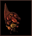
| 02/15/2007 09:01:21 AM |
Cauliflower... brain foodby asimchoudhriComment: I gotta give you credit, cauliflower really does look like the chambers of the brain. Pairing the cauliflower with the skull was a good creative move and is a visually interesting photograph. But what makes the composition suffer is that the main subjects appear in dull grey tones that really does not pop off of the black background. There is no dynamic difference in the tones of the skull and the cauliflower from it's backdrop. The color tones are flat when I know that whites of the cauliflower is much brighter that how it appears here in the photograph. I have a feeling that you mayhap did just a straight and simple Desaturation from color to B&W. Problem with the straight desaturation is that most of the time you loose the dynamic color tones. Playing with the levels in the Channel Mixer or Hue/Saturation adustments are just two ways to improve on color tones in B&W. This is a good tutorial that can demonstrate the ways to improve the image //www.dpchallenge.com/tutorial.php?TUTORIAL_ID=43
This is a good and very creative photo but it just needs more tonal variation in the main subjects to make it pop visually. Accomplish that and this photo moves from average to above average. |
| Photographer found comment helpful. |
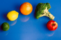
| 02/15/2007 08:43:29 AM |
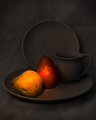
4 vs 1by BoltiComment: Your lighting on the main elements is good as well as focus. The areas where the composition is weak is in visual interest and angle. With the exception of the reflections on the blue backdrop that are a distraction this is technically a good photo - in terms of focus is good and lighting is good. But an above average or exceptional photo needs to be more than technically good - the arrangement of compositional elements needs to be visually interesting to the viewer. First off the angle of the shot is stand-offish/distant/it does not draw us in. It is an overhead shot looking down - typically that angle is used to make your main subject small or give the impression of smallness (i.e. to convey the feelings of a person feeling very small a photographer will have there model put on a sad face and shot at an overhead angle looking down -typically that photo will have alot of negative space to add a feeling of emptiness to the mood of the person feeling small & insignificant.) There is no mood in this shot so that overhead angle does not help convey any additional information. A better angle would be to bring in the viewer by shooting at level with the fruit. That level brings us closer to your subjects - it can show us details in color tones and textures that we miss from a distant overhead shot. Bring us closer to the main subject. Show us more details in the textures and tonal colors of the fruit and/or veggies and that will draw in the viewer's eye. |
| Photographer found comment helpful. |
| 02/14/2007 06:50:38 PM |
The Dunceby skewsmeComment: Heh, very cute and creatively done! Reminds me of some of the works of the italian painter, Giuseppe Arcimboldo 1527- 1593. This little man is made up of all sorts of veggies. My critique lies in the lighting. I appears too dark on my screen. Portions of the Dunce fade into shadow such that some of the outlines of the individual vegetables get lost in the shadows. Either more lighting was needed to better illuminate the vegetable man OR selective editing to either gamma correct or up the brightness/contrast levels. |
| Photographer found comment helpful. |
| 02/14/2007 10:20:57 AM |
Still Life with Pearsby nheilweilComment: Wow, the spotlighting on the pears really make them stand out from the background! In some ways this almost takes on the appearance of an oil painting. I love the look of this still life but I think it needs a tad more illumination on the pitcher and plates. Upping the gamma a tad or using a little more light would make those objects stand out a little more from their background. Hmmmm...just had a thought that adding a little more light might be problematic if you used a long exposure with light painting technique. If so then the only way to brighten up those objects a bit is to use gamma correction selectively or even brightness/contrast levels. |
| Photographer found comment helpful. |
| 02/14/2007 10:10:44 AM |
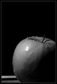
grannyby shamerComment: First off, I love the details of the water beads on the top of the apple. The main critique I have here is lighting. Half of the apple is lost to shadow. I know that it gives it a dramatic look as the apple seems to emerge from the darkness - but that dramatic punch is lost without color. A burst of red or green emerging from the darkness has alot more visual impact and is noticed more than the study in B&W tones. If you go with the B&W tones the object needs to have interesting texture or the cropping needs to add to the dramatic presentation. Texture - the surface of a granny smith is basically one color you could spice up the B&W if you went with a different apple - such as a two-tone apple (Gala apples, Jona Gold or even Ambrosia apples). The 'texture' is introduced in the shifting tones which would increase the dramatic look in a B&W study. If you stay with the granny-smith apple then a another simple way to increase the visual appeal is to crop it closer to your main object. Cutting out much of the negative space by utilizing a square crop that is close to the apple would help. You could balance the level of shadow on the bottom of your apple to match closely with the negative space of the background so that in a square composition we just see this apple 'emerging' from the shadows. |
| Photographer found comment helpful. |
| 02/14/2007 09:56:20 AM |
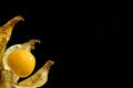
Physalis Undoneby taljComment: O.K. I had to look up the word Physalis to get an idea what you are going for - plus you learn something new everyday:-) That said the lighting on the subject is excellent and the presentation is a simple & clean minimalistic approach to showcase this Cape Gooseberry. It states that they are distictive for their lantern-type pod that covers each berry. That pod feature gives the gooseberry its "caped" appearance and as such it looks like it is emerging from it's crysalis in this photo. Not only does it look like it is emerging from the pod in a crysalis fashion but also from the position you place it in within the composition. It is coming out of the bottom left hand corner and 'emerging' out into negative space. |
| Photographer found comment helpful. |
| 02/14/2007 09:46:40 AM |
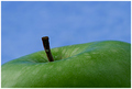
Simply Grannyby dahkotaComment: A very good close-up of a granny smith apple. A simple and clean minimalistic approach. Detail and lighting are very good. My critique is that the colors could do with a tad saturation boost. The green and blue tones appear a little flat and dull. Upping the saturation a tad should make the green of the apple really pop visually with the blue background. |
| Photographer found comment helpful. |
Home -
Challenges -
Community -
League -
Photos -
Cameras -
Lenses -
Learn -
Help -
Terms of Use -
Privacy -
Top ^
DPChallenge, and website content and design, Copyright © 2001-2026 Challenging Technologies, LLC.
All digital photo copyrights belong to the photographers and may not be used without permission.
Current Server Time: 06/12/2026 10:23:27 PM EDT.