| Image |
Comment |
| 09/21/2007 04:13:45 PM |
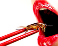
Another Tasty Treatby bdennyComment: As much as I find the thought of a cricket/grasshopper as unappetizing I do appreciate all the fine details and the technicals of this composition. Those red tones really pop off of the white background. Reds are vibrant and bold and immediately capture the eye. Details are really sharp even on the grasshopper. The one thing that I would suggest to improve this image is to cut down on the gleam for it is a little overbearing and distracting. A good polorizer will cut down on the glare and reflection (problem is I don't know how much as that it just might eliminate all the sheen which is not what you want to do). Hmmmm, perhaps a selective editing in toning down the brightness/contrasts, gamma adjust or possibly the use the clone tool with a transparancy of say 10% so that you don't entirely cover the sheen up but just tone it down. |
 Photographer found comment helpful. Photographer found comment helpful. |
| 09/21/2007 03:34:40 PM |
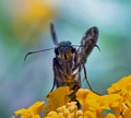
Smiling Right At Youby NobodyComment: This is an average shot but there are some nice and wonderful details that can be seen on the frontal view of this butterfly from the antenae down to the 'hairs' on its legs. But what makes a butterfly so beautiful to look at is the side view with all the lovely colors and patterns on the wings. The difference between the original and your composition is that the 'smile' of the insect is much more evident because of the pattern on it's 'face'. It pattern looks like it is flashing a big smile with a full set of teeth. The butterfly here in this composition has no such recognizable pattern for it's 'mouth' is vertical not horizontal. To capture the beauty of a creature you need to show us what makes it look so beautiful - in the case of the butterfly that is a side view with it's wings visible. Or if you are trying to show off a unique feature that 'humanizes' it like the original does you have to capture it at an angle that would spotlight that feature. |
| Photographer found comment helpful. |
| 09/21/2007 12:37:38 PM |
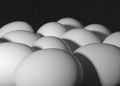
E L E V E Nby libertyComment: This is a wonderful emulation of the original. Composition is really good with the one egg in the foreground dominating the lower half of the frame. Lighting is good but the contrasts could use just a wee bit more of a boast to increase the dynamic range of the lights and darks. That is easily done in playing with Brightness/Contrast levels. |
| Photographer found comment helpful. |
| 09/21/2007 12:34:56 PM |
"Eleven" (Original by connie for Curves)by sh0rtyComment: A nice emulation of the original. Lighting is good but the contrasts could use a bit of a boast to increase the dynamic range of the lights and darks. That is easily done in playing with Brightness/Contrast levels. The other thing I think that would increase the visual impact is to bring the viewer closer in to the main subject. The original has the one egg in the foreground dominating the lower half of the frame. Zoom in closer to that middle egg and bring it front & center to our field of vision. Other than than this is an above average shot. |
| Photographer found comment helpful. |
| 09/21/2007 12:29:38 PM |
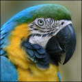
Macaw Study by Seanachaiby JuliBocComment: Wow! Absolutely wonderful details on the textures of the plumage to the white & black portions of this Macaw's face. The colors are wonderfully bold & vibrant. An excellent emulation of the original. |
| Photographer found comment helpful. |
| 09/21/2007 12:24:45 PM |
librodo "Eyes"by ChinabunComment: Love the bright and vibrant color of the veil/head covering that is characteristic of Librodo's portrait shots of exotic looking ladies. The lighting is spot on illuminating all the beautiful features of this exotic beauty. The play of light on folds of cloth is exceptionally nice too. Color tones of the skin is wonderful. Well done. |
| Photographer found comment helpful. |
| 09/21/2007 12:19:15 PM |
Tribute : timj351's "Needle in Red" : Curves Apr 2002by Dr.ConfuserComment: A wonderful emulation on the original! Love the flow of shapes and colors in both this one and the original. Love how you got the angle just right to replicate the sweep of the curve that cuts diagonally across the image from left to right. Colors are bold and vibrant and sharpness is spot on! Well done. |
| Photographer found comment helpful. |
| 09/21/2007 12:16:09 PM |
Yellow Ribbon, Textures III, July 2005, Western Gray Squirrel by brianlhby ShamanComment: Nice details on the textures off the hair and whiskers of this gray squirrel! This is also a good close-up portrait of this wild creature. My main suggestion to make this image visually pop more is to increase your dynamic tonal range of the B&W. Just off the top of my head this one DPCer's tutorial Methods of Black & White Conversion gives some good pointers on how to boast the dynamic ranges of your light and dark portions of the image. Playing around with different levels or mayhap you could adjust the contrast levels in your camera will greatly boast the 'wow' factor of the shot. |
| Photographer found comment helpful. |
| 09/21/2007 12:08:43 PM |
Fill Frame III- by btrinhComment: I like the addition of the pink eye shadow in this emulation. The soft shade of color is wonderful but I think the details of the eye & eye color is greatly lost in this composition. We cannot see the details of the iris or portions of the inner eye which is one aspect of the original that is visually appealing. The only thing that I can think of that may bring out the details of the iris in the shot is to try the same settings as Unneva did such as Aperture of 4.5, ISO of 200, and Shutter speed of 1/50. DOF and details increase with each F-stop, 8 and above being the best to bring out fine details Generally the smaller the aperture opening and a slow shutter speed should be able to get you some great eye details. |
| 09/21/2007 12:00:36 PM |
Tribute To ElSapo by nutzitoComment: Nice emulation on the original! All elements are in sharp focus. Lighting is very good and the pose & expression of the model crawling out from the frame is fabulous! The only suggestion I have here is that the color tones appear a bit flat. Bring up the saturation of colors to make them a little more richer and then play with Brightness/Contrast level to add that bit of punch to the contrast & tonal range. |
| Photographer found comment helpful. |
Home -
Challenges -
Community -
League -
Photos -
Cameras -
Lenses -
Learn -
Help -
Terms of Use -
Privacy -
Top ^
DPChallenge, and website content and design, Copyright © 2001-2026 Challenging Technologies, LLC.
All digital photo copyrights belong to the photographers and may not be used without permission.
Current Server Time: 06/19/2026 02:23:47 AM EDT.