| Image |
Comment |
| 06/24/2008 08:50:59 AM |
Day-07.jpgby Dirt_DiverComment: When you have good lighting and a great model to boot the photos that come out of the shoot are wonderful. Love the expression! I have to say I like both because the composition, model, and lighting are wonderful (of course in the original you would crop closer to the blue backdrop to remove the distracting elements in the background on the right). The after image has great appeal for it has an old retro feel - plus the processing brings out greater contrasts in the face and hair thus making them even more prominent. |
 Photographer found comment helpful. Photographer found comment helpful. |
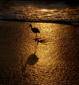
| 06/24/2008 08:44:05 AM |
Day-5-after.jpgby JakerComment: I like the closer to a square crop better than the original. It makes the viewer focus more on the bird's silhouette. Love the golden glow of the beach and the waves but they engulfed the main subject in the original. In the After image those two elements act more complementary to the main subject now. In the original I found that the cresting wave at the top third of the picture was too distracting - the golden gleam at the crest of the wave and the deep shadow at the bottom acted like a dividing line drawing far too much attention away from the dividing line of the water and the beach and thus attention away from the main subject that stands just below it. In the after image you removed that 'double' dividing line. Now there is just one division between land and sea. |
| Photographer found comment helpful. |
| 06/14/2008 10:23:23 PM |
In the shadowsby IreneMComment: Wow, great portrait the whites of the eyes of this grizzled cowboy really grabs the viewers attention. Subject really fills the frame and thus captures and HOLDS our attention. Focus is wonderful showing us every great detail upon this cowboys face. He does appear to be peering out or emerging out from the shadows. My only critique on this is that I wish that that there is greater definition of his hat - the black tones of his hat fade and blend in too well with the dark backdrop. Mayhap a little dodging around the brim and top portion of the hat would give it better definition. The other possibility is to place a light directly behind the subjects head to illuminate it better. But I would not use a strong light for then it will give too much of a halo look surrounding him - rather a dim light just enough to illuminate the edges of the hat like highlight shading such that it stands out from the dark backdrop. |
| Photographer found comment helpful. |
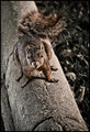
| 06/14/2008 10:09:30 PM |
squirrel.jpgby yankoComment: Your post-processing skills REALLY hit this photo out of the park! Jawdrop - just look at all those rich details in the textures from the concrete post to the tail of this squirrel!!! It really pops and draws the eye in visually. The contrasts between light and dark tones are so dynamic that they extrude this two dimensional photo into a three dimensional one:-)! Great job I have no absolutely no critique at all on this one. Love those textures and details! |
| Photographer found comment helpful. |
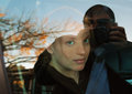
| 06/14/2008 10:02:44 PM |
doors day 3by onesaintComment: Great job in warming up the tones in this capture. The tones of the original were more to the cold blues - here the warmer tones compliment her skin better...not only that it warms up the color feel of the image. And by that I mean the autumn hues of the leaves are now a deeper warmer shade of orange and yellows. I know that you like the image and it would (SHOULD) be a wonderful shot of a beautiful young women gazing out the window upon the autumn adorned trees but I find that the reflection of the photographer within the photo distracts from that mood & feel. I would recommend getting a GOOD quality polarizer to remove reflections (my research lead me to buy Moose's Warm Circular Polarizer which works beautifully) but then that would rob this shot of the autumn tree and the mood of 'reflecting' upon nature you have captured here. The simplest solution is to change angle mayhap a 45 degree angle or 25 degree will keep all those lovely elements within the shot.
|
| Photographer found comment helpful. |
| 06/14/2008 09:42:45 PM |
day6_afterby loveComment: HA! Gotta love the 'editoral' opinion slapped on the edited version of the magazine. Excellent job in darkening the background for it allows the model with her lolly and magazine to pop off the page. B&W conversion has a wonderful dynamic range to the light and dark tones. Good job there. Also great job in removing the 'words' stuck to the lolly. In this final version the spiral of the lolly is detailed and unbroken with that words that were originally plastered onto it. Love the pose/attitude of the model as she is sucking the lollipop and flipping through this magazine. My only plaint (and a minor one at that) is that the head of the model on the magazine cover appears to be a sharp diagonal line. In the original you see that her head is resting on a pillow - here her head looks like it is resting a flat space. Perhaps burning back in some of the lines that defined the pillow back in will not make her look like such a 'flat line' head. |
| Photographer found comment helpful. |
| 06/14/2008 09:32:15 PM |
Self Portrait Editedby TCGuruComment: Hmmm, I am wondering why you wanted to have the main focus of your composition the earring...is it perhaps you were creating a modern day portrait of Vermeer's Girl With the Pearl Earring? I really like the closer crop for the main subject now dominates the composition drawing the viewer in closer to observe & appreciate the details. Excellent job in 'reconstructing' the earring in nice sharp detail - the original has the bottom portion blurred. Skin tones on the subject are lovely but because the backdrop has a similar hue range it does not allow her profile to truly visually pop off the background. A darker backdrop before the shoot or darkening the backdrop with PP would really make the profile of her face pop off the page. |
| Photographer found comment helpful. |
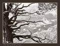
| 06/14/2008 09:21:58 PM |
IMG_0075Grand-Canyon.jpgby JerseyGenieComment: First off the composition had strong bones about it with the natural framing of the tree dominating the left & bottom side and the overhanging branch on the right. What you have done in this B&W version is bring up the tones, details and contrasts in the tree with it's twisting/curling branches and really made them the main focus of the shot with the Grand Canyon as a complimentary backdrop for it. In the original color version the details of the tree and it's textures are lost in shadow. Because it obscures the view of the Grand Canyon it seems an annoyance that would normally be a throw away shot. But here in your B&W version those knotted & twisting branches really pop and become the main focus for a rather unique view of the interesting landscape. Nice job. Message edited by author 2008-06-14 21:22:34. |
| Photographer found comment helpful. |
| 06/14/2008 09:08:44 PM |
Wall Flower B&Wby timfythetooComment: I like the simple and clean presentation of this final version rather than the cluttered and busy overlay of 'wallflowers' in the other version you posted. This is minimalistic high key at it's best. Those big, beautiful luminious eyes of this little girl really reach out and draw you in. I also like that she seems to be 'emerging' out from the right hand side of the composition...like she is stepping out from the light into our field of vision |
| Photographer found comment helpful. |
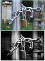
| 06/14/2008 09:03:06 PM |
Day 03by Dirt_DiverComment: Darkening the backdrop such that the industrial elements disappear really help the fence and the lock & chain become the standout main focus. And wow, what a difference converting the color version to the B&W because now with the dynamic range in contrasting tones the textures really pop visually. The eye more readily sees the pits, spots, and rust on the fence pipe in the B&W than it does in the original. You took the mundane from a color snapshot and added visual pop & grunge feel with the B&W final composition. |
| Photographer found comment helpful. |
Home -
Challenges -
Community -
League -
Photos -
Cameras -
Lenses -
Learn -
Help -
Terms of Use -
Privacy -
Top ^
DPChallenge, and website content and design, Copyright © 2001-2026 Challenging Technologies, LLC.
All digital photo copyrights belong to the photographers and may not be used without permission.
Current Server Time: 06/19/2026 04:58:02 PM EDT.