| Image |
Comment |
| 08/17/2008 09:09:40 PM |
Woo Hoooo! by bruskiComment: Lighting and composition are wonderful! Love how you composed this at a diagonal for it adds to the visual appeal/interest. The world spins while the duck stays in perfect focus - great job in adding movement to this composition. Colors and lighting are also spot on. Love the expression of your main subject who was well chosen for the ducky does appear to have an expression of pure excitement from his spinning ride. Great job. |
 Photographer found comment helpful. Photographer found comment helpful. |
| 08/17/2008 09:05:42 PM |
A Drop in the Ducket by scrybzComment: Holy Moly!!!! Great idea, great execution, and great title! Either you got super lucky ducky with capturing the waterdrop with the refracted ducky in the first 20 shots or you have extreme amount of patience to have gotten this shot. Either way - kudos for capturing such a great action shot! Love the colors too - nice deep blues, purple, orange and yellow hues that are pleasing to the eye. Composition has sharp clarity and we can clearly see all the details of the ducky refracted in that waterdrop that has been forever frozen in the act of falling. Great job - coming back to comment and bump to 10 |
| Photographer found comment helpful. |
| 08/14/2008 08:10:41 AM |
Waterbedby youbeeyouComment: It appears that this scene is supposed to be a mother duck pushing her baby duck in a baby carriage. By shape it looks to be a carriage but I cannot be sure because the wheels are lost in deep shadow. The scene would be a cute one but your lighting and angle hurts your composition. Better lighting would greatly help the scene by getting rid of those deep shadows around and below the pram/stroller. Not to mention the deep shadows on the 'faces' of the ducks. Based on the direction of the shadows I can guess that the the scene was light from directly above and slightly behind the set-up. That illuminates the top and back of the subjects. To get rid of the shadows you would need to place another light in front (you don't necesarrily need a fancy studio light as that it can even be a desk light) OR you could play with the flash on your camera to illuminate the scene with additional frontal lighting. By placing a simple tissue paper around the flash unit it helps to diffuse the light so that you do not end up with harsh shadows (a trick I learned here at DPC BUT you have to be mindful of your angle and distance from subject as that it still might throw some strong shadows behind the subject). Experiment with lighting set-up and different exposure settings and I am sure you will find that you can more effectively illuminate all your subjects in the scene so that the viewer can better see & and appreciate the composition. The angle you have here in the composition does add visual interest by placing the subjects on a diagonal BUT there is a drawback - you show us the berber carpeting of the floor which hurts the mood & setting of the scene. Placing this on a straight white or black backdrop would keep the focus on your main subjects and offer no other 'texture' that will distract the eye. Or another thought to play into your scene with a loving mother duck with her baby in the stroller is to play up the scene as a stroll in a park - which of course you would have to find a location (or make one) to set up that scene. Hope this advice helps. Good luck! |
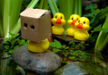
| 08/14/2008 07:52:16 AM |
Im So Ugly.by nibblesComment: I love this composition and creative presentation! This is a wonderful whimsy play on the classic story the Ugly Duckling. Lighting and composition of elements are exceptionally well done. And your choice of subjects was well thought out too! Not only are the three duckys 'shunning' the poor ducky in the forefront by their physical position but they also show it in their expression. They seem to wear an expression of utter distain with their downturned 'smiles'. The expression of the rejected ducky in magnified by the bag/box head he chooses to put on to hide himself. The scene just makes the viewer sympathetic to the poor little ducky. Well done on composing the scene in a pond or lakeside setting. Setting the scene in a natural setting gives it more of an authentic feel. Love your lighting too! Everything is wonderfully illuminated. Coming back to comment and bump up to a 10. |
| Photographer found comment helpful. |
| 08/14/2008 07:41:46 AM |
Deviled Eggsby TammerComment: Coming back to comment now. The lighting here is excellent. All subjects are wonderfully illuminated & color tones/hues are really great. Presentation is simple in composition and color which lends to a pleasing image to look upon. Love how you placed the two ducks in slightly different positions to create further visual interest as the eye travels up the line of eggs in the carton (great choice of composing this on the vertical btw). Title is very clever too. Great job 9. |
| Photographer found comment helpful. |
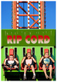
| 08/11/2008 10:08:56 PM |
Fear Factorby scalvertComment: Making time to comment. I saw this one while in voting but did not have time to vote & comment (curiosity got the better of me and HAD to take a peak at the entrants). I have to say I am very glad this got in the top three. Congrats on the blue! I absolutely LOVED the expressions on the kids - the abject terror as they fall while on this ride. Priceless. The iceing on the cake is the name of the ride in large bold letters along with the painted lines that give the composition a sense of movement. The colors, the lighting, the sharp focus all come together to create a wonderful image that one cannot help to both sympathize and chuckle at. |
| Photographer found comment helpful. |
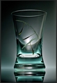
| 08/11/2008 10:02:00 PM |
Fallen inby IreneMComment: Evening Irene - I knew that this would be in the top 10 (although I did not vote for I have had very little time). Congrats. The lighting and clarity is spot on wonderful! Clean and simple presentation which is minimalism at it's best. The 3 dandelion seeds actually gave me the First Impression of it being one seed falling down over time in the glass (one seed, three positions showing time lapse of a fall). Even now when I KNOW that it is 3 separate seeds I still see a time lapse of the seed falling; movement caught in a static object. Nicely done! Oh, and tis nice to know that I am not the only one that is a perfectionist given the frustration you had with the original idea;-) |
| Photographer found comment helpful. |
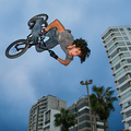
| 08/11/2008 09:54:43 PM |
From The Skyby nutzitoComment: Really great action shot. Normally I like a minimal approach but if you had not captured the tall buildings and trees in the backdrop then the viewer would not have had the very strong sense of height or the action of falling. Good tones and contrast. Lighting illuminates the subject wonderfully so we get to see the look of concentration on his face while doing the stunt. Congrats on your placement in the top 10:-) |
| Photographer found comment helpful. |
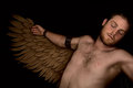
| 08/04/2008 08:24:49 AM |
ICARUS FALLEN with cardboard wings...by desertsnailComment: Wow! I am impressed with the amount of work and effort you put into this. Congradulations on creating such a wonderful photo. The level of detail in the wings (holy hannah you had a lot of patience with 'carving' those cardboard feathers), the pose, the expression of the models face -ALL- together is what makes this a fantastic composition. The lighting in this one is also very good for as Icarus 'falls' the darkness is decending upon him - at least that is the way I read the image. I am glad that your composition did not get slammed by the DNMC crowd. It would be nice if it had placed a little highter BUT you made it into the top 25% and earned over a 6 on the final score. Not to mention the most important thing: you created an image you should be very proud of. |
| Photographer found comment helpful. |
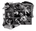
| 08/04/2008 07:49:50 AM |
Chapters in Life....which one are you?by JudiComment: One of my top rated images in the challenge. Loved how this composition illustrated many facets of life stages or chapters as you put it in the title. When I first saw this in the challenge it made me think of the Brady Bunch opening formation credits. But instead of just a head portrait you give us far more 'personality' of the people within the boxes because of the activity they are doing, the expressions, and dress of each person. Tones, lighting, composition of all elements come together in perfect unison. I too was a little confused as to why the two men adorned the opposite and outsides of the box. My conclusion is that you placed them there in that position to act as a Yin & Yang type symbol (one is dressed in dark colors the other in light). |
| Photographer found comment helpful. |
Home -
Challenges -
Community -
League -
Photos -
Cameras -
Lenses -
Learn -
Help -
Terms of Use -
Privacy -
Top ^
DPChallenge, and website content and design, Copyright © 2001-2026 Challenging Technologies, LLC.
All digital photo copyrights belong to the photographers and may not be used without permission.
Current Server Time: 06/19/2026 06:23:23 PM EDT.