| Image |
Comment |
| 12/18/2008 11:14:25 AM |
r e l a x e dby RetroesqueComment: He truly is fully relaxed and comfortable - with the single simple decorative ornament hanging on the tree in the backdrop it communicates to me that if one keeps the holiday nice & simple and relaxed one would enjoy the simple pleasure in life rather than have the chaotic whirlwind that mostly happens this time of year. This is the story that this photo communicates to me:-) Love those dynamic tonal ranges you have here as well. Wonderful details can be seen in this beautifully captured and composed B & W pet portrait. |
 Photographer found comment helpful. Photographer found comment helpful. |
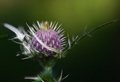
| 12/18/2008 11:05:36 AM |
Whatever 10by KenComment: The processing on this purple thistle is just stunning! Love the colors. The 'brush strokes' on the purple portion of the flower makes it appear as basketweave and adds an ethereal glow. The leafy spikes and the spikes also give off an otherworldly ethereal glow but it also makes them appear dangerously sharp. The thistle really dominates and captivates our attention! Wonderful job on this! |
| Photographer found comment helpful. |
| 12/18/2008 10:53:25 AM |
IMG_9366webEPN.jpgby RistyzComment: My kids and I have seen the performances of these beautiful Lipizzaners twice now. Beautiful shot - Love how you caught them in action. The white of their coats and the blue of the rider's coats really pop visually off of the dark backdrop. I have to admit I am not a fan of the overlay processing - the texture of the 'lined boxes' pattern takes attention away from the action and details of the natural beauty of the scene. |
| Photographer found comment helpful. |
| 12/18/2008 10:48:05 AM |
Butterflyby bobonacusComment: Excellent details on the wings and body of this butterfly, plus you have also captured some wonderful textural details on the leaves. Great macro shot of this insect! Colors are wonderfully bright and bold. |
| Photographer found comment helpful. |
| 12/18/2008 10:45:53 AM |
#dix - The Church of Our Savior on the Spilled Bloodby bobonacusComment: Wow! Nice shot of this fabulously beautiful church! The colors are beautiful and you show us many wonderful details from the decorated domes to the arches and spires. I am not quite sure that you needed to include the buildings off to the far right into the shot as that this church is the main focus of your composition. It would strengthen the visual impact to just have the church dominating the photo with no other buildings distracting the eye's attention away from it. The other thing that tend to distract is that the building seems to appear to be leaning back away from us. There is a simple trick when focusing the camera to help it 'see' the image as we do to avoid the leaning building capture...darn it can't seem to find my photography book that talks about correcting that problem (have to get back to you on that) |
| Photographer found comment helpful. |
| 12/18/2008 10:37:23 AM |
#neuf - Domesby bobonacusComment: Absolutely love the stunning gold color and the brilliant royal blue in this photo! The colors are what capture and help hold our attention. The vibrant gold stars on the blue add another point of visual interest. I really like how you composed the shot such that the gold and the blue are 'layered' at a diagonal. The gold comprises the top left diagonal while the blue comprises the bottom right diagonal of the composition. |
| Photographer found comment helpful. |
| 12/18/2008 10:33:24 AM |
Real Chocolate Covered Thin Mintsby TCGuruComment: Yet another winner candy composition that takes on all the lovely aspects of a mouthwatering ad for these thin mints. Love the color and the clarity. Composition of the candy with the festive holly and greens is pleasing to the eye. Love the cracked texture of the font...can't remember what the font name is but it works well here. |
| Photographer found comment helpful. |
| 12/18/2008 10:20:06 AM |
day 6by nixterComment: Wonderful tonal range in this composition. I like the askew diagonal composition of this self portrait for it adds visual interest. The image grain adds to the feel of an old photograph or as you were trying to achieve an old B&W 50's movie feel. Wonderfully done! |
| Photographer found comment helpful. |
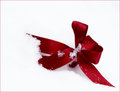
| 12/17/2008 11:32:39 AM |
Foundby CharleneComment: Nice find! Love the bold and deep reds of the ribbon that just pop visually off of the white snow. Composition is a well captured crisp minimalistic photo that is very visually appealing. |
| Photographer found comment helpful. |
| 12/17/2008 11:30:39 AM |
Puddle of Joyby colorcarnivalComment: Color tones and clarity of this photo are absolutely wonderful!!! Love the sparkles on the JOY ornament. I agree with turnofthesue, the ornament takes on the appearance of ice with the color and clarity you have. And the waterdrops are the beginning of it starts to melt. |
| Photographer found comment helpful. |
Home -
Challenges -
Community -
League -
Photos -
Cameras -
Lenses -
Learn -
Help -
Terms of Use -
Privacy -
Top ^
DPChallenge, and website content and design, Copyright © 2001-2026 Challenging Technologies, LLC.
All digital photo copyrights belong to the photographers and may not be used without permission.
Current Server Time: 06/20/2026 03:16:59 AM EDT.