| Image |
Comment |
| 03/12/2009 09:40:06 AM |
Splashby ShutterHackComment: Voted earlier coming back to leave comments. WOW! What a great capture of this dolphin surfacing!!! Color and clarity are sharp as a tack - look at the details on those water splashes coming off the back and out of the surface of the water. This is a great action shot of this beautiful creature. My critique (yeah, I know picky picky right:-) ) is that I think you can bring us even closer to this spectacular animal. A slightly tighter crop would do that and bring us even closer to the action....hmmmm going to adjust my score and bump this up another notch. |
 Photographer found comment helpful. Photographer found comment helpful. |
| 03/12/2009 09:33:41 AM |
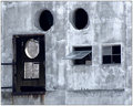
Portalsby lwkimagesComment: Voted earlier coming back to leave comments. A study in shapes and blended hues is what I see as appealing in this composition. All are portals or windows that give us an outside view but not all are the same shape and this is an exploration of them. To find so many on one wall in this arrangement is most unusual. You have circles, squares, and then the dark rectangle that contains both shapes. Heh, interestingly enough you could make the observation that your photo itself is another 'portal' that we are looking out of to see this arrangement of windows. We are looking through your rectangular portal to see these 'window's on the wall opposite. The state of the colors on the wall itself a 'whitewashed' or 'watercolor' look gives it the appearance of a painting. We can see the places where the white brushstrokes has left the canvas such that we see the grey underneath. |
| Photographer found comment helpful. |
| 03/12/2009 09:25:32 AM |
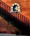
Grandbury Stairsby Hey_You_3000Comment: Voted earlier coming back to leave comments now. You know what I really find appealing about this photo. The way you composed it, the shapes, and the colors. Love that the stairwell cuts at the diagonal. The leading lines travel from the top left corner to the bottom right corner. And the shapes! The details of the design on the railing is shadowed and repeated on the brick wall. While the leading lines of the stairway dominate the composition as the main subject you also have an added visual interest of that top arched window that adds another visual element to the top right half of the diagonal. The balance to that window element in the bottom left half is the flower pot. I mentioned the colors are appealing too for the Black tones of the stairs really contrast nicely off of the red brick wall. |
| Photographer found comment helpful. |
| 03/12/2009 09:14:40 AM |
Two bettas fins spreadby ibangpotsComment: Voted earlier coming back to leave comments. Oh, the situation is not good...two betas together - they look like they are about to raise their gills and get ready to fight. The photo shows us that these two siamese fighting fish (betas) are ready to combat. Unless of course one is a reflection. If so they you did a SPLENDID job is capturing sharp detail on the reflection. I have to commend you for capturing such sharp wonderful detail on these fish for it is not easy to capture a moving object in water with such clarity. Love the colors here too - those red tones on the fins really pop off the black background. These fish really are beautiful to look upon - I see them as the peacocks of the water. |
| Photographer found comment helpful. |
| 03/12/2009 09:07:20 AM |
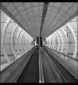
Motion Sicknessby greignerComment: Voted earlier coming back to leave comments. Great choice to go with B&W for it really puts the spotlight on the shapes and leading lines of the photo. The Composition is good too, for I like how it looks like we are 'zooming' out to the horizon. It takes on the aspects of a launch tube. The circular struts give us the tube in which we are in and the lines that lead us off to the vanishing point in the horizon is the 'path' the eye speedily travels on. The person in the shot gives us a good sense of scale. My only critique on this is that while the B&W tones are good they could be even better. Boosting the contrast on the difference between the light and the dark areas can really make this visually pop even more. |
| 03/12/2009 09:01:22 AM |
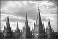
Mountain of the Lordby goinskiingComment: Voted earlier coming back to leave comments. Wow! Look at those monumental spires that tower up to the sky. The title is apt too. The spires do look like a mountain range, and if this is a church then certainly they are a Lordly mountain range. It is subtle but I like how you composed it such that one sees a mountain range in the backdrop to parallel the man build mountain range of church spires in the foreground. The details on the architecture is amazing in this photo. The black and white treatment was a good choice for it gets us to pay attention to the details, lines, patterns and textures seen here in the photo. My only critique is that the B&W tones are a little washed out. Per what I see, I think it could use a little boost in the contrast so that the tones become more dynamic and visually pop even more. |
| Photographer found comment helpful. |
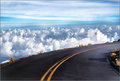
| 03/12/2009 08:49:06 AM |
Heavenlyby 1m1AComment: Voted earlier coming back now to leave comments. Holy...cow...I - am - really- glad to be sitting here and observing this as a picture (fear of heights). Though I imagine it must have be really breathtaking to observe in real time. Tis certainly cool to be above the cloud cover - I have experienced that once with driving into a cloud cover on the Blue Ridge Parkway in NC (an experience but one I do not readily seek to have again:-) ). O.K. back to the photo, I like how the composition has the road curving - those leading lines direct us to travel around the bend as we look upon the photo. But we also take a quick glance at what lies beyond with the billowy white clouds and the sky blue horizon. One also looks that there is no guardrail and tries not to think of how high up one is and how bad the fall would be....The unobstructed view of the wide open sky is that we feel we are above the heavens even though we are still rooted to the ground plane. Colors and details are wonderfully crisp. |
| Photographer found comment helpful. |
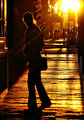
| 03/12/2009 08:15:39 AM |
Can you spare some change?by Yo_SpiffComment: Voted earlier coming back now to leave comments. For me I see the story unfolding here as "The Golden Hour". The main subject is mainly cast in silhouette so there are really no identifying features other than the handbag that is being held. The story I get from looking upon this image is a day of shopping at the markets or browsing the stores along the street - window shopping and getting a bite to eat at a local bistro. What really draws me is the warm golden tones of this capture and the feel that this is a quick glance imagery in that we are actually there observing the scene in real time (something the Lomo photography really does a good job in capturing - the feel of everyday life). Those warm hues make me think of a warm summer day or even autumn (those golden hues - leaves starting to turn gold and orange). You even have some rays and the person is wrapped in a warm glow of gold/orange hues. I feel that it adds to a sense of season and adds to the feel of the piece. The biggest critique I have for this (yeah, I know did you have to get picky)is that there are some odd blotches or spots on the top half of the pants of the main subject. I don't know if that it was from the processing or if they were actually there on the pants and the processing may have emphasized them. If it is due to processing then that can be easily remedied. It also might help to improve the visual impact of the photo by deepening the tones on the silhouette of the person to true black - something one can achieve by patiently selecting the person, feathering the selection to avoid hard edges, and either lowering the gamma all the way or brightness all the way. Of course, it could be that you see the silhouette as true black on your monitor and are wondering what the heck is she talking about. I, myself, have run into that situation where I see the silhouette as nice, deep dark shades but not everyone's monitor is calibrated the same plus the newer flat screen monitors seem to be much brighter than the older bulkier models. |
| Photographer found comment helpful. |
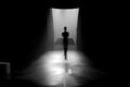
| 03/11/2009 09:03:05 PM |
Timeby badger88Comment: Voted earlier coming back to leave comments now. There is such a surreal feel to this capture and a very symbolic one. An individual hangs above the ground, he stand upon the threshold of open doors that signal a new journey. A leaving of what lies behind and to venture in to the vast horizon beyond. What that journey holds only time will tell. There are no identifying features on the individual so it makes it very easy for us, the viewer, to project ourselves into the scene and identify with a journey that is unfolding before us. All it takes is courage to take that first step. The silhouetted individual seems to be hovering above ground which adds to the surrealism of the scene. He/she seems be hovering between two posiblities or two paths. Stay grounded and go back or the sky is the limit and venture forth. This journey can be real or imagined. Very symbolic imagery you have captured here - thank you for sharing this vision with us. |
| Photographer found comment helpful. |
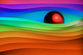
| 03/11/2009 08:30:23 PM |
Paper wavesby aKiwiComment: Voted earlier coming back now to leave comments. WOW!!!! Such vibrant and bold colors in this abstract that reach out grab you by the collar and scream 'look at me!" BTW, my youngest spotted this on the screen and said "That's cool!" It is indeed very neat and spectacular to look at. The play of curves both on the waves and the red ball show off pleasing shapes and lines that captivate the eye. Now back to the color - they are vibrant colors of the rainbow and this rainbow of color and shapes is very appealing to look upon. I can imagine this hanging on a wall to add some vibrant color to a room or even hanging up in a modern designed and upscale restaurant. Ach...sucker for the color and shapes seen here bumping up to an 8. |
| Photographer found comment helpful. |
Home -
Challenges -
Community -
League -
Photos -
Cameras -
Lenses -
Learn -
Help -
Terms of Use -
Privacy -
Top ^
DPChallenge, and website content and design, Copyright © 2001-2026 Challenging Technologies, LLC.
All digital photo copyrights belong to the photographers and may not be used without permission.
Current Server Time: 06/21/2026 03:58:00 AM EDT.