| Image |
Comment |
| 05/16/2010 12:13:35 AM |
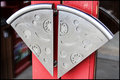
IMG_4049-edit-1by JokersSoulComment: Cool door handles! It is definately unique but the soda or bar behind the glass door on the left is distracting attention away from those pizza slices...wonder how this would look shot at a different angle. This will definitely take the slice (yeah bad pun I know:-) ) with uniqueness but it just needs something.
Oh you are going to kick me for this, but this might also be a good one for a reshoot (and to add something a littttlle different that some might welcome after looking at tons of door handles and locks and such). Close-up like you see here of the pizza door handles but just pull back slightly. Move two steps to the left to get most of that bar out of the picture. Now to introduce the next element: A person's hand just touching/cupping the left handle (don't have it obscured - just so much that the fingers are going to be in the action of pulling it open) Now the person's right hand will be holding a BEER! This is why I mentioned pulling back that full beer bottle needs to be fully visible and positioned just off to the right off the right pizza door handle (I has to not obsure that either). The idea is Beer and Pizza (two tastes that go well together LOL) The drawbacks to this is that whomever you get to be the model might have to contort in such a way that will be uncomfortable, this being a public place you could get some stares and a nasty stare down by the owner and you might have to zoom out so much that those great pizza handles no longer dominate the composition. Food for thought. |
 Photographer found comment helpful. Photographer found comment helpful. |
| 05/16/2010 12:01:31 AM |
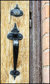
IMG_3917-edit-1by JokersSoulComment: If you can't go do the reshoot on the double ZZ doors then this is my number # 1 pick. Love the textures I see here with the lines and the cracked paint. Hmmmm, did you crop this or can you go back to the original and make this more of square crop? I think that you can crop closer to the nail that holds the chain that portion really doesn't add too much to the overall composition and you want your audience to focus their attention squarely on the lock and chain overall. Those are you main subject so bring us closer to them and let them take center stage. Also I think some shadow/highlight/midtones is in order to punch up the contrasts between the highlights and shadows so we get more of a feel of the 'rough' weathered texture of this door. I also like the punch of green that runs down the middle - gives it a punch of color. |
| Photographer found comment helpful. |
| 05/15/2010 11:54:11 PM |
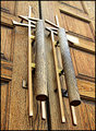
IMG_4036-edit-1by JokersSoulComment: Cool doors! - I like the perspective with this one BUT I do like the other door that had this same design but with glass panels. There is just sooo much wood and texture that the handle gets lost in the same color and wood tones of the door. The glass panels broke up that pattern of 'sameness' and gave it more punch as well as contrast such that the handles stood out more. Yer gonna hate me, but could you go back and shoot the one with the glass panels with this same angle perspective? Please. If you could I really think you have a great chance of getting a new Personal Best on your page. Also I did notice a great amount of reflections on the glass panels - if you have a good polarizer (and I mean a good one as that there are some pretty bottom level ones Moose Warm Cicular Polarizer is a really good one for cutting down on those window reflections) that could eliminate most or all. I wonder if the angle perspective can be kept but the double ZZ's could be more visible....I tell you I flip-flop between thinking ZZ top or Zeus - god of Lighting (doors to Mount Olympus) |
| Photographer found comment helpful. |
| 05/15/2010 11:42:07 PM |
IMG_3964-edit-1by JokersSoulComment: Interesting textures in this one with the wood then cracked paint and the brick that you could pull out nice details with some processing BUT the big drawbacks are there is too many that will be competition with each other and this is a straight on level shot which holds no lasting interest. |
| Photographer found comment helpful. |
| 05/14/2010 01:33:51 PM |
IMG_2860by TammsterComment: Congrads to you both! Tammy you look so proud:-) Please pass on to your son: Success and well wishes for the college and the future! |
| 05/10/2010 08:39:06 AM |
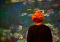
At the Museumby PennyStreetComment: This is a very artsy interesting composition - a cross between Monet and Magritte. Monet's watercolor paintings of flowers observed/appreciated by an faceless lady with lively and vivid orange hair. She is faceless because she could be anyone - a way for some observers to place themselves in her shoes - As she observes the painting and contemplates what she sees so to do we observe the 'art' photo of her and we now slip into the same shoes of observing and comtemplating the piece. The orange hair and the collar are bold and vibrant which may be a statement about the personality of the lady we are observing. |
| Photographer found comment helpful. |
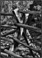
| 05/06/2010 08:42:43 AM |
The Fenceby JokersSoulComment: B&W tones are very dynamic and really great - lots of texture and detail on the wood fence. Lighting has some really cool light and shadows shown falling on the fence. B&W is the better choice to present this because they eye can appreciate the play of light and shadow and also the textures seen. Now that is what I find as high positives. What I have found in my experience here at DPC is that a good number, not all mind, of 'artsy' type shots get buried by sweeping landscapes or 'eye-popping' eye-candy; nothing wrong with those mind you but most don't give artsy shots equal rewards of high marks. The one critique I do want to point out with your composition is that the background tangle of trees are in as sharp focus and have alot of detail that it detracts attention away from your main subject (too much detail is what got me into very critical waters with  and low score:-( ). Bokeh effect or a different angle of shooting could have decreased or eliminated the backdrop from edging in and calling focus away from your main subject. The photo has many strong points and would, I think, score well with a majority 'artsy crowd', but DPC is a salad bowl of different 'vegetables':-) If you so choose to submit the positive is that your photo/art will be seen by a greater number of people than just sitting in your portfolio...and hey you just might also get a good score (one just never knows which crop of voters they will be getting) |
| Photographer found comment helpful. |
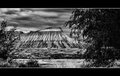
| 04/23/2010 07:53:03 PM |
MT-G5by JokersSoulComment: The tones look good and the scene is quite dramatic - but the editing steps have made the image lose alot of nice detail especially the mountain sides - they look too soft now. I think that the culprit step is the Guassian Blur. While it may have helped tone down all the detail in the supporting objects of the trees/bushes that act as natural frames it made the star attraction your interesting mountain loose it's edge in fabulous details. As for title - every time I see this I think of the name "Riven Rift Valley" ....btw what is the name of this place? |
| Photographer found comment helpful. |
| 04/21/2010 05:33:48 PM |
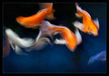
Riverdance by scalvertComment: Voted earlier - this is a stellar shot! Now that I have some time to comment I wanted to say why I love this shot (and favoriting it too). I love the brilliant colors that pop visually off of the blacks & blues of the water. While the Koi fish are not in sharp focus, I love how the sweep and swirl of the motion shows pleasing curves and a dreamy feel. With the movement it is almost like brush strokes. It is very impressionistic - hmmm, impressionistic zen and very well done I might add. This would be a wonderful print to hang on the wall. |
| Photographer found comment helpful. |
| 04/21/2010 05:25:57 PM |
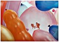
"My Gawd, I Hope There are No Darts at this Party"by libertyComment: Now that...is brilliant! I love the humor and the wonderful creativity in this shot. Putting fish inside a different sort of bubble - great imagination! Humor made me laugh. Love the colors, shapes, and the composition. I have two thoughts as to how you got the goldfish in the balloon - one would require extreme patience and luck, the other is that a picture taken earlier and hung there to give the illusion of being. All the same the effect is wonderful! Voted earlier and placed this as a 9 but had a little time now to come back and say what I enjoyed with this picture. |
| Photographer found comment helpful. |
Home -
Challenges -
Community -
League -
Photos -
Cameras -
Lenses -
Learn -
Help -
Terms of Use -
Privacy -
Top ^
DPChallenge, and website content and design, Copyright © 2001-2026 Challenging Technologies, LLC.
All digital photo copyrights belong to the photographers and may not be used without permission.
Current Server Time: 06/21/2026 08:39:09 PM EDT.