| Image |
Comment |
| 07/24/2010 09:19:48 PM |
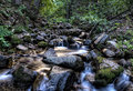
Bathing Browniesby CoryComment: Now this is a beautiful calendar shot! A top-notch landscape shot that would score really well in a challenge geared to those descriptions. But I just don't see any brownies in the shot at all - they are not visible to the human eye (well, see that was my point the artist might say). I have looked at this several times to make sure that I am not missing any camouflaged creatures but I don't see any unless you made them very, very, very transparent that they effectively disappear. I feel one should avoid relying heavily on the title to carry the idea of brownies being there but not visible to the human eye. I believe in the storytelling adage of "Show, don't tell". The title should complement the shot but not carry it. I have the expectation to see a creature of the mythical sort in this but none has been made visible and there-in lies the problem. I am being very honest here, I just cannot give this shot the full marks it deserves because it does not meet the spirit of the challenge which is mythical creatures. Voting on this one is a tad difficult because while it doesn't truly meet the spirit of the challenge (there is always the chance you have camouflaged them really well - all monitors not being equal in lighting) I can't bring myself to vote it extremely low either. |
 Photographer found comment helpful. Photographer found comment helpful. |
| 07/24/2010 08:45:31 PM |
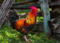
Big Redby ace flymanComment: Love the colors and amount of details I can see here. Look at the texture in the feathers, the coxcomb and the wooden post! Wow! Colors and clarity are wonderful. This is a great slice of life photo of the farm-life/country. Nicely done - even the cropping is perfect for it complements the Rooster without calling attention/focus away. |
| Photographer found comment helpful. |
| 07/24/2010 03:19:04 PM |
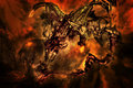
Alaerth's Fireby JudiComment: Can't vote on this but I want to tell you this is absolute stellar work! Like your other pieces I would easily label this the artist's 'Etheral Series'. Mythical creatures come to life in the smoke and fire. The warm red/orange hues breath life and heat into this creation. Love that this dragon is called forth from the fire and ash - the smoke swirls and erupts to take shape and form into this mighty and fierce beast - 'Behold! the Dragon's Breath!. That wizard best be careful on the fire he/she has envoked least they get burned; this dragon is not to be summoned lightly. Great job on this crafted piece - I have no critique's on what could be improved. The invocation of the image was called forth perfectly. A moment is captured and a story is told within this image. |
| Photographer found comment helpful. |
| 07/24/2010 03:18:29 PM |
The Collectorby TullyComment: I love the creative imagination that I see in this composition! Makes me think of just who this collector of fantastical beasts is; a demigod - a child-god, etc. etc. But back to the beasts. The main creature - hmmm is that the Clazmonian Sow of Greek myths (although it is said to have pink flamingo wings;-) ) I think I also see a gryphon but it does not have wings. There are other 'created' beasts that I cannot tie to any known mythical beasts - I wish there were more identifiable ones for that would have further strengthened the connection to known mythical beasts as opposed to fantastical beasts. Still, a an above average composition that is well done. |
| Photographer found comment helpful. |
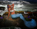
| 07/24/2010 03:03:43 PM |
She wears seashells by the seashore by MacDonaldComment: Great mermaid image. Good blending of the mermaid to her environment. I like the composition of elements and subject. Gotta wonder if you included the seagull because he was there or because it is a slight nod to the seagull character in Disney's Little Mermaid:-) The tail could use a tad more definition to the scales. By that I mean using adjust Shadows/Highlight/Midtones to make the shadows deeper - that would make the scales pop a bit more visually. The color hue might be a little to bright - a darker blue green akin to the color you see in the water pooling at the bottom left would have kept the colors a tad more in the realistic photo realm rather than digital art. The bottom fin is good but could be better if an actual fish tail was used and color adjusted to match the rest of the body. Still, it is an interesting tail fin for the texture invokes the idea of swirling water. Last critique is the starfish on the rock plateau doesn't quite look right registered to it's environment. It looks like an impression in the rock (flat) rather than 3D. Hmmmm, perhaps some burning of the edges to create shadows to make it 'pop up'. Still overall this I feel is an above average composition. Nice job. |
| Photographer found comment helpful. |
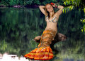
| 07/23/2010 05:13:37 PM |
Lobstermaidby HeiSchComment: Definately a new spin on the mermaid tale or 'tail':-) I like the creative thought behind merging the colorful lobster tail with that of a girl. Color, detail and creativity are good - an above average composition that has the potential to attain an 8 or above if a few things are addressed. First off I think the lake environment clashes with the stereotypical idea of where a mermaid is found...not only that when I think lobsters I think of the sea as well. I understand that you might have had to work with what you have and not been able to legally get a beach background. Hmmm, what might have worked better to make the mermaid be more believable in her surroundings - uh, mayhap the tail of a rainbow trout? .....o.k. did a quick google and it turns out that there are 'fresh water' crustaceuans. So it is possible but I have a feeling many people will have the same thought as I did that mermaid/lobster = ocean. The other thing I wanted to point out is that the plaid bikini top not only clashes with the colors and textures of her tail but does not tie into what a stereotypically drawn/painted/sculpted mermaid would be clothed in. With the expert editing - you could have easily selected the top, feathered selection to avoid hard edges, and changed the color. You would then have to do a bit of dodge and burn so that the shading would then look realistic as opposed to a solid flat color. You could even use the option of selecting using the tail as the bikini's color or maybe as a texture overlay. One suggestion on how to do it: with point-by-point select tool outline the bikini and feather to avoid hard edges. Save the transparent selection. Next select a good sized portion of the lobster tail, copy it. Now create a new layer set on normal 100% and paste the selected portion of the tail over where the top would be. Select your saved selection of the bikini top with will show where the top would be, invert selection, feather, and hit delete. Now you have 'cut away' all the excess and are left with a perfectly crafted top made of lobster tail:-) Lastly, (omg, I was wondering when she was going to finish this dissertation - yah, I know picky, picky) a small thing but something that might help with the aesthetics of the scene - I think the merge between tail and girl's body would be better if the tail was moved up to cover the hips and waist...most drawings and paintings I have seen have mermaids with the tail up to the waist and no belly button. |
| Photographer found comment helpful. |
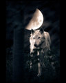
| 07/23/2010 04:28:40 PM |
Hati Hróðvitnisson -- The wolf who chases the moonby wyverndragonComment: Color tones and contrasts are great. The wolf really pops off the dark, moody woods. The lighting and dominant blue/black tones in the composition gives off a feel of something otherworldly or spooky. I think the thick black border robs focus away from the full impact of the image - it also gives it the feeling of being small. Go big! Show us more details and draw us into the great wide world of your composition rather than 'contain' it. I looked up Hati Hróðvitnisson to get a better understanding (I love learning new things). I think you did a good job in the presentation of the mythical Norse creature BUT I think there are two things that could have been done to push this from an above average shot to a score of 8 or higher. First, the myth is the wolf chases the moon - this wolf is not showing that action. It would have been much more stronger connection to the myth if you had a running wolf (yes, I know it might have been tough or very difficult to get that but I stand by my suggestion). The other smaller critique is that I feel the moon is too close in reach of the wolf - he is supposed to be chasing it rather than it hanging right over his head. I think it would have been better to place it in the top left corner...out of easy reach. |
| Photographer found comment helpful. |
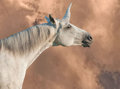
| 07/23/2010 09:40:28 AM |
The Last Unicornby littlemavComment: Nice blending of the horn to the horse to create this unicorn. Composition is good. Good attention to the feel or mood you want to project with the desert-like backdrop to tie into the idea of this being the 'last' of it's kind because of the barren landscape. While above average it still has some areas that call for improvement to make it even better. The contrasts between light and shadow are a little washed out (at least on my monitor - not all monitors are created equal) A bump in the levels in Shadow/Highlight/Midtones would easily help balance that out. The other suggestion that I think would make the image even better is some more contrast in the backdrop. Light shades/tone on the unicorn and then light shades for the backdrop doesn't really allow for your main subject to 'visually pop' off the page. A bit of darkening the hues (brightness/contrast levels) or lowering the gamma on the backdrop would allow the lighter tones of the unicorn to visually pop off of a shade or two darker backdrop. |
| Photographer found comment helpful. |
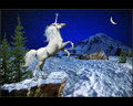
| 07/23/2010 09:30:56 AM |
New hope - the ultimate return of Unicornby william88Comment: The composition is above average and is appealing to look at. I love the magical feel/mood captured in this image. There is without a doubt a-lot of work put into piecing this together. Some elements are photographic in nature while others have an illustrated look; indeed it reminds me of a cover for a folder that I had way back in high school, but that was a pegasus. Again, I give this high marks for composition and the magical feel this projects. However I wish that there was more attention to lighting in that all elements had the light fall or are light in a realistic manner. I think that is one area that becomes problematic with moving it out of a the photographic realm and more into the digital art realm. The separate elements all have different light and shadow. What I mean by that is that if you look at the unicorn the shadow falls upon the bottom of the head and torso - that should also be seen on the cliff face. But it is not, the top snow covering is lit correctly to match the unicorn but the rest of the rock cliff face should fall into more shadow. |
| Photographer found comment helpful. |
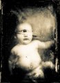
| 07/22/2010 10:03:09 PM |
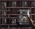
Infantby rooumComment: Very errie and a bit disturbing. The distressed look to the 'photo' adds an element of age and something nostalgic perhaps - like the old bill poster advertising circus acts of people with odd features/anomalies. Here we have a cyclops baby - perhaps it is even one of the original greek titan children. Definitely very well done in the composition and presentation and also in the creepy chill one gets when looking at this image. An above average composition - well done. |
| Photographer found comment helpful. |
Home -
Challenges -
Community -
League -
Photos -
Cameras -
Lenses -
Learn -
Help -
Terms of Use -
Privacy -
Top ^
DPChallenge, and website content and design, Copyright © 2001-2026 Challenging Technologies, LLC.
All digital photo copyrights belong to the photographers and may not be used without permission.
Current Server Time: 06/21/2026 11:58:45 AM EDT.