| Image |
Comment |
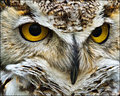
| 02/15/2011 07:48:13 PM |
Great Hornedby davidwComment: Fabulous detail on this owl - I can see the individual hair filiments in the feathers! Great color and focus - the composition brings us up close and personal with this bird of prey. So much so that the viewer can have a staring contest with those big brilliant yellow eyes. |
 Photographer found comment helpful. Photographer found comment helpful. |
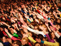
| 02/15/2011 07:34:13 PM |
Put your hands in the airby varlyte79Comment: The emotion and energy of the event itself must have been thrilling to experience while there. However, that energy and vibe doesn't resonate so well with those who did not share in the same live experience. I can recognize it as a fun and fabulous time judging by the smattering of smiles but I find the photo very hard to look at because there is just too much going on. The scene is very busy with a sea of people, a riot of color, and hands in the air - there is no focal point. Hmmm, or is there....after looking I do see something that with the right processing and focus could make this composition more stronger in the street photography sense. First off, the woman in the right corner with the purple shirt is facing in the opposite direction of the crowd. I would play her up as the focal point in the sea of people. Second the riot of color is too overwhelming to the eye - my suggestion is to make this a B&W. Maybe just select that woman and have her in color while the crowd is B&W OR have it all B&W but select all the crowd & darken the crowd slightly so that she stands out more. Also you could do a selection around the woman and do USM to bring back some sharpness of detail in her face. |
| Photographer found comment helpful. |
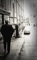
| 02/15/2011 07:21:31 PM |
Walkingby vladoComment: I like that you have your main subject dominating the left half of the frame. The buildings are composed in a leading line that draws us forward to see where this man is destined to walk. There is also the fade from dark tones (the man and building in the forefront) to the light tones (the end of the street, the vanishing point off in the distance). To me it is a subtle nod of mood that signals this man's thoughts or feelings: walking out of dark thoughts/sadness to happier thoughts/carefree. Tis a shame that the street does not go off into the distance for that brick wall muddies the strength of the mood created. Also there is an odd 'halo' sharpened effect that is most visible around the dark outline of the pants. |
| Photographer found comment helpful. |
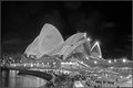
| 02/15/2011 02:50:57 PM |
l i g h t o p e r aby nivlekComment: Very lovely B&W photo showcasing the beauty of the Sydney Operahouse at night. Love the swoop and lines of the building structure you have captured here. The biggest detraction to the photo is the faint odd circular spots that appear in the night sky and the heavy grain that is most noticable in the dark tones of the sky. The spots almost look like there was raindrops on the camera lens. Selective editing and feathering of selection of sky to either gamma & shadow/highlights to darken the sky so the light tones of the opera house pop even more and hopefully the spots would disappear. It not, might have to go over it carefully with clone tool to minimalize or make the circles disappear. |
| Photographer found comment helpful. |
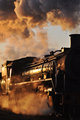
| 02/15/2011 02:41:29 PM |
Locomotive Breathby HarveyGComment: I love how the light illuminates this mighty train engine as it belts out steam and smoke. I can almost hear the hiss of the steam of this engine. It is a good shot and it has much potential to be a great shot - the one thing that the composition suffers for is that the full front of the engine is halved. Had you captured the full front within the composition it would be much stronger in the presentation of this Iron Horse. |
| Photographer found comment helpful. |
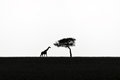
| 02/15/2011 02:28:16 PM |
Dreaming of Africaby Hussar1812Comment: I was going to start off that I think a vertical orientation would have better complemented/subtley alluded to the height of the giraffe and the tree, but studying the composition more I think you made the better choice of horizontal. I get the feel of a wide open savanna - wide and majestic in scope and then, one lone tree with this great giraffe strolling up to it. The B&W and the silhouettes of the main subjects with the negative space of the sky just focuses my attention all the more to the tree and giraffe. Simple and beautifully minimal in presentation. |
| Photographer found comment helpful. |
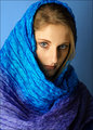
| 02/15/2011 02:21:21 PM |
allyby vikasComment: Very stunning portrait. Great lighting and she has some lovely catchlights in her eyes that draw the viewer in. This photo has lovely jewel tone colors of blue and purple that drape and frame her face. Well done. |
| Photographer found comment helpful. |
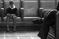
| 02/15/2011 10:26:31 AM |
Waiting IIIby MelethiaComment: Great B&W tones in this composition. I also like the composition of elements and the mood presented here. One person we see in the backdrop but the other we only see a portion of. The crossed legs are in sharp focus but the lines and direction of the foot point the eye in the direction of the child in the backdrop. Both are seated comfortably (seeing as the chairs look so). But there is a story here that presents itself for the imagination to fill in the details...we wonder who are these two people, what is it that they are waiting for, and are they waiting for the same thing or something different. |
| Photographer found comment helpful. |
| 02/15/2011 10:15:40 AM |
inside outby rider808Comment: Amazing that you captured a good shot of being inside the curl of a wave! It is a good shot but has the potential of being an exceptional shot had the crest of the wave been in sharper detail. Undoubtly getting a shot in side a wave is difficult so tis understood that to get it in full sharp detail is a challenge, but it is not unachievable. I see that the sharper focus is on the mountain backdrop and the portion of the wave that is closest to the backdrop. Perhaps a higher aperture would get you a better DOF of foreground and background but that would also possibly mean bumping up the ISO a bit more so that the photo is not dark. Lastly show off your photo! I think the large black border just detracts from the composition - it drowns it in a heavy black border that makes it smaller. A thin black border would better complement the shot. |
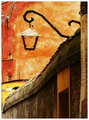
| 02/15/2011 10:03:52 AM |
A street in Veniceby arpitaComment: Love the rustic warm colors in this composition. This is a really pleasing study in lines, shapes and color. The hues of red, orange, and yellow are warm and vibrant. Love shape of the lantern and the way the hanging post curls with swooping lines. I do have a small critique. I think that the composition would be stronger if you cropped out the distracting sign seen at the far right. |
| Photographer found comment helpful. |
Home -
Challenges -
Community -
League -
Photos -
Cameras -
Lenses -
Learn -
Help -
Terms of Use -
Privacy -
Top ^
DPChallenge, and website content and design, Copyright © 2001-2026 Challenging Technologies, LLC.
All digital photo copyrights belong to the photographers and may not be used without permission.
Current Server Time: 06/20/2026 07:46:16 PM EDT.