| Image |
Comment |
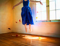
| 04/23/2011 11:38:48 AM |
Through Yonder Windowby tangueraComment: I love the whimsy of this shot - the warm colors of the room complement the vibrant blue of the dress. You have the blue of the sky and the fall of 'fall' colors to bring the outdoors indoors to color the room. With the whimsy aspect it also calls to mind a touch of Mary Poppins:-) |
 Photographer found comment helpful. Photographer found comment helpful. |
| 04/23/2011 10:47:19 AM |
when daddy leftby disassociationComment: Well you certainly captured sadness - though I truly hope it was a spur of the moment seen & captured rather than a created 'forced' one taken for the sake of challenge. The reaction I get is the need to comfort this little crying boy. The photo strengths is that the child is showing genuine emotion - those are real tears welling up in the eyes and rolling down the cheeks. The picture has good focus and good lighting. My critique on the photo is that I think the presentation could be stronger if it was in B&W. The color version calls too much attention to the shirt and the off white tones of the wall - why that would be important is because the tones don't allow the main subject to visually "pop" off of the backdrop. A B&W with good dynamic tones in shadows and highlights will keep the attention focused on the main subject without color being a distraction. (not voting) |
| Photographer found comment helpful. |
| 04/22/2011 10:56:43 PM |
waitingby slide52Comment: Very nice pet portrait of this dog. I can see what you were trying to capture - the dog's sadness that his/her master is gone...wondering when they will return. But the emotion needed more visual clues to more strongly portray that feeling of sadness. As it is now I think many have to struggle to look past the image as just a good pet portrait to see the emotion you wanted the audience to notice. I don't know what view there is outside the window but if there were barren trees visible or a leaf ladden neglected walkway that could have been included in the shot to help project a feeling of sadness - of waiting for someone who is not coming. I like that you made this B&W but I think you could have taken it one more step into the realm of projecting sadness. Blue tones can convey cold and/or sadness. In Paintshop Pro there is the Auto Color Balance in which you can use a slider to adjust color temperature to warmer (orange hues) or cooler (blue hues). I'm sure Photoshop has the same feature. By introducing some blue tones to the B&W, the color could be a supporting feature that helps the audience connect it to sadness. (not voting) |
| 04/22/2011 10:34:07 PM |
To be eaten...by hajekaComment: First off the color and exposure are wonderful. Now as to meeting the challenge you know that you took on a huge challenge to anthropomorphize an inanimate object right? It is difficult to capture the emotion of sadness in a living being be it animal or human but it is extremely difficult to attribute the emotion of sadness to an apple. Try as I might I just don't see any emotion - I see a nice still life, but no sadness. Maybe if there was a single waterdrop on the stem that was like a single tear ready to fall and an apple core off in the backdrop (out of focus ala bokeh because it is a supporting cast not the main object that is to dominate the eye's attention) I would be able to see the sadness in the idea. As it stands now I only see a nice shot of a still life. (not voting) |
| Photographer found comment helpful. |
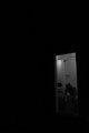
| 04/22/2011 10:24:35 PM |
How did I get here?by kichuComment: I like the use of negative space in that the small rectangle room of the main subject seems to be swallowed by the darkness. The figure sits with the shoulders slumped and head down which is another visual indicator of sadness. The outlook is bleak the man despondent - he is surrounded by darkness. While a good shot showing sadness there are a few things that could make this an even stronger photo. First off as much as I love the meaning and impact of the negative space it is a tad too much. Cropping a bit more off the bottom to have the man and the room dominate the bottom right corner of the photo would give a bit more impact to the darkness having him "cornered". Next is that the B&W tones of the man and the room are flat - more greys than a dynamic range of highlights, midtones and shadows. I think if you play a bit more with brightness/contrast, highlights/midtones/shadows and a little dodge and burn to make the areas that should be tending more in white tones instead of shades of grey (shower tiles, sink, lesser degree the toilet). The man has some nice light falling on his shoulders, arms, and head but because the tones of his backdrop a more grey he does not "pop" visually. Having more dynamic tones in the room and the man would make them visually stand out more and thus take more commanding presence in the darkness that threatens to swallow them. (not voting) |
| Photographer found comment helpful. |
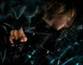
| 04/22/2011 09:25:00 PM |
Lost in the darkness. I don’t know which way to stray. Trapped by despondence. by timfythetooComment: Hmmm, very interesting - the sadness is not one that is in your face but more of a having to study the image to appreciate it. I hope the voters are taking the time to look and appreciate. I like the glass wall and the hand that has made the attempt to break through. The image is primarily cast in a dark light - ala the darkness of the mind/mood. The way I see it is that the person trapped behind the glass wall is a person trapped by their own depression. Attempts are made and there are cracks but the wall has yet to shatter. An attempt to punch through results in a minimal success (the hand) but at the risk of getting cut. I read desperation and depression in this image. My only critique is that I wish more of the facial expression was visible so that the emotions could be more strongly portrayed. (not voting) |
| Photographer found comment helpful. |
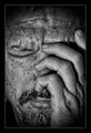
| 04/22/2011 07:21:54 PM |
Sadnessby FocusPointComment: B&W tones are excellent and call attention to a gritty 'angst' feel. But if one just judges from the photo itself, the audience can read it one of two ways. The hand on the head and the closed eyes could speak anguish and sadness OR it could be interpreted as physical pain such as not feeling physically well/headache. At times I do see the emotional anguish/sadness but upon other viewings I see it as the actual physical pain as in a headache. Within the photo itself there are no other clues for me, the audience, to draw from to make a firm and strong conclusion. Had there been a single tear on the cheek that would have been the extra touch and defining clue that would without a doubt place the reading as sadness. It is your title that then tells me which way to read it. It is a good shot but I feel it would be an even stronger shot if one did not have to refer to the title to make a firm conclusion. (not voting) |
| Photographer found comment helpful. |
| 04/21/2011 04:03:12 PM |
April is National Child Abuse Prevention Monthby chazoeComment: First off I have to say the lighting and set-up of the scene is technically excellent. Now comes the hard part - it is hard to say if this falls into the strong candidacy of sadness. The image itself speaks of fear and abuse very strongly. The sadness comes from your audience reaction to the image. Yes, looking at the scene, it makes me sad - Knowledge of the numbers of child abuse are too high and it's heartbreaking. But again the image itself does not contain sadness but it does very effectively evoke a reaction of sadness. It's a great photo and I do hope it finishes well. (not voting) |
| Photographer found comment helpful. |
| 04/21/2011 03:21:32 PM |
le fragile mortby Shanny403Comment: I really like this one - it has a film noir look to it. There are some nice visual clues within the photo that invoke the feel and mood of sadness. First off, the B&W tones help - sadness can be conveyed with color or in this case lack of color. Devoid of happy colors or distracting colors the mood can be subdued - sad especially of the main subject invokes that feeling. Along with the choice to go with B&W, the model is hunched over with eyes cast down - body clues that speak sadness. We see the trails of smeared and running mascara - she has been crying. Even thought stereotypically tattoos speak of toughness of character her poise and her face speak of a moment of frailty - a moment where sadness has overwhelmed her. (Not voting) |
| Photographer found comment helpful. |
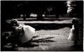
| 04/21/2011 03:06:30 PM |
untitledby bspurgeonComment: (Not voting) It wasn't until I began looking at this on the laptop which is brighter that I now see that the two girls on the left are laying flowers on a gravestone. My first impression upon seeing it on the PC (in which both far right and far left are cast in darker shadows) was that it was the two girls on the left were playing and excluding the girl to the far right. My thought was that the action of excluding the little girl was sad - even though I could not see/read her expression because it is dark and in shadow. Now I can see that the two girls are paying respect to a loved one who has passed - the problem still rests in that facial expressions and the tombstone that is flush with the ground are too lost in the shadows to convey a strong sense of sadness - there is a touch of sadness but it is hidden by the deep shadows that fall on the opposite sides of the photo right where they need to be visible the most. Since this was Advanced editing you could have done a little dodging and brighten up the areas on the girl's faces (but not too much) and a little more on the left side so the graveside is a bit more visible. |
| Photographer found comment helpful. |
Home -
Challenges -
Community -
League -
Photos -
Cameras -
Lenses -
Learn -
Help -
Terms of Use -
Privacy -
Top ^
DPChallenge, and website content and design, Copyright © 2001-2026 Challenging Technologies, LLC.
All digital photo copyrights belong to the photographers and may not be used without permission.
Current Server Time: 06/19/2026 07:47:08 AM EDT.