| Image |
Comment |
| 05/27/2006 10:17:26 PM |
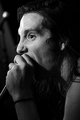
Don't Forget !!!by holdingtimeComment: ::: Critique Club :::
Hi, my name is Kari and from the critique club.
First Impression - the most important one:
Yay finally I get to critique a lenscap! When I first saw it I thought PIRATE .. but I am not sure what you were aiming for with the title?
Composition:
Interesting composition .. may have worked with a little more face and a little more lescap ... not sure.
Subject:
Meets the challenge ... and you have no problems with that.
Technical (Colour and light):
natural light is great .. but totally unforgiving .. and that is an issue here. the eye lkooks great ... but the skin is quite reddened.
To grow its vote?:
Think about how interesting the shot is to other people when you are taking it .. and especially when processing it ... changing to that thought may help.
Summary:
Good work .. and great try.
If you've got any questions about this critique, please feel free to contact me via the PM system.
Cheers
Kari |
 Photographer found comment helpful. Photographer found comment helpful. |
| 05/27/2006 10:13:05 PM |
Watching footballby Ragga2000Comment: ::: Critique Club :::
Hi, my name is Kari and from the critique club.
First Impression - the most important one:
10.30 is late out for a kid this age ... good work - good on keeping him awake as well.
Composition:
Lovely I like this, worked the thirds of the pic nicely .. and the leading line of the body seems to work as well.
Subject:
Meets the challenge quite well.
Technical (Colour and light):
Lovely crisp colours .. I love the contours in the kids face .. they help to make this hot work.
To grow its vote?:
No idea sorry ... the top 30 in this challenge have me slightly baffled.
Summary:
Great work .. keep it up you are doing awesome.
If you've got any questions about this critique, please feel free to contact me via the PM system.
Cheers
Kari |
| Photographer found comment helpful. |
| 05/27/2006 10:09:16 PM |
the ball and the fieldby crayonComment: ::: Critique Club :::
Hi, my name is Kari and from the critique club.
First Impression - the most important one:
Intesting and totally out of the box take on a portrait .. no person .. no animal ... a portrait of a ball.
Composition:
This is fine for this pic.
Subject:
Doesn't seem to be the thing for this challenge at all ....
Technical (Colour and light):
Have you applied some vignetting .. or somethng like that at the bottom and slightly up the sides or is this natural .... the sky being blown is not helping and the sharpening artifacts on the goal posts don't help either. The blue of the ball is great.
To grow its vote?:
Try putting in something like a person .. I think that may have helped .. or even an animal.
Summary:
Interesting study ... keep up the good work I know that you do.
If you've got any questions about this critique, please feel free to contact me via the PM system.
Cheers
Kari |
| Photographer found comment helpful. |
| 05/27/2006 10:04:06 PM |
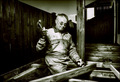
The hand of a Master Falconerby MacDonaldComment: ::: Critique Club :::
Hi, my name is Kari and from the critique club.
First Impression - the most important one:
powerful bird .. not enough of the hand for a photo which is titled hand of the falconer.
Composition:
This is nicely done, but would benefit from including slightly more of the hands in the picture ... it seems a little cut off at the wrist.
Subject:
Lovely and meets the challenge .. no animal did great in this challenge .. people seemed to want to see people.
Technical (Colour and light):
The hand is rather red .. but desating more may have killed the image itself ... it is a crisp and focused picture.
To grow its vote?:
Put in a person . .sorry but sometimes you got to play for what is asked.
Summary:
Great work .. you have a lovely portfolio .. if not deadly to small furry things :)
If you've got any questions about this critique, please feel free to contact me via the PM system.
Cheers
Kari |
| Photographer found comment helpful. |
| 05/27/2006 09:58:33 PM |
back to the old houseby coldaComment: ::: Critique Club :::
Hi, my name is Kari and from the critique club.
First Impression - the most important one:
To me ... this is very english beauty type shot ... so much the young gentry :)
Composition:
I love how you got him in the perfect third of the shot ... the background really adds here ...
Subject:
meets the challenge .... well and truely .. pity that not all get the feeling of the ole english ... but I think it is truely here.
Technical (Colour and light):
of course natural light ... and great colours .. the makeup you have used on your poor kid really makes the face look fantastic .. you should be proud.
To grow its vote?:
try to get it through that not everyone lives in the same environment. So many things that i have entered that mean lots here in NZ mean nothing on this site .. no matter how good the shot. This shot is a top 10 to me.
Summary:
Great work .. keep it up .. try completing yur photographers comments as well.
Interesting to do a critique on your image but it is difficult if you don't give us any information in your photographers comments. When we do a critique, we go past just the photographic result, that's what voters comments do. The critique looks at what you were trying to achieve, how you wanted it to look and what issues you had in getting the image captured and ready for voting.
If you've got any questions about this critique, please feel free to contact me via the PM system.
Cheers
Kari Message edited by author 2006-05-27 21:59:36. |
| Photographer found comment helpful. |
| 05/27/2006 09:51:43 PM |
The singerby TNCameronComment: ::: Critique Club :::
Hi, my name is Kari and from the critique club.
First Impression - the most important one:
Singer in a band .... interesting shot.
Composition:
Is fine for what it is .. but I think different angles could have provided better less flat perspective ... but is a candid and a good shot for it.
Subject:
it is missing the environment part of this challenge ... that is probably the issue.
Technical (Colour and light):
Black and white here is ok .. but colour may have enhanced the shot heaps .. as with colour lights and stuff from concerts really capture great in pics.
To grow its vote?:
Its all about trying new and different things .. you did good with this shot.
Summary:
Keep it up you got a good eye.
If you've got any questions about this critique, please feel free to contact me via the PM system.
Cheers
Kari |
| Photographer found comment helpful. |
| 05/27/2006 09:28:50 PM |
Life is great!by max90034Comment: ::: Critique Club :::
Hi, my name is Kari and from the critique club.
First Impression - the most important one:
I hate gold .. what is the point .. chasing a little white ball around a aeries of green fields ... but hey this is a great shot ...
Composition:
I like that you have cropped in this manner ...
Subject:
Meets the challenge, person in environment .. which tells story.
Technical (Colour and light):
Lovely natural .. and all that ... his face seems to have a little much colour added post processing but hard to know without knowing your processing steps.
To grow its vote?:
this shot did great ... you gopt top 50 percentage ... that is good ... I can also see that this is a stretch from your normal pics .. which is really cool.
Summary:
Keep it up you are doing well.
Interesting to do a critique on your image but it is difficult if you don't give us any information in your photographers comments. When we do a critique, we go past just the photographic result, that's what voters comments do. The critique looks at what you were trying to achieve, how you wanted it to look and what issues you had in getting the image captured and ready for voting.
If you've got any questions about this critique, please feel free to contact me via the PM system.
Cheers
Kari |
| 05/27/2006 09:18:00 PM |
Housebuilderby TUBORGComment: ::: Critique Club :::
Hi, my name is Kari and from the critique club.
First Impression - the most important one:
Coy and cute.
Composition:
Very centred ... less of the fence on the left side would not have reduced this picture at all .. and would have allowed you to make him slightly larger and give more impact.
Subject:
meets the challenge and edoes so with flare.
Technical (Colour and light):
This is one area I didn't mind the post processing ... is a little too much like a painting for me .. but still works as a photo ...
To grow its vote?:
looking at the winners of this challenge .. cropping him differntly would have worked wonders ... e.g. inclue the hammer and lower hand .. out past the post slightly so you know that hes building ... and slightly closer to the top of his head.
Summary:
Great work .. keep it up .. you are definately going places.
If you've got any questions about this critique, please feel free to contact me via the PM system.
Cheers
Kari |
| 05/27/2006 09:12:29 PM |
Waiting for the Perfect Shotby cislanderComment: ::: Critique Club :::
Hi, my name is Kari and from the critique club.
First Impression - the most important one:
My partner does this to me and I hate him for it.
Composition:
Needs more on the left of the person .. or less on the right as it seems a bit off balance to me .... this is of course just my opionion. I have also learn today of the potential of vignetteing ... not that sure that it added a great deal to this picture.
Subject:
meets the challenge .. and I am glad the bloke you are photographing found it good as well.
Technical (Colour and light):
Good DOF ... and great colours .. I like the natural lighting of course.
To grow its vote?:
Take a look at the stuff that was top ten .. they all focused entirely on the person .. this one is top ten to me it focuses on the person in their environment.
Summary:
Good work .. keep it up ... :)
If you've got any questions about this critique, please feel free to contact me via the PM system.
Cheers
Kari |
| Photographer found comment helpful. |
| 05/27/2006 09:06:37 PM |
In Hidingby michael5014Comment: ::: Critique Club :::
Hi, my name is Kari and from the critique club.
First Impression - the most important one:
Hell .. get me out of here .. I am so glad to live in NZ .. where we only have these things in glass boxes.
Composition:
is fine ... not fantastic with the snake of course being hidden by the bush ... but is kinda cool having to look for him. I just can't imagine it on the side of a part.
Subject:
DNMC is what you heard. But note portraits do not have to be human .. just have to not be hidden so well. of course this is more of a candid :)
Technical (Colour and light):
Is direct on the beast .. and that is fine ... I think it is straight overhead and causing distraction on the leaves.
To grow its vote?:
get a persons reaction and shoot that ... nah you did great for your first challenge ...
Summary:
Don't let the first try put you off trying again ... you obviously have a good eye.
If you've got any questions about this critique, please feel free to contact me via the PM system.
Cheers
Kari |
| Photographer found comment helpful. |
Home -
Challenges -
Community -
League -
Photos -
Cameras -
Lenses -
Learn -
Help -
Terms of Use -
Privacy -
Top ^
DPChallenge, and website content and design, Copyright © 2001-2026 Challenging Technologies, LLC.
All digital photo copyrights belong to the photographers and may not be used without permission.
Current Server Time: 07/18/2026 09:53:45 AM EDT.