| Image |
Comment |
| 05/27/2006 11:28:37 PM |
Still loving you ...by choppersComment: ::: Critique Club :::
Hi, my name is Kari and from the critique club.
First Impression - the most important one:
Big mistake decreasing the colours.
Composition:
the composition is ok .. not fantastic .. but there is very little to play with in this shot to improve it.
Subject:
Meets the challenge.
Technical (Colour and light):
You have issues here. The colour being dulled out is boring .. and flat ... and well you need colour ... unless you think that the original is bad. Playing with things like brightness .. reducing for this shot .. and upping the contrast adds a whole new dynamic to the picture ... and picks up colours you can't see here.
To grow its vote?:
Think about what other people will see and say when entering something like still life ... yes interesting, exciting, new ... or oh a pinecone. I like pinecones .. they make great fuel in the fire ... but ...
Summary:
I think this is a solid shot ... but just needs some playing to make it intesting. Good work .. keep practicing.
If you've got any questions about this critique, please feel free to contact me via the PM system.
Cheers
Kari |
 Photographer found comment helpful. Photographer found comment helpful. |
| 05/27/2006 11:21:45 PM |
Crystal Clear!by cogeroxComment: Hi, my name is Kari and from the critique club.
If you are not 100% certain of your readings for iso etc .. add them later .. do not guess .. cos it does not help.
First Impression - the most important one:
Very dark for ... I think I know what you are trying to do .. but am not 100% sure.
Composition:
it seems very centred .. have a look at this site .. it talks about the rule of thirds .. I found it helps heaps when composing and cropping.
[url]//www.silverlight.co.uk/tutorials/toc.html[\url]
Subject:
Meets the challenge.
Technical (Colour and light):
This is really too dark ... interesting DOF .. but it detracts i think. There is grain in the picture that may have been helped through using something like neat image .. there is freeware out there somewhere I think.
To grow its vote?:
I think this is a great second entry. You scored well and I think are learning ... good going.
Summary:
You are doing great .. keep thinking about how interesting it would be to you if your were voting and this will help to keep things in context while composing.
If you've got any questions about this critique, please feel free to contact me via the PM system.
Cheers
Kari |
| Photographer found comment helpful. |
| 05/27/2006 11:14:08 PM |
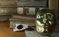
Midas' Libraryby smykComment: ::: Critique Club :::
Hi, my name is Kari and from the critique club.
I am unsure why you have asked for a critique when you don't like what you did .. and only entered for in your words the sake of entering something. Oh well onwards and upwards I happen to like the pic.
First Impression - the most important one:
I love books and these old ones are interesting ... the mask in intriquing and adds intesting.
Composition:
this scene is a little too tightly croped for me ... I think that trying to hit the mask on the thirds vertically and horizontally would have worked better for the shot ... rather than dhaving his nose in the middle and making it a little centred.
Subject:
Meets the challenge ... I don't think you thought of the table surface .. the veneer doesn't work for this shot and covering it with fabric may have helped create an older feel which the books and mask do.
Technical (Colour and light):
The mask has a little too little light on the right side ... using something to reflect onto the side may have soften the image slightly.
To grow its vote?:
Think about all aspects .. the mask being on a piece of paper detracts a little, but having it on the table surface would have been worse ... you could have had it on one of the books and used that as the surface and also background.
Summary:
Just thoughts .. hope they help .. your portfolio is really good.
If you've got any questions about this critique, please feel free to contact me via the PM system.
Cheers
Kari |
| Photographer found comment helpful. |
| 05/27/2006 11:05:33 PM |
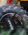
Nikor Mud Cutby KronusComment: ::: Critique Club :::
Hi, my name is Kari and from the critique club.
The photographers comments are not only for post processing steps but when we do a critique, we go past just the photographic result, that's what voters comments do. The critique looks at what you were trying to achieve, how you wanted it to look and what issues you had in getting the image captured and ready for voting.
First Impression - the most important one:
This is a great use of a kids toy. Way to go and good concept and execution.
Composition:
Playing to the bottom coner worked well here ...
Subject:
meets the challenge .. but I hope didn't same the cap.
Technical (Colour and light):
The DOF is great .. the grass in fron is almost gone .... you could have cropped slightly more off the top to avoid distractions from there.
To grow its vote?:
This is your second entry and in the top 50 already ... you did awesome.
Summary:
Great work ... keep it up.
If you've got any questions about this critique, please feel free to contact me via the PM system.
Cheers
Kari |
| Photographer found comment helpful. |
| 05/27/2006 10:59:01 PM |
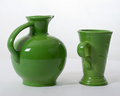
Pitcher and Mugby ClubJuggleComment: ::: Critique Club :::
Hi, my name is Kari and from the critique club.
First Impression - the most important one:
Not bad .. interesting product ... but a few distractions.
Composition:
I would almost call it contrvied ... I know still lifes are a set up thing .. but often in paintings they are set up for use ... here the handles at the same angle and not really looking like you can just pick them up and use them ...
Subject:
Monocromatic you wanted and that is what you got ... meets the challenge and scored way higher than you predicted too.
Technical (Colour and light):
There is a line where you background and table meet ..this is a clear distracition for me ... using a backboard with a slight bend eliminates this sudden change in direction from being obvious. The lighting is fine .. seeing it in the just is not that great, the reflections are really distracting ... I have no idea how to deal with this ... but I am sure we will all be faced with it and have to find out.
To grow its vote?:
I think this shot did great for the shot it is ...
Summary:
Good work ... I hope you learned what you were after.
If you've got any questions about this critique, please feel free to contact me via the PM system.
Cheers
Kari |
| Photographer found comment helpful. |
| 05/27/2006 10:52:56 PM |
mmmm lenscapby DoubledizzleComment: ::: Critique Club :::
Hi, my name is Kari and from the critique club.
First Impression - the most important one:
Your poor bloody dog!
Composition:
The lenscap is slightly lost on this composition .. but you got the cute vote anyways.
Subject:
meets the challenge ..
Technical (Colour and light):
This works really well here .. you have not said what you have done .. so not sure what to say .. but it did work. I also like the DOF you have used.
To grow its vote?:
From looking at those ahead of you I am not sure you could ... cute really only takes us so far. :)
Summary:
Good work .. and nicely appealing pic.
If you've got any questions about this critique, please feel free to contact me via the PM system.
Cheers
Kari
edit spelling Message edited by author 2006-05-28 03:29:36. |
| 05/27/2006 10:48:20 PM |
End of the Trailby collie65Comment: ::: Critique Club :::
Hi Carma
My name is Kari and from the critique club.
First Impression - the most important one:
hmmm .. blurry ... and blue .... neither which seem to work with this shot.
Composition:
the top of the saddle lines to the horizontal thirds (this is good) ... the stirrup his the vertical thirds .. this is also good ... I would probably have cropped a little wider ... as it seems slightly too tight at the moment.
Subject:
Meets the challenge in some odd ways.
Technical (Colour and light):
Ok ... get a tripod .. and don't be like me .. USE it ... I think that some of the blurring is camera shake .... have a look for neat image they have freeware available and this may hel with some of the grain in the shot, and try reducing the blue channel slightly in the colour balance.
To grow its vote?:
Take another shot ... and try applying some of what was said in the processing .. I think this is just the learning phase you are in right now .... you are still doing ok.
Summary:
Good work ... keep praciticing .. it will happen.
If you've got any questions about this critique, please feel free to contact me via the PM system.
Cheers
Kari Message edited by author 2006-05-28 03:32:19. |
| Photographer found comment helpful. |
| 05/27/2006 10:41:51 PM |
Lost Seedsby marytwitchelComment: ::: Critique Club :::
Hi, my name is Kari and from the critique club.
First Impression - the most important one:
Lovely shot ... maybe a little too much in the crop.
Composition:
Interesting .. . but hasn't really applied the rules .. leading lines would drag the eye into t he shot and rules of thirds would create interest .... have a look at this site:
[url]//www.silverlight.co.uk/tutorials/toc.html[\url]
Subject:
is fine and meets the challenge.
Technical (Colour and light):
I love outdoor light .. so in nature .. but the question is the DOF ... I don't think that the greenery in the background adds to this shot ... aper from the the DOF is fine.
To grow its vote?:
Take a look at what others have done .. and think as you take a shot .. are other people going to find this interesting .. is this compelling .... that sort of thing.
Summary:
Great work .. always on the improve ... keep it up.
If you've got any questions about this critique, please feel free to contact me via the PM system.
Cheers
Kari |
| 05/27/2006 10:33:13 PM |
bille II by ehoscaComment: ::: Critique Club :::
Hi, my name is Kari and from the critique club.
First Impression - the most important one:
great a ribbon entry to critique .. time to get finickey!
Composition:
I really like this but feel there should be just a tad more in front to force the ball onto horizontal thirds ... but what do I know . .you got the ribbon.
Subject:
Meets the challenge .. even if it was DNMC .. it ribboned!!
Technical (Colour and light):
Great and excellent really.
To grow its vote?:
Shoot the first two and take first spot. This was a really tough challenge ... you did great ... and sooooo very close to second ... point nothing in the score.
Summary:
Great work ... you are really going places. AND THIS IS ONLY your SECOND CHALLENGE!!!!
If you've got any questions about this critique, please feel free to contact me via the PM system.
Cheers
Kari Message edited by author 2006-05-27 22:34:15. |
| Photographer found comment helpful. |
| 05/27/2006 10:25:25 PM |
Simply Redby hotpastaComment: ::: Critique Club :::
Hi, my name is Kari and from the critique club.
First Impression - the most important one:
The green and red look great .. but what is the placemat there for?
Composition:
interesting composition .. I am not an expert at still life .. but I like how you have set up this .. and cropped ... to a point I want to turn the apple around to create a leading line with the stem .. but not sure if that would work.
Subject:
meets the challenge.... does it well.
Technical (Colour and light):
Great colour and nice lighting .. .the actual reflection of the windows is a little distraction though.
To grow its vote?:
simple pictures with basic elements have taken out this challenge .. I think taht the mat addedd complexity that wasn't needed.
Summary:
Good work . something quite out of the box for you ... keep it up.
If you've got any questions about this critique, please feel free to contact me via the PM system.
Cheers
Kari |
| Photographer found comment helpful. |
Home -
Challenges -
Community -
League -
Photos -
Cameras -
Lenses -
Learn -
Help -
Terms of Use -
Privacy -
Top ^
DPChallenge, and website content and design, Copyright © 2001-2026 Challenging Technologies, LLC.
All digital photo copyrights belong to the photographers and may not be used without permission.
Current Server Time: 07/18/2026 04:20:29 PM EDT.